
WestMetal Group / Design System
Built with precision.
Designed for trust.
A shared foundation for building clear, capable, and unmistakably WestMetal experiences—from a single button to a full campaign.
Try “logo”, “photos”, “buttons”, or “accessibility”.
01 / Brand assets
A consistent mark in every context.
Prefer the horizontal logo for headers and wide formats. Use the circle or icon marks when space is constrained. Preserve the artwork’s proportions and use the white variants only on dark, uncluttered surfaces.












Site icons
Favicon & touch icons
Use the SVG favicon when supported, retain the PNG as a raster fallback, and use the 180px touch icon for Apple home-screen bookmarks.



Do protect the mark
Keep clear space around the logo equal to at least the height of the “W” icon. Use approved artwork and maintain strong contrast.
Don’t improvise
Never stretch, rotate, recolor, outline, add effects, rearrange, or place the mark over visually noisy imagery.
02 / Photo library
Shared photography for components and page layouts.
Browse the theme’s photo library as a thumbnail grid, then open images in a modal with download and previous/next navigation.
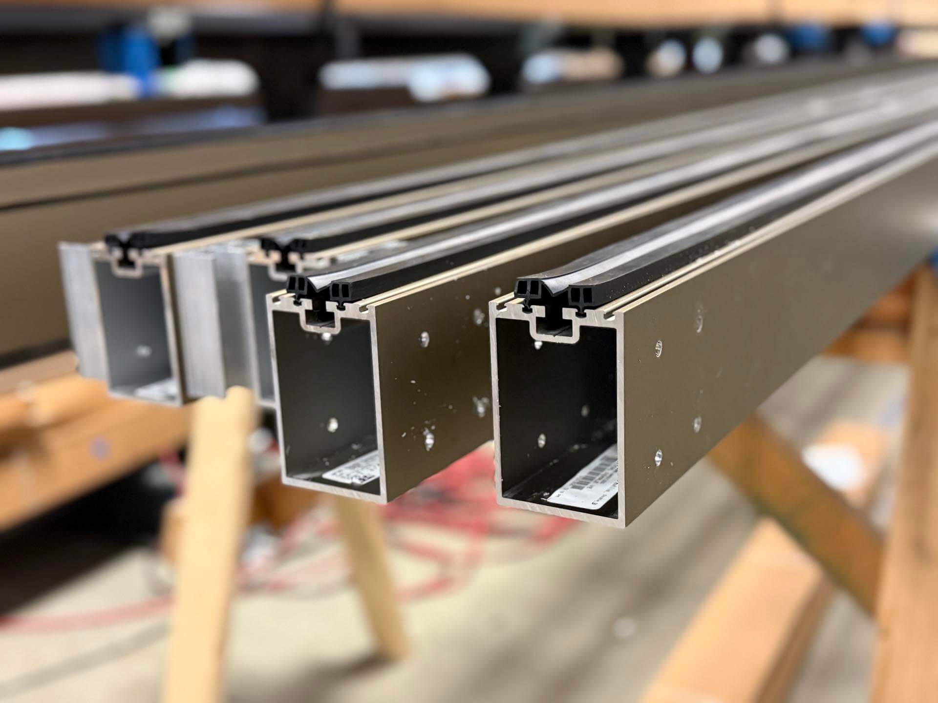
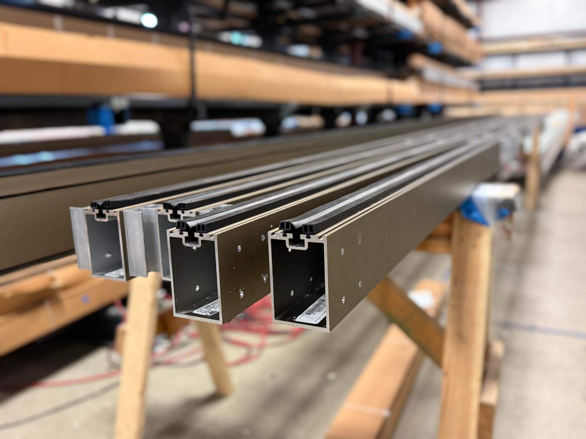
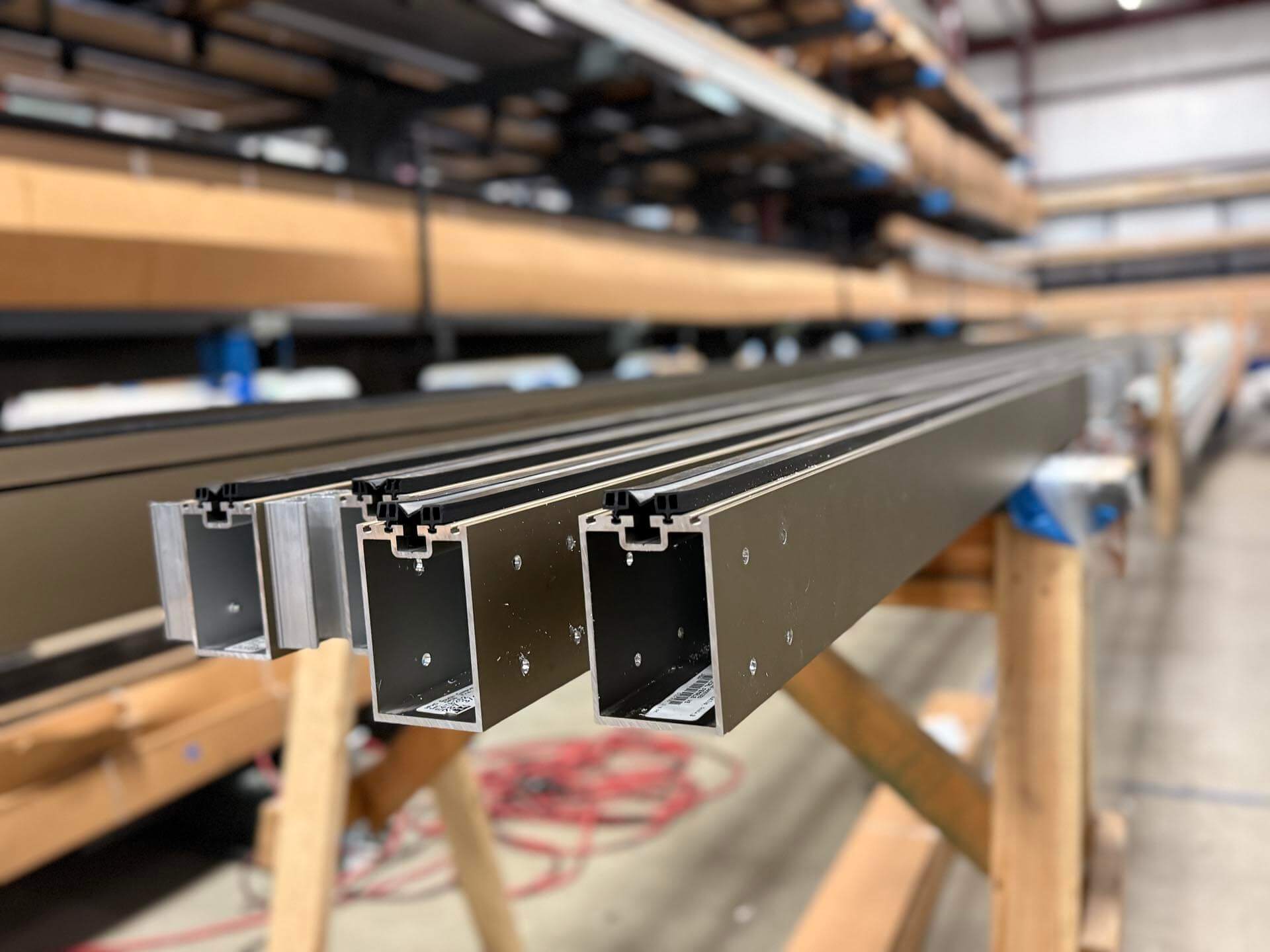
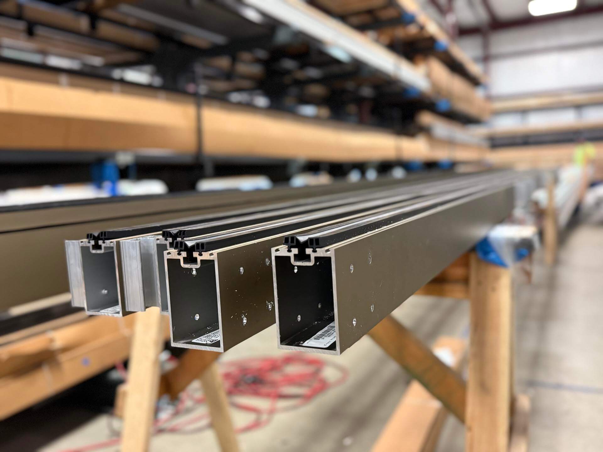
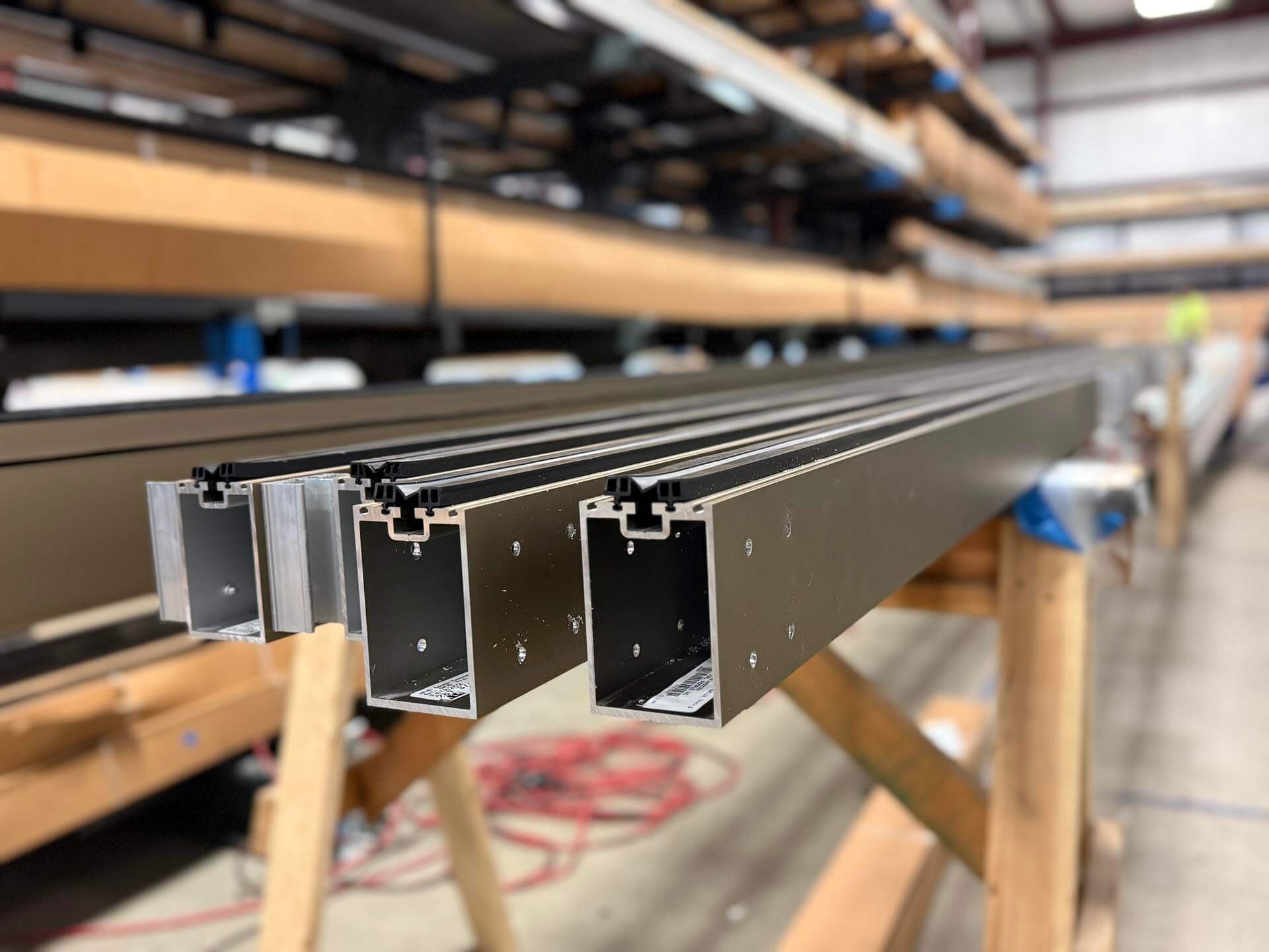
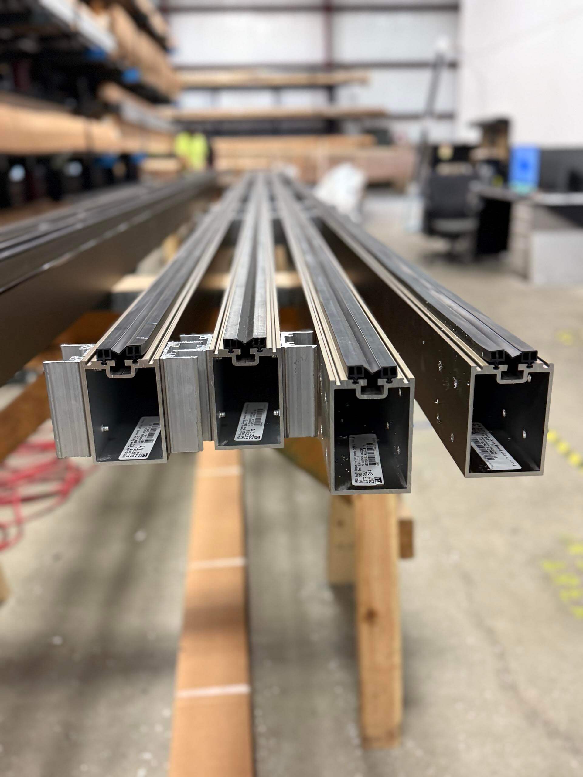
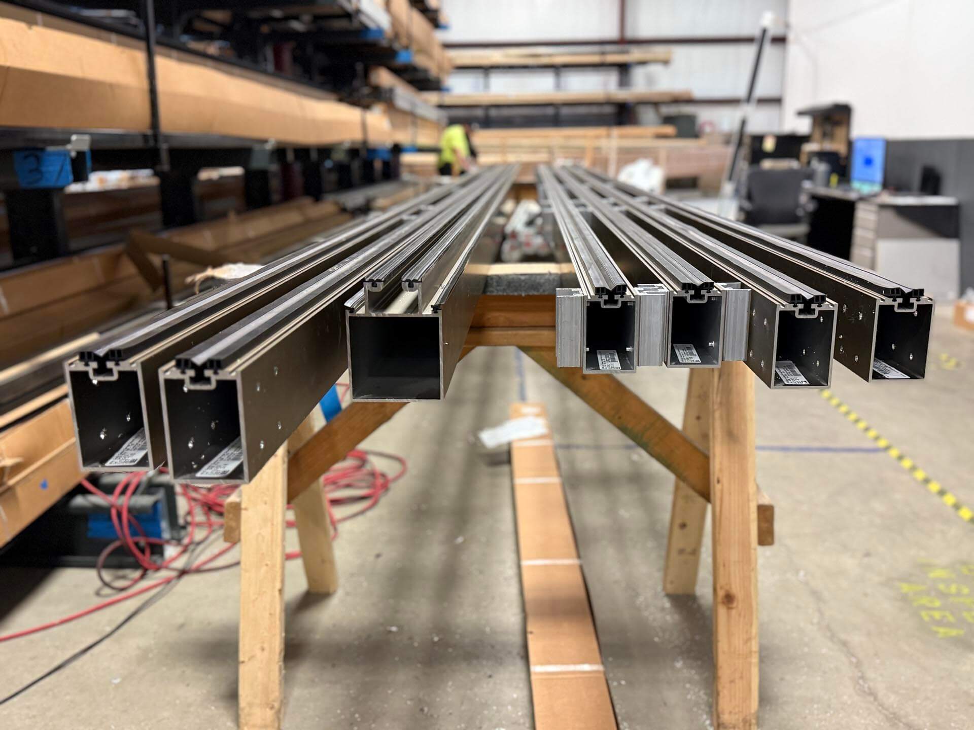
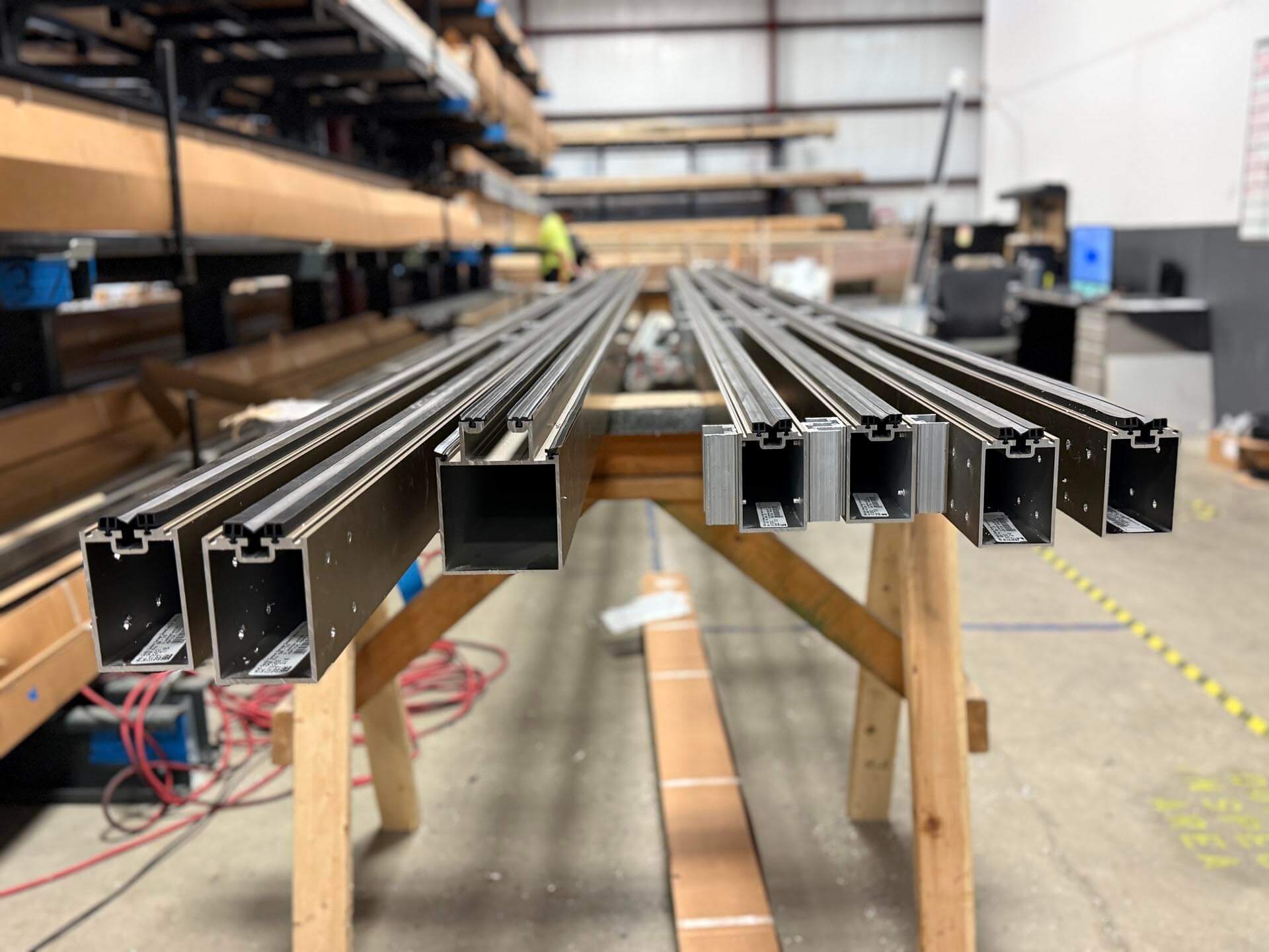
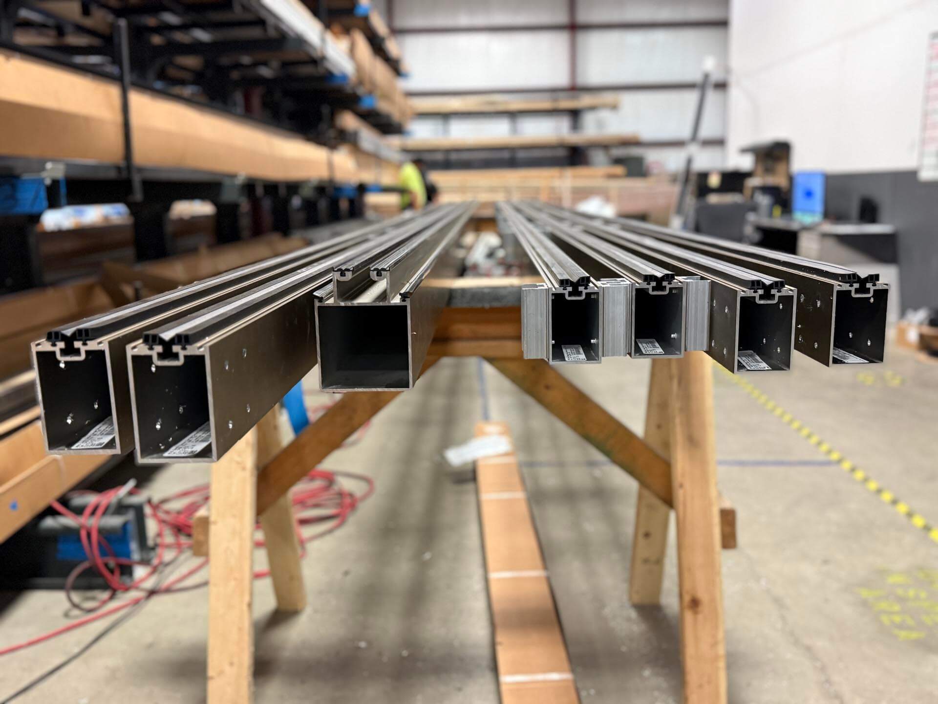
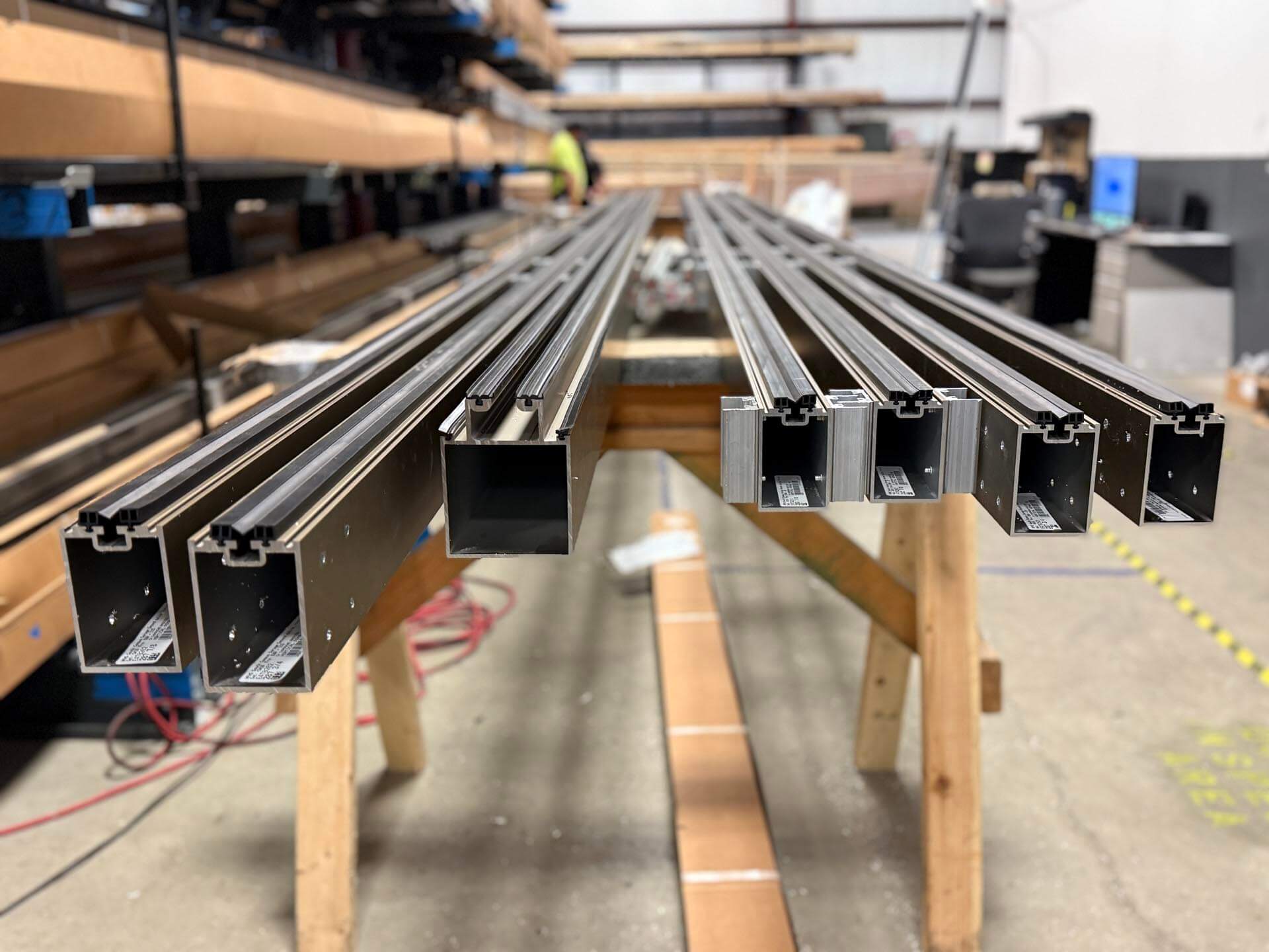
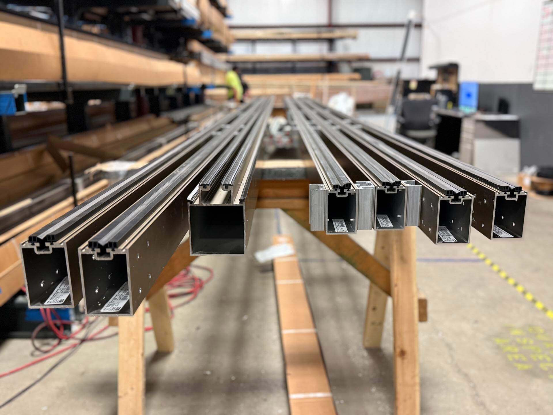
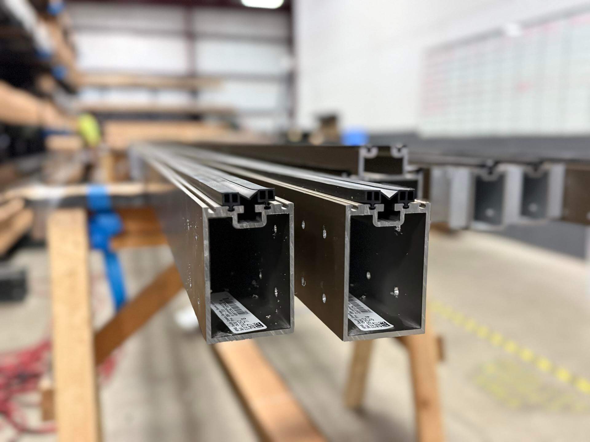
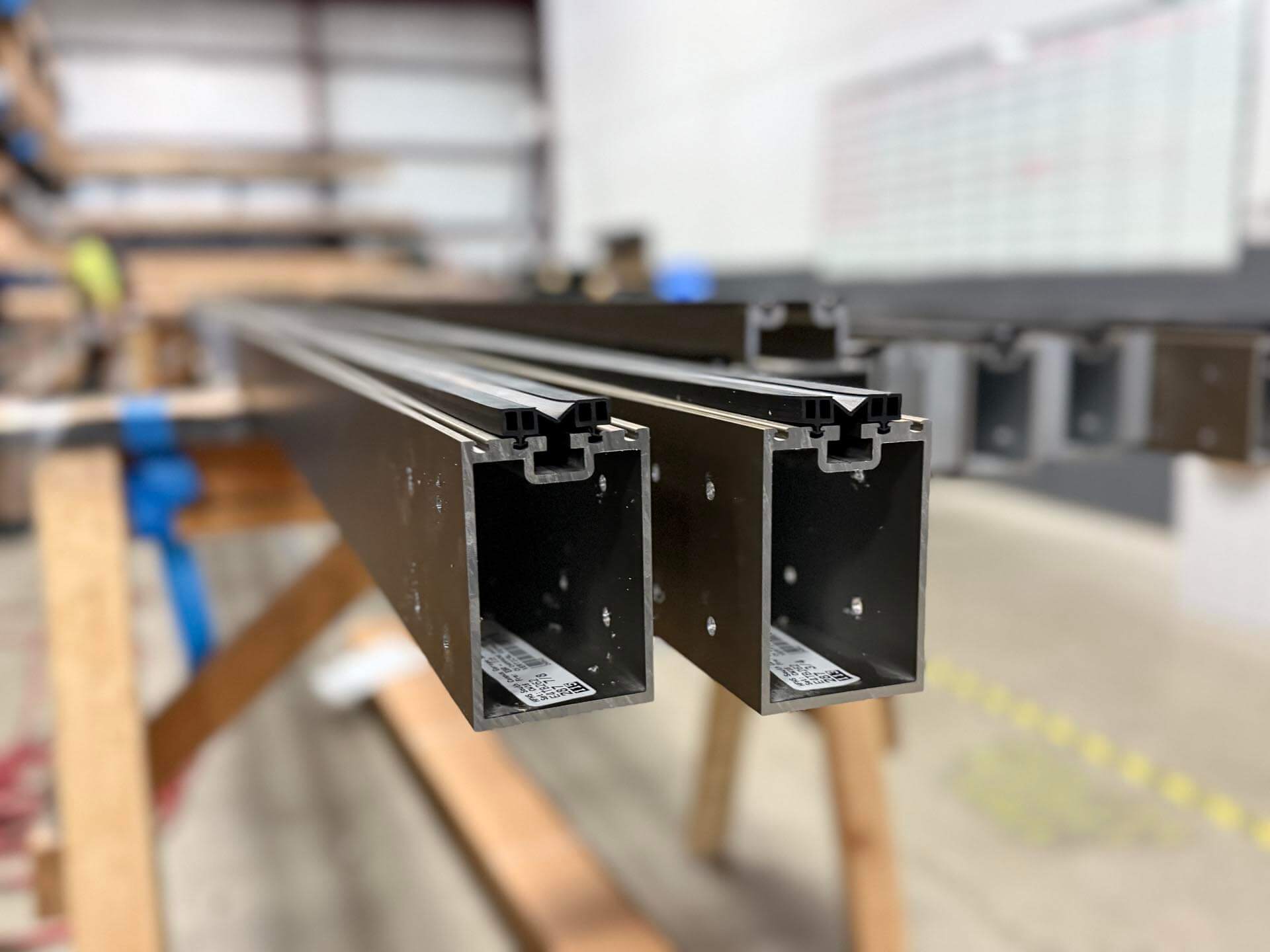
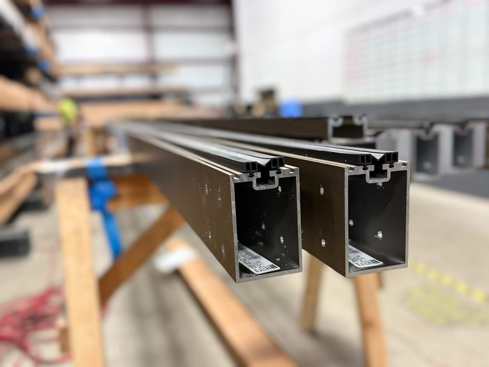
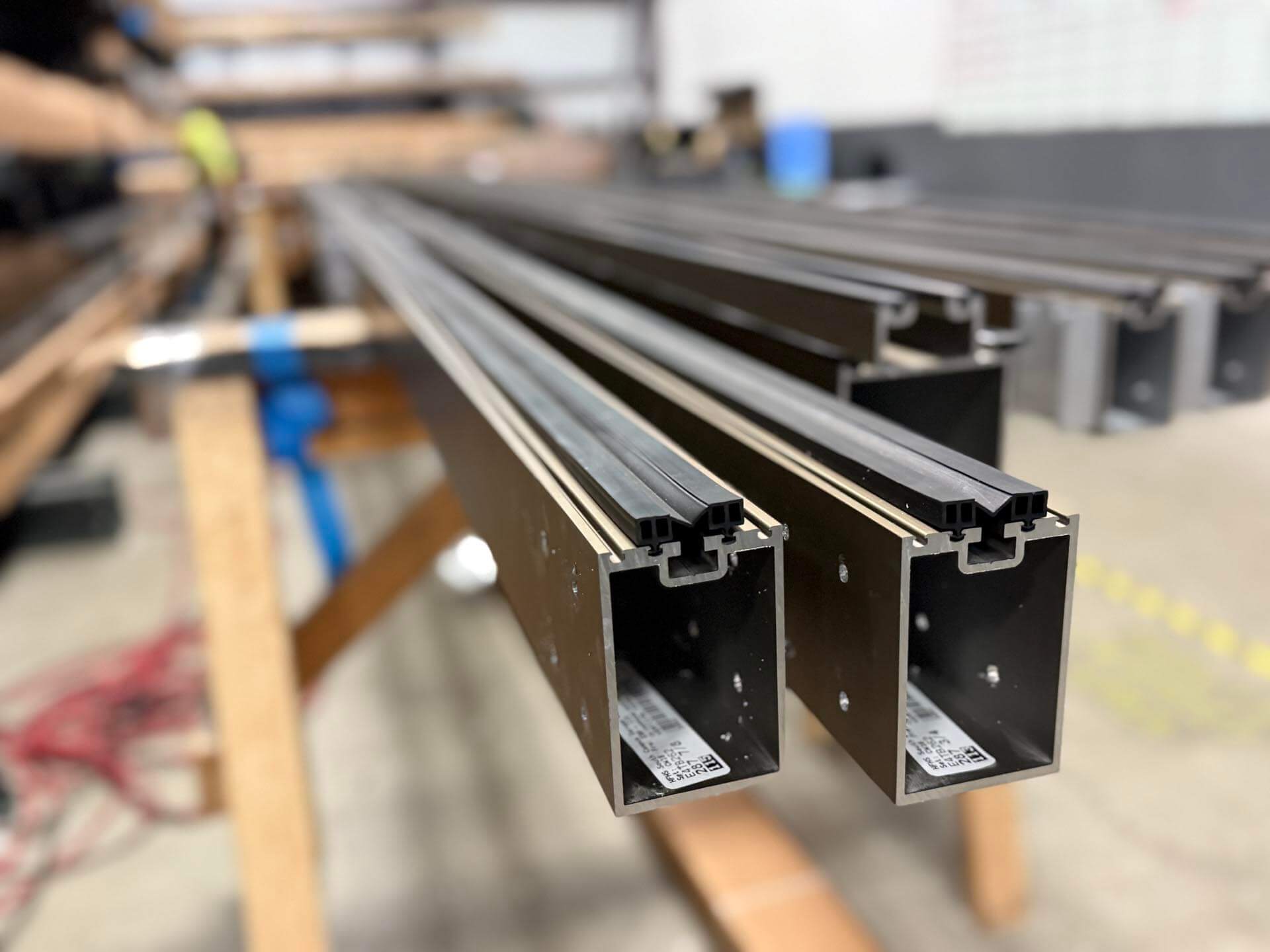
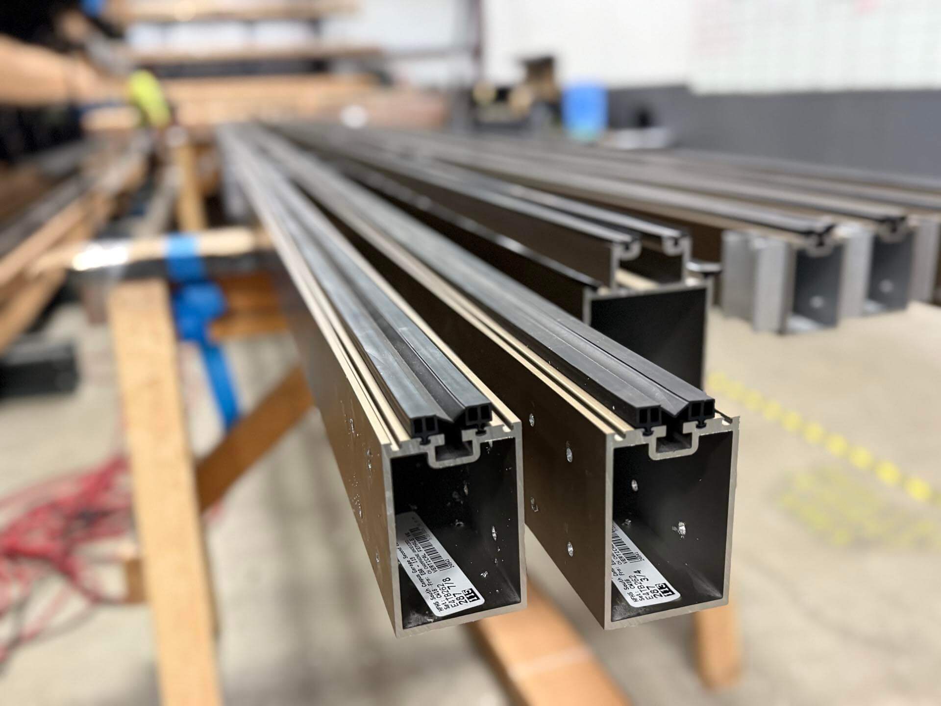
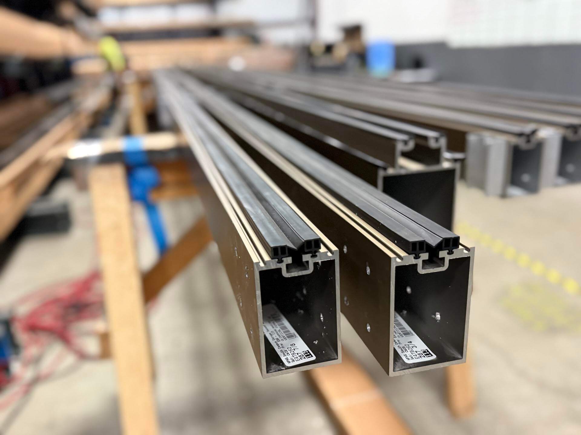
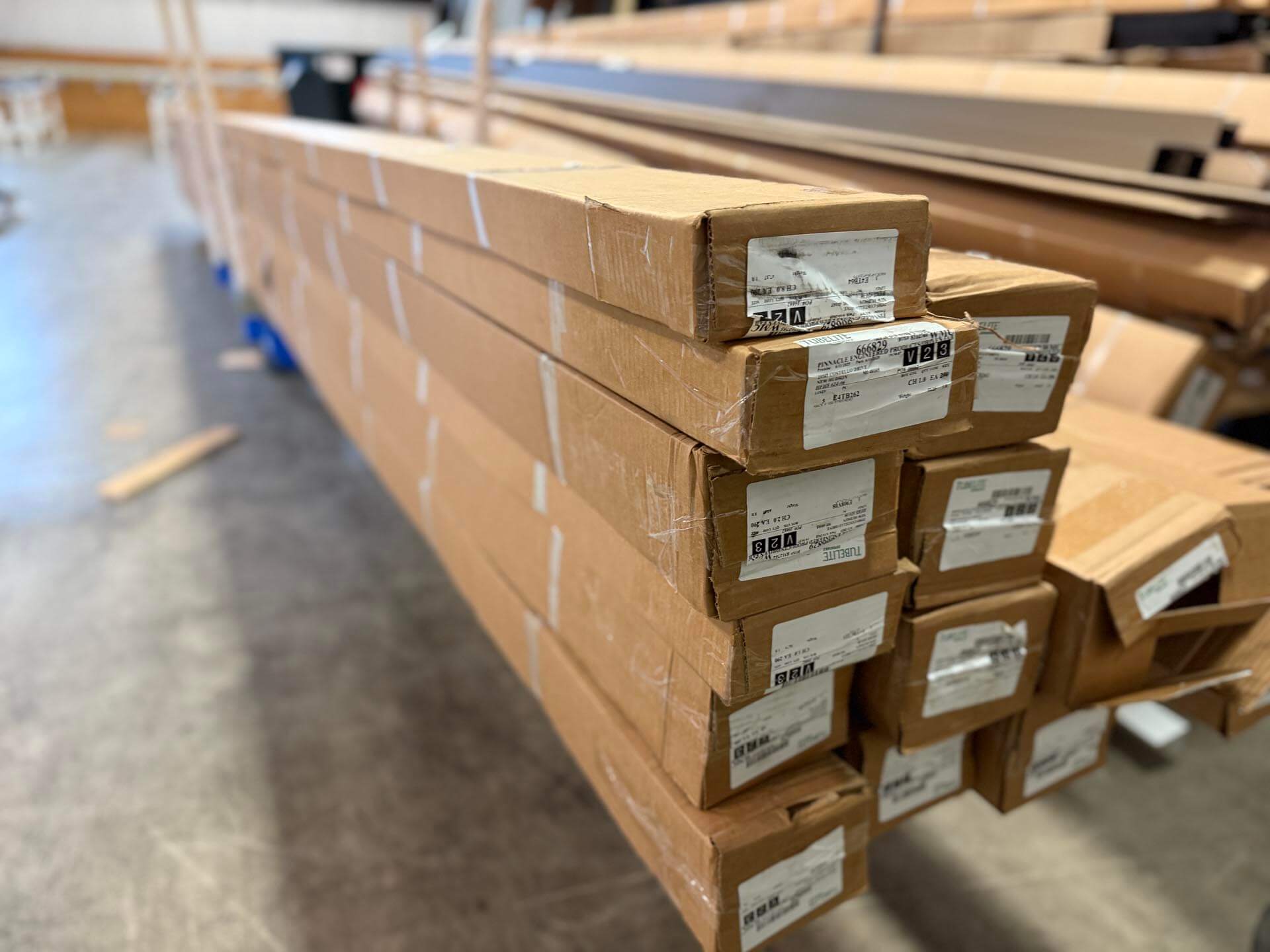
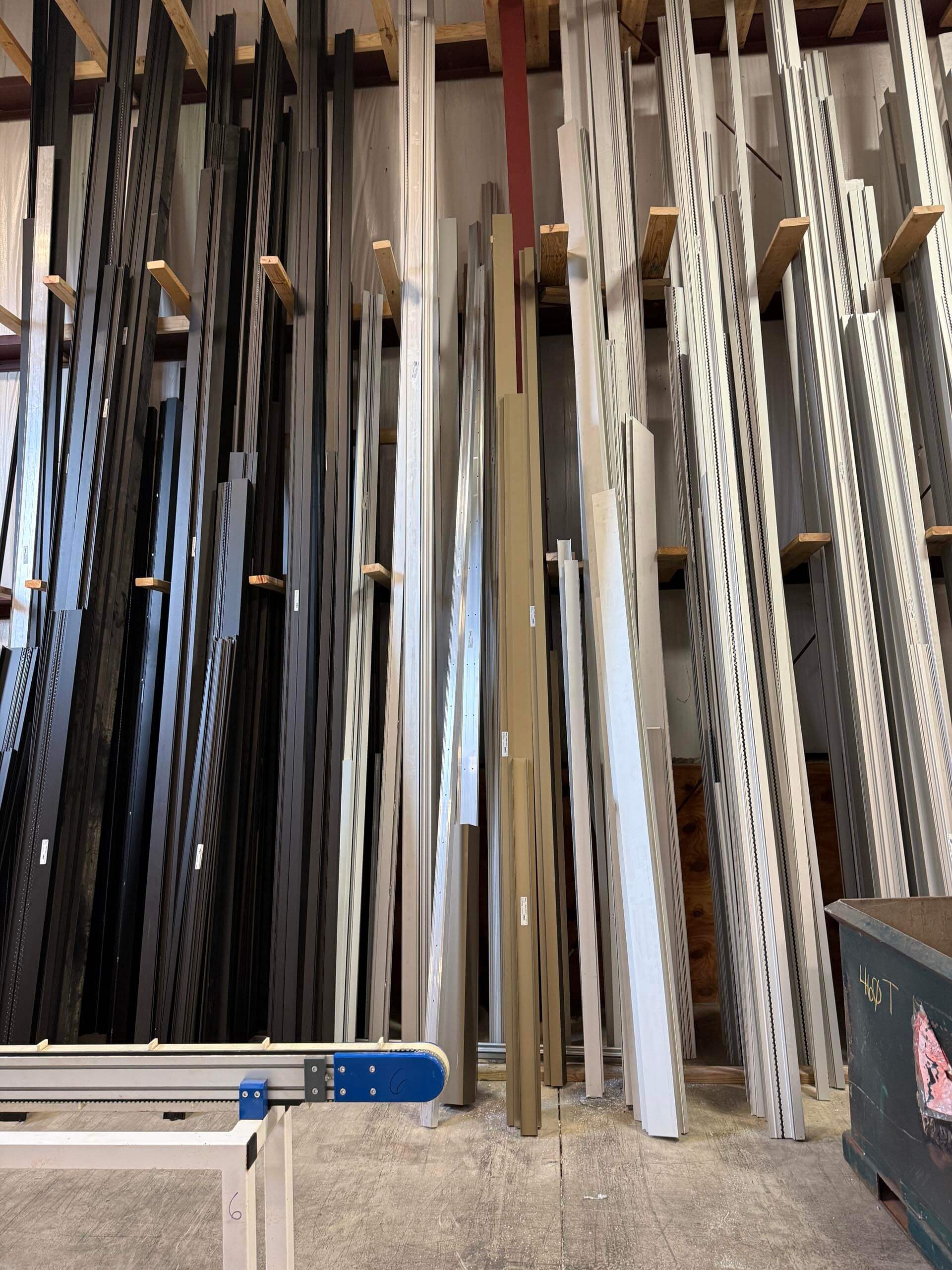
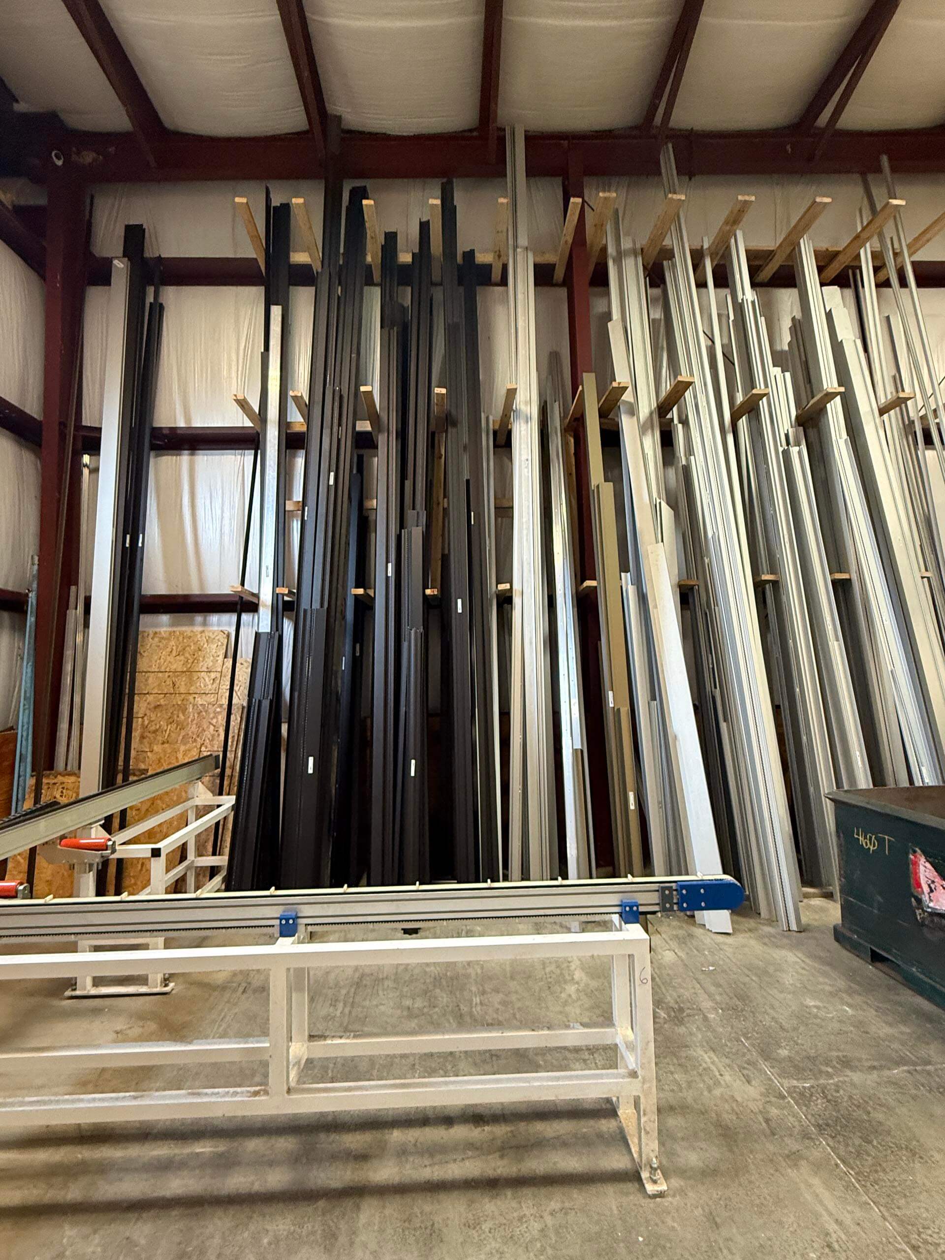
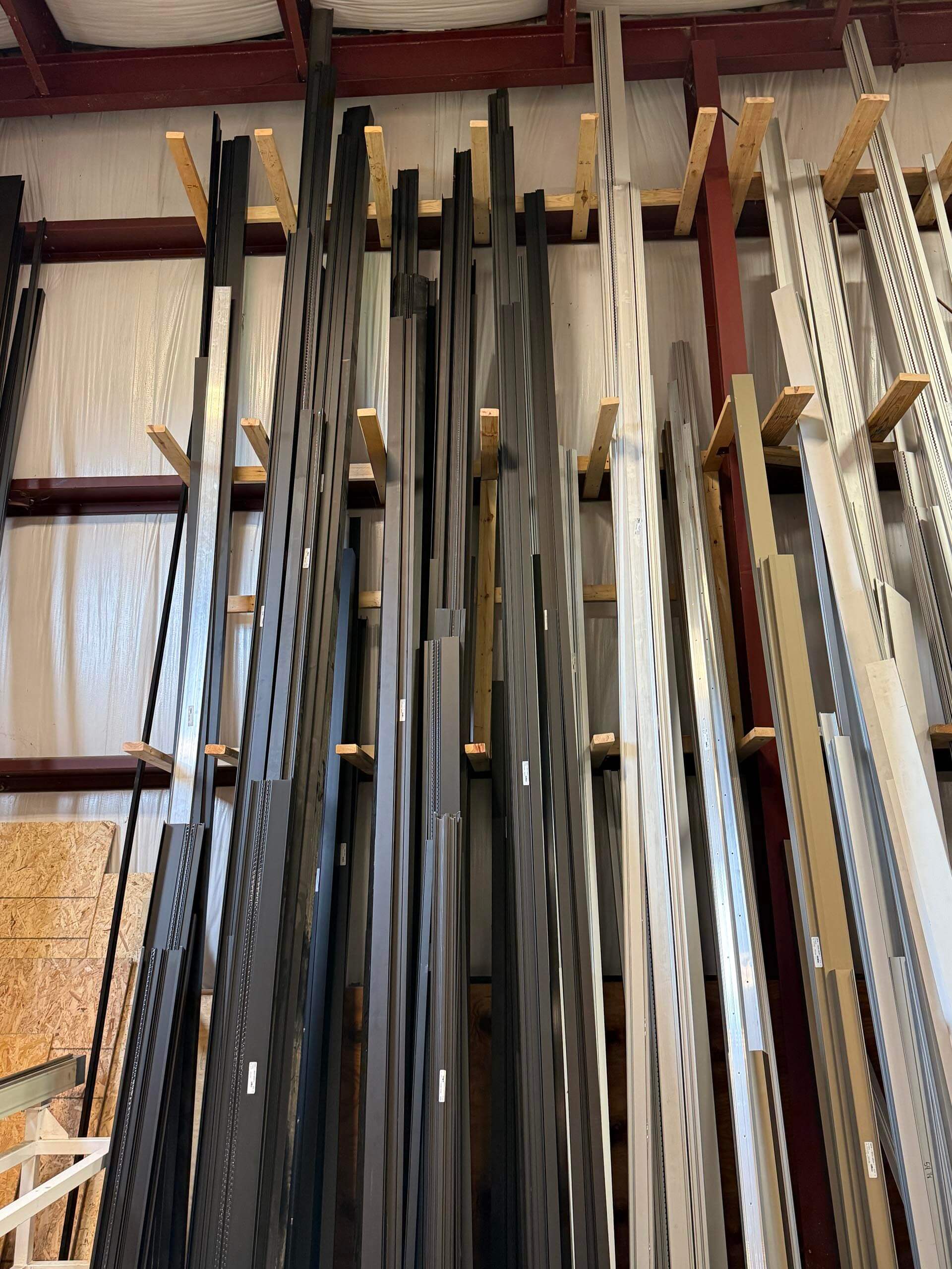
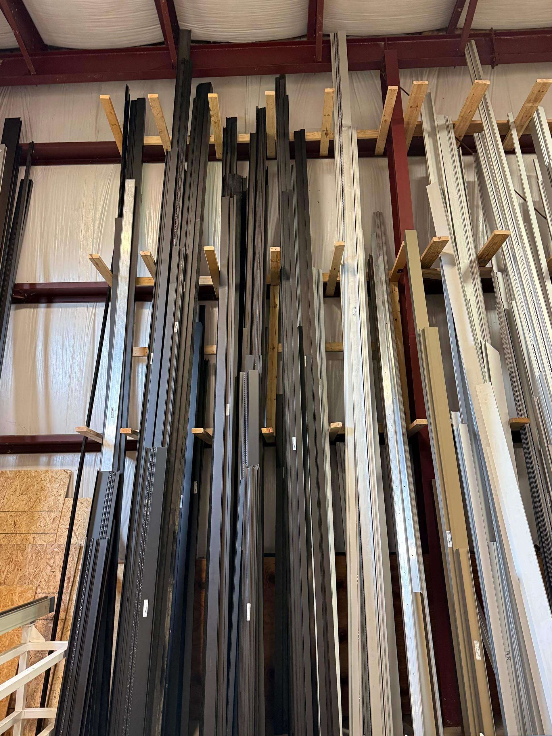
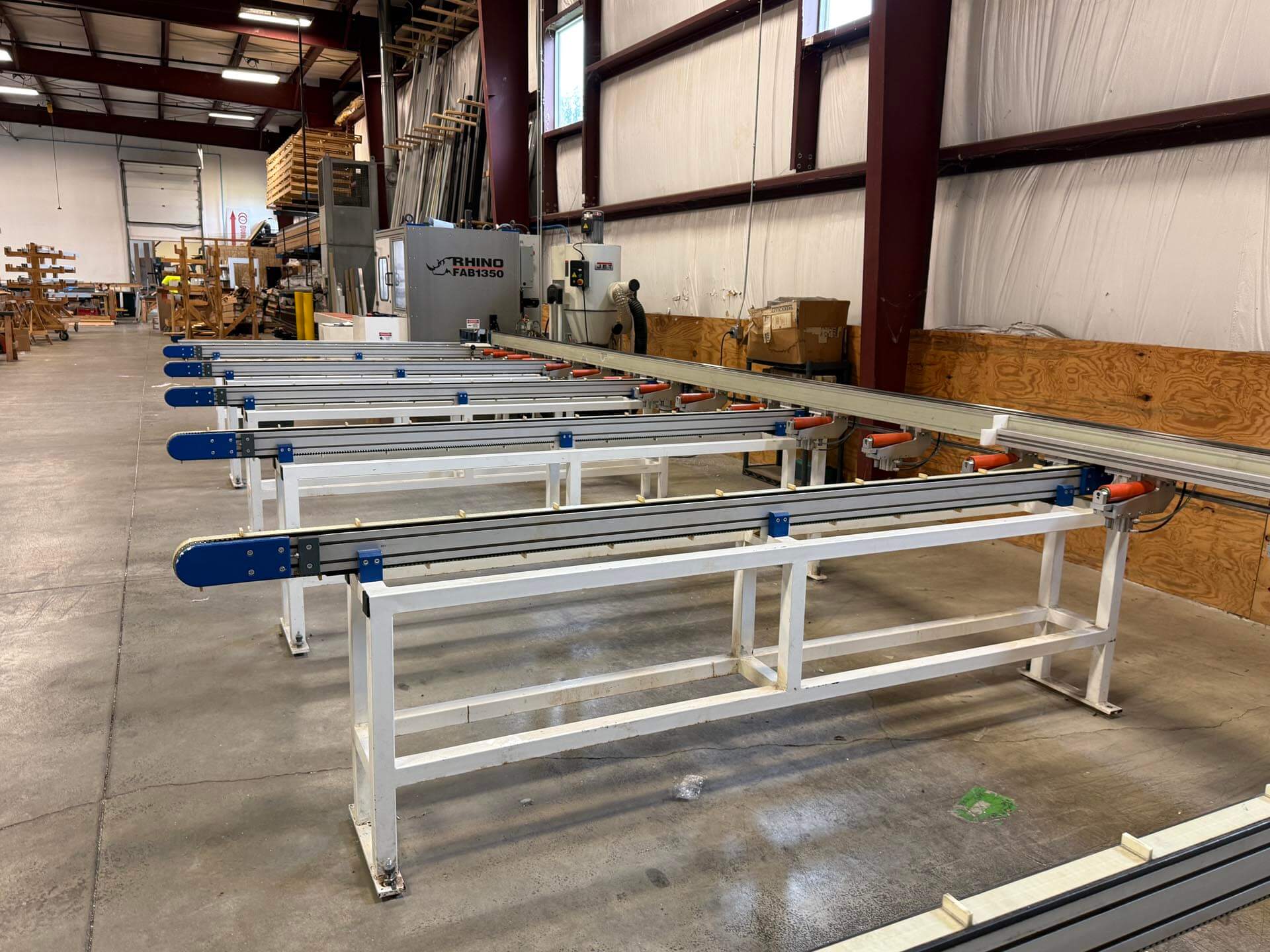
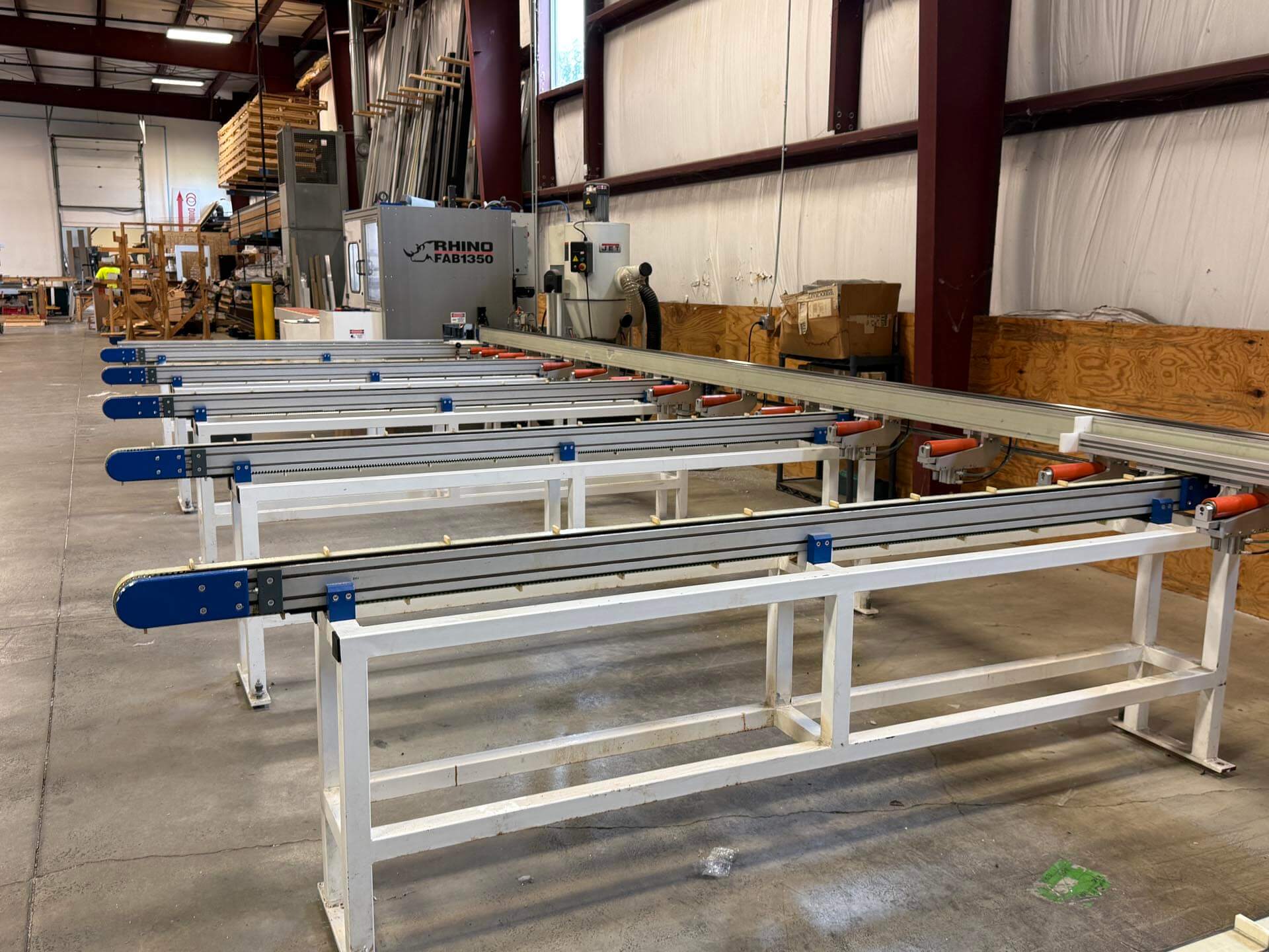
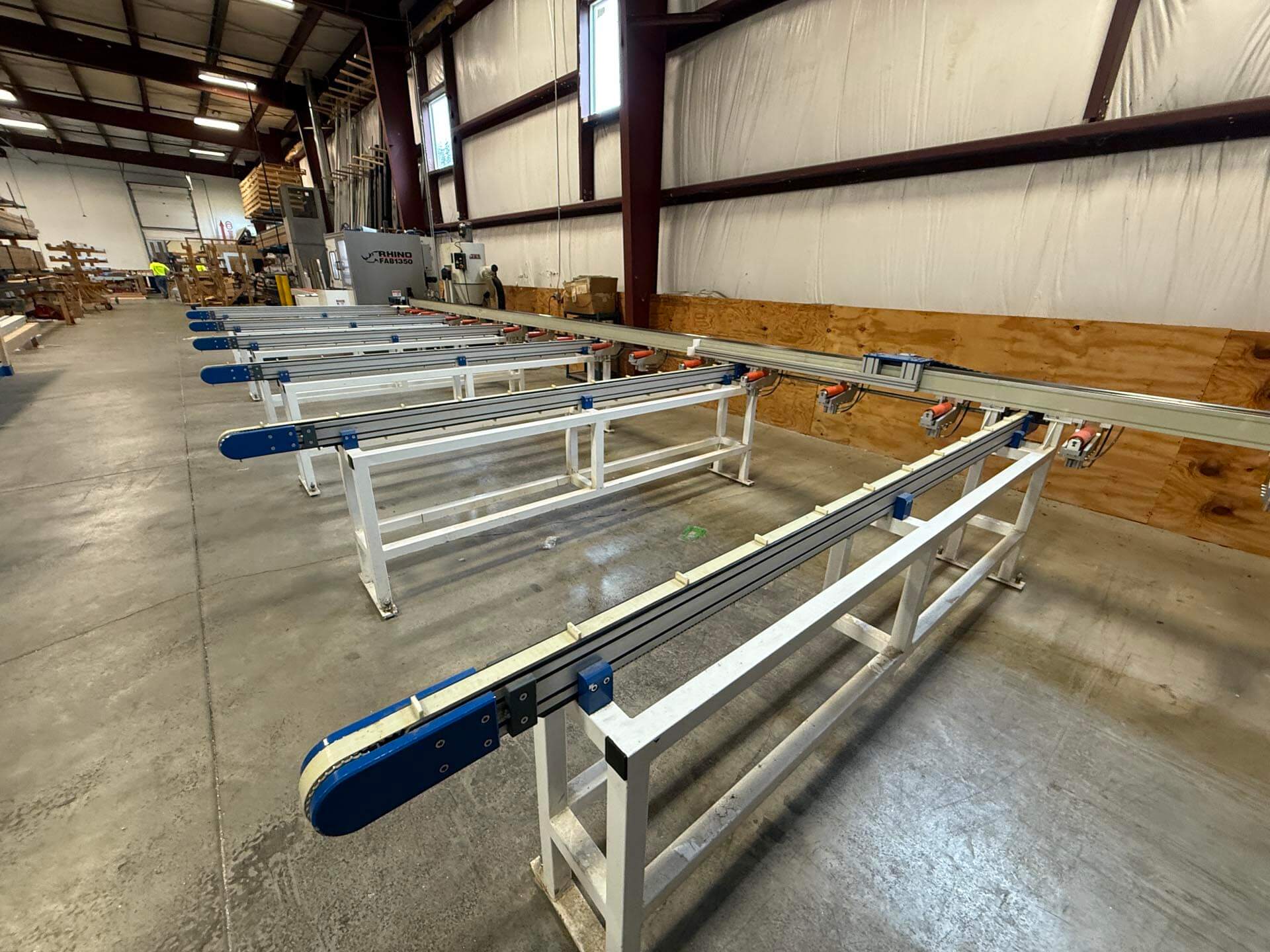
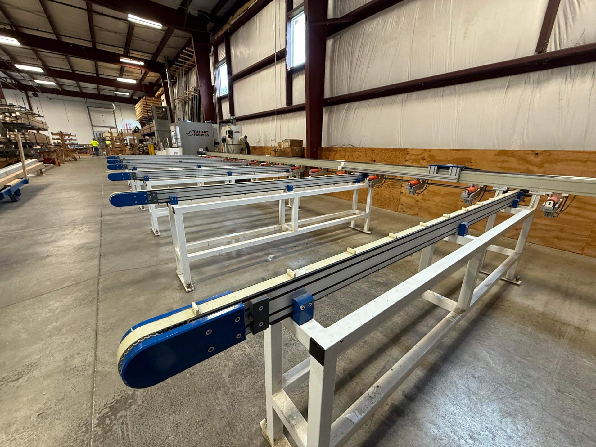
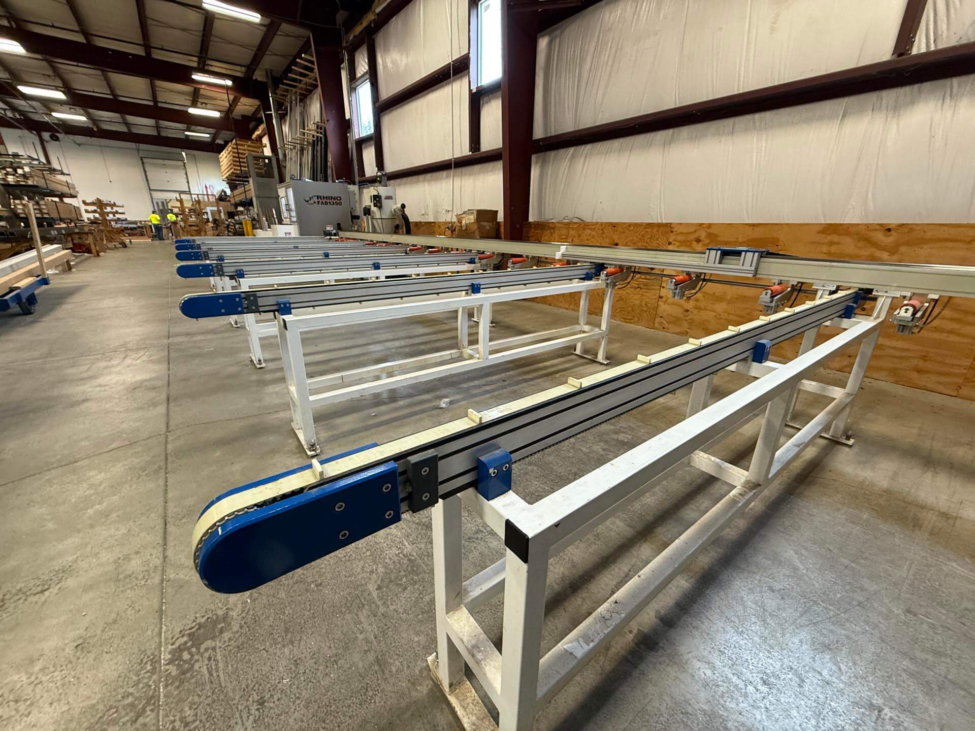
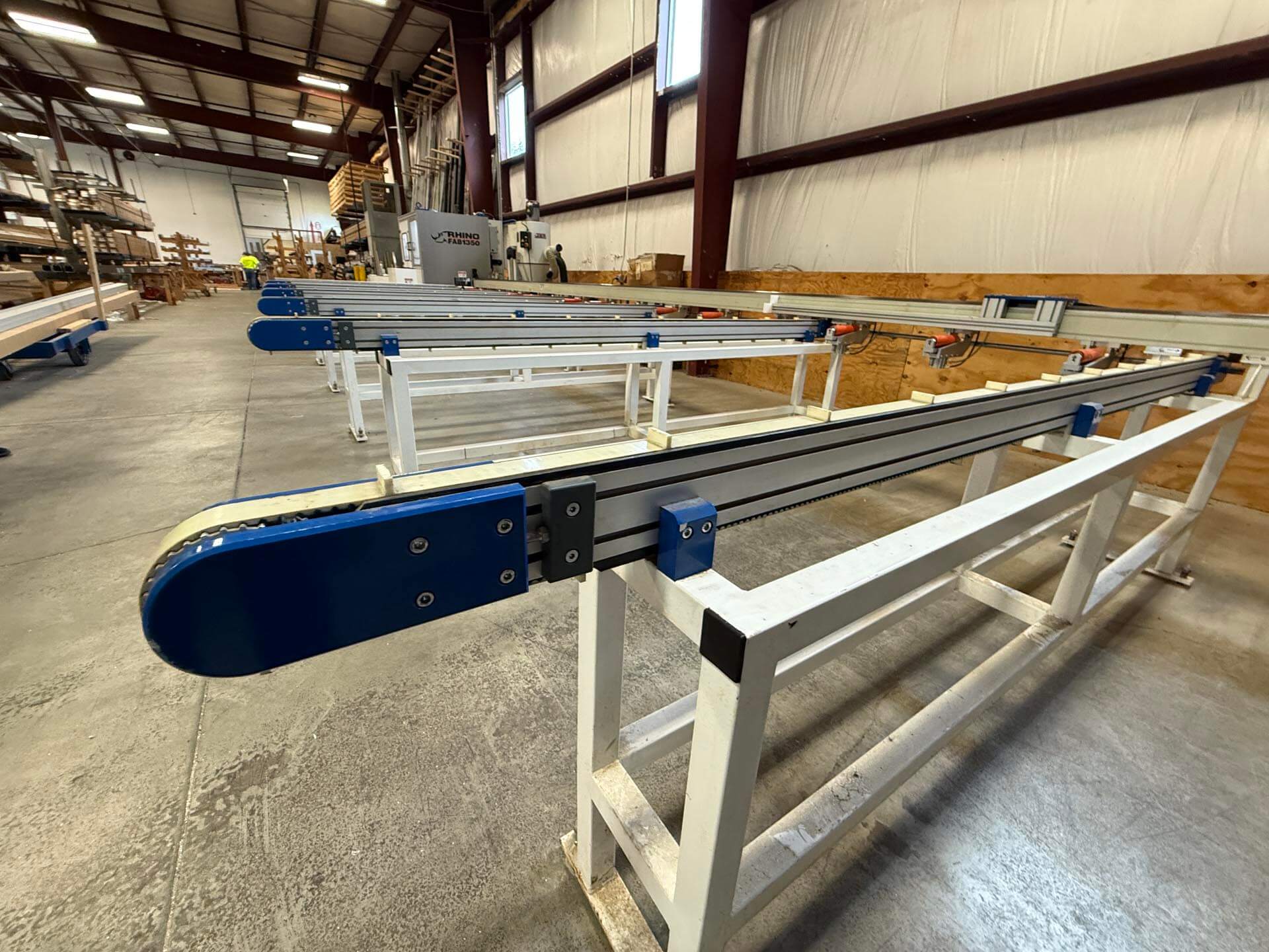
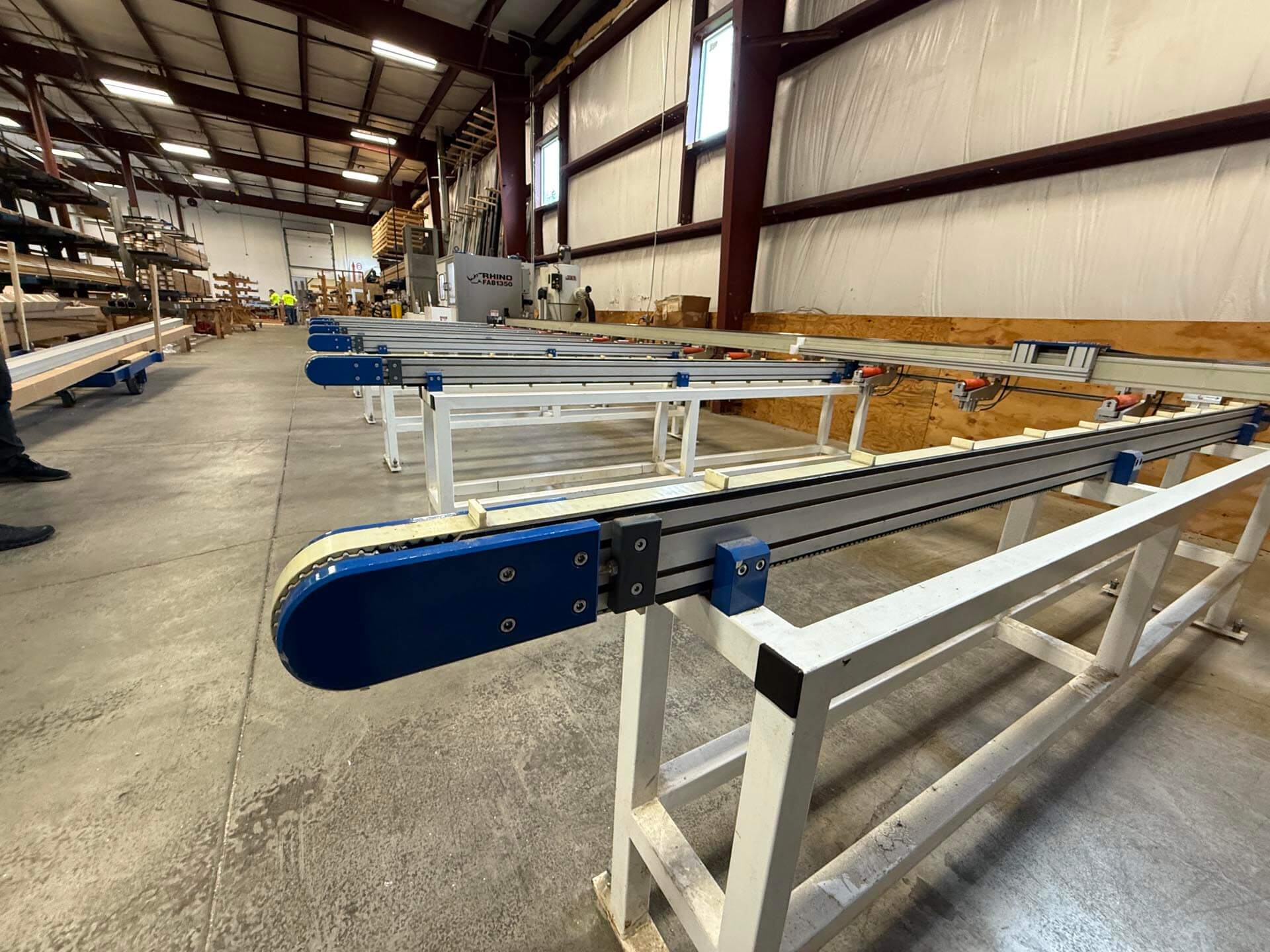
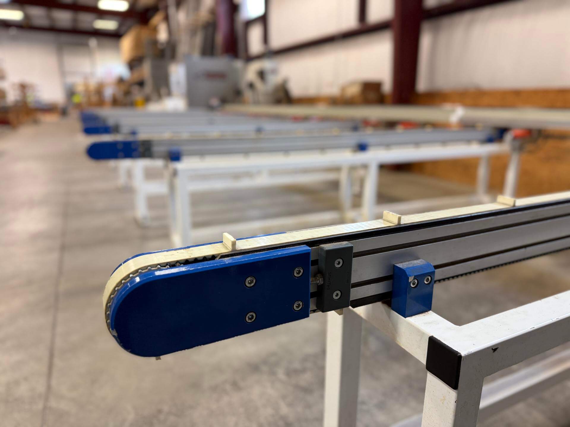
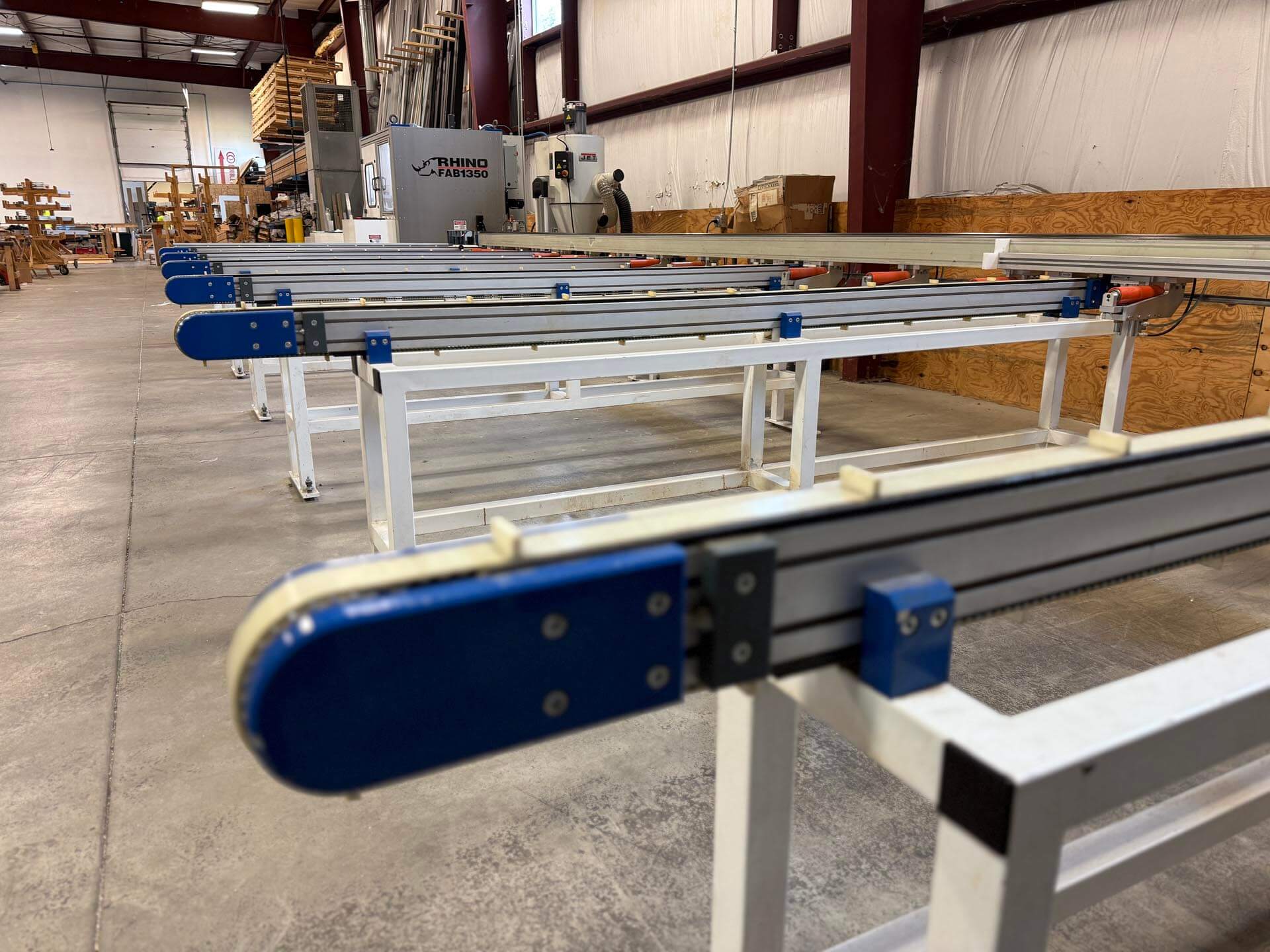
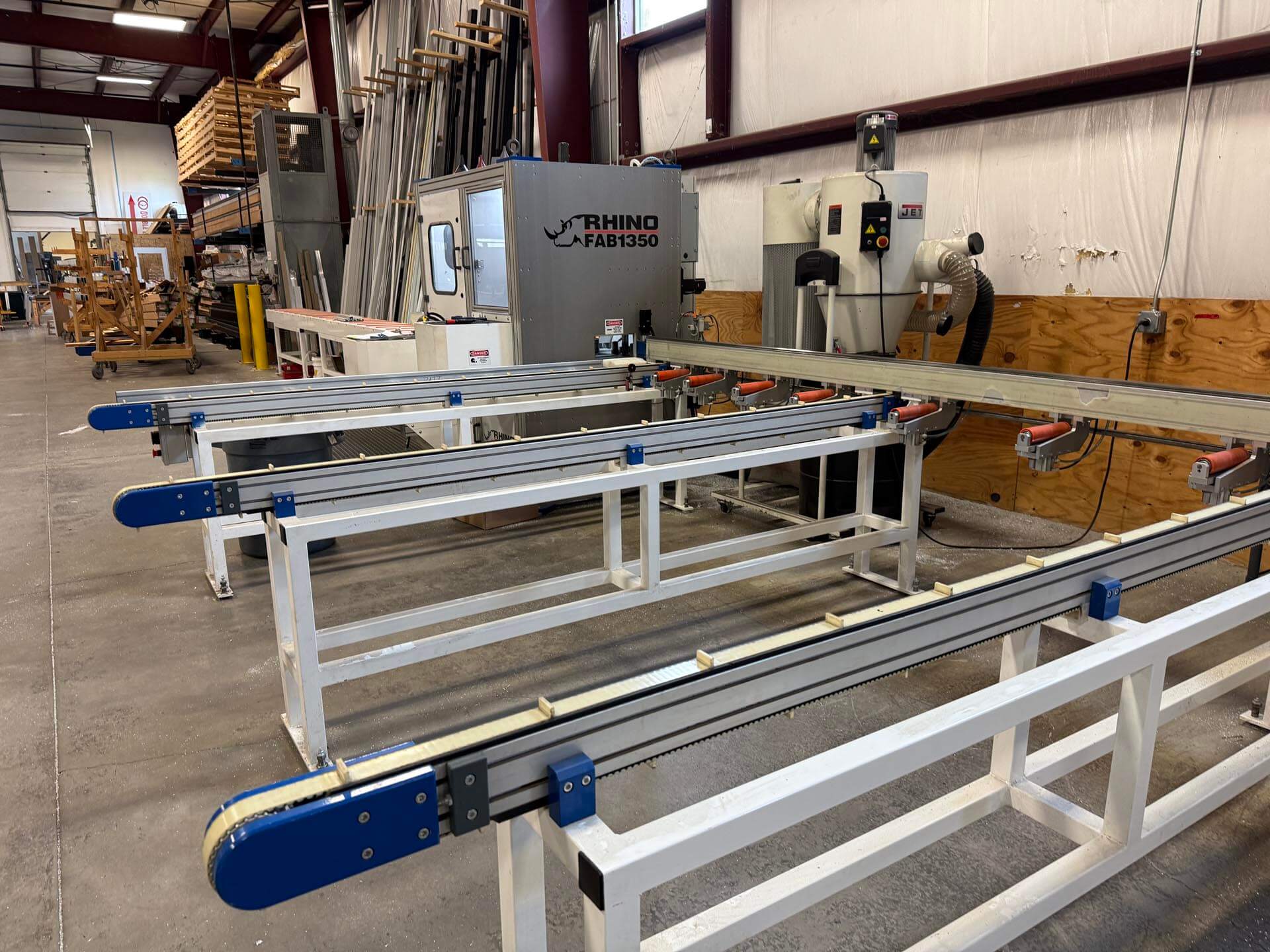
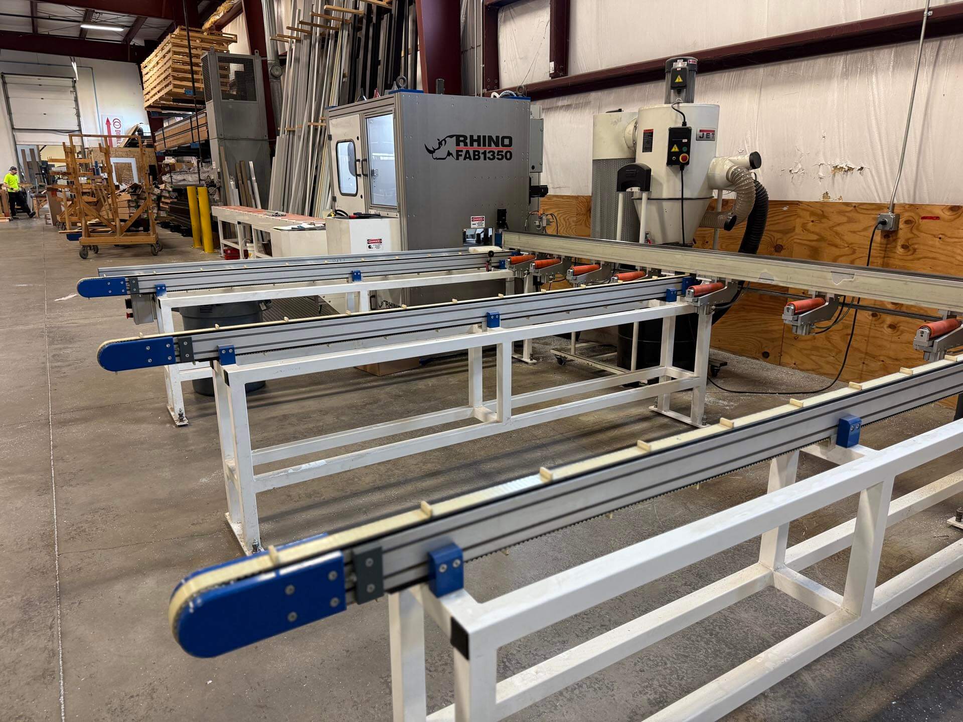
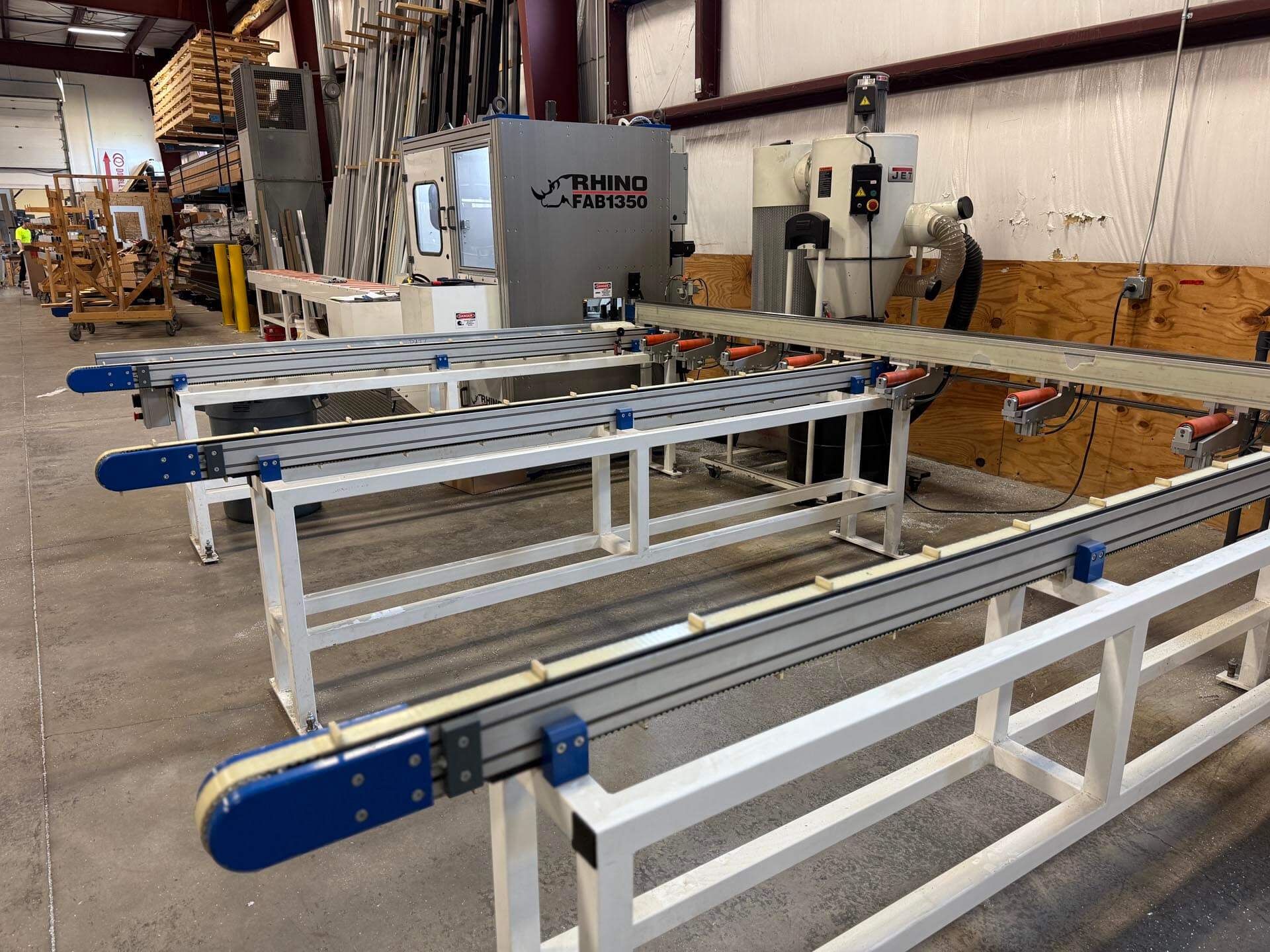
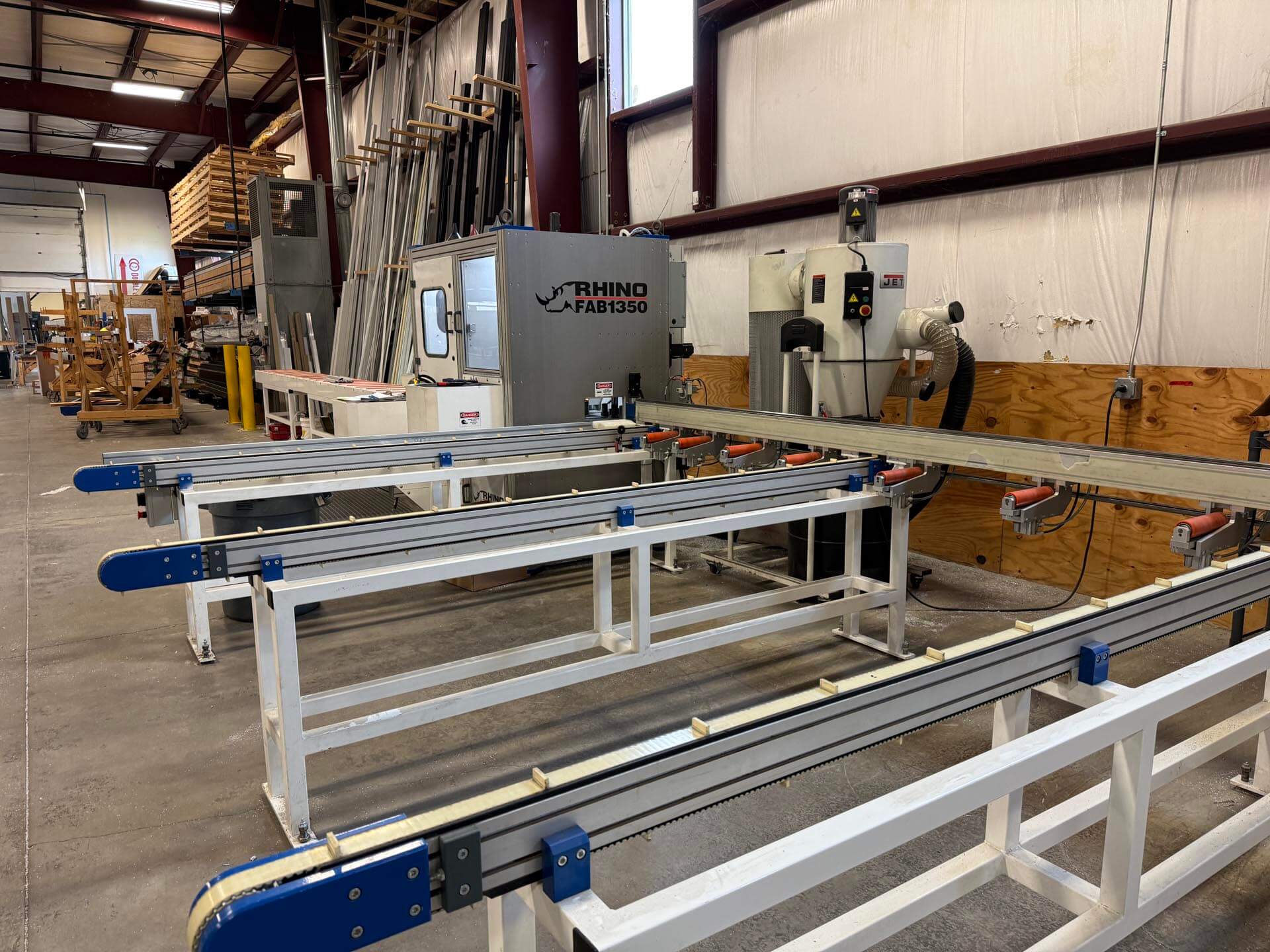
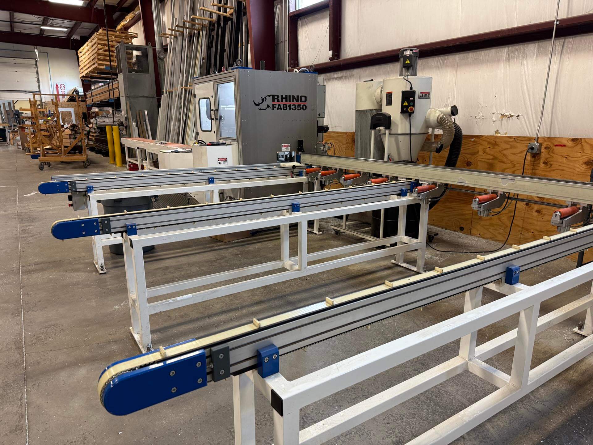
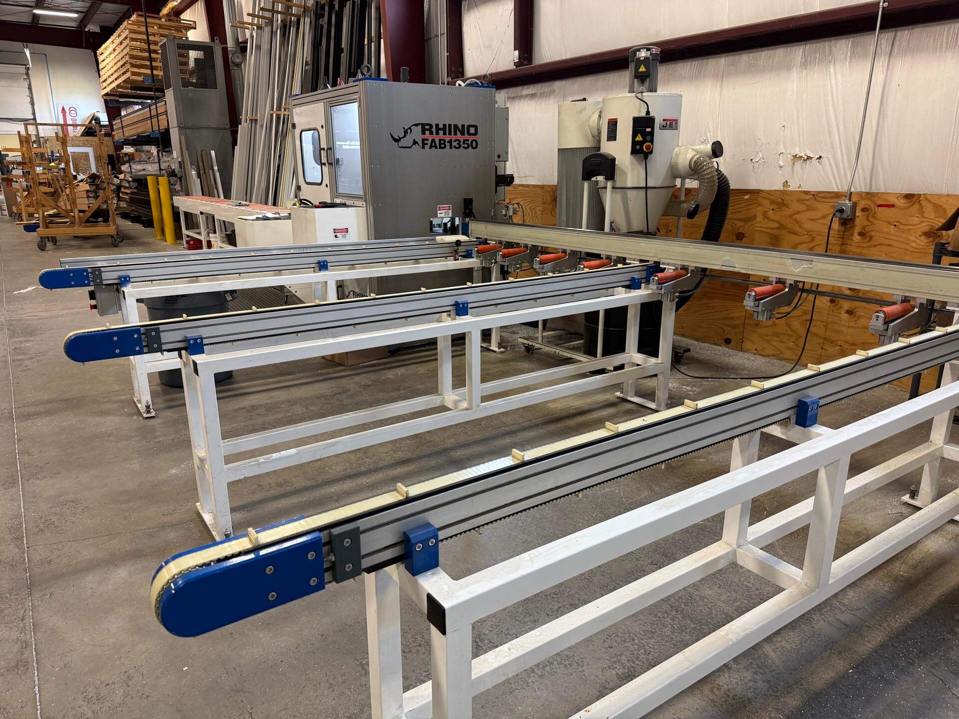
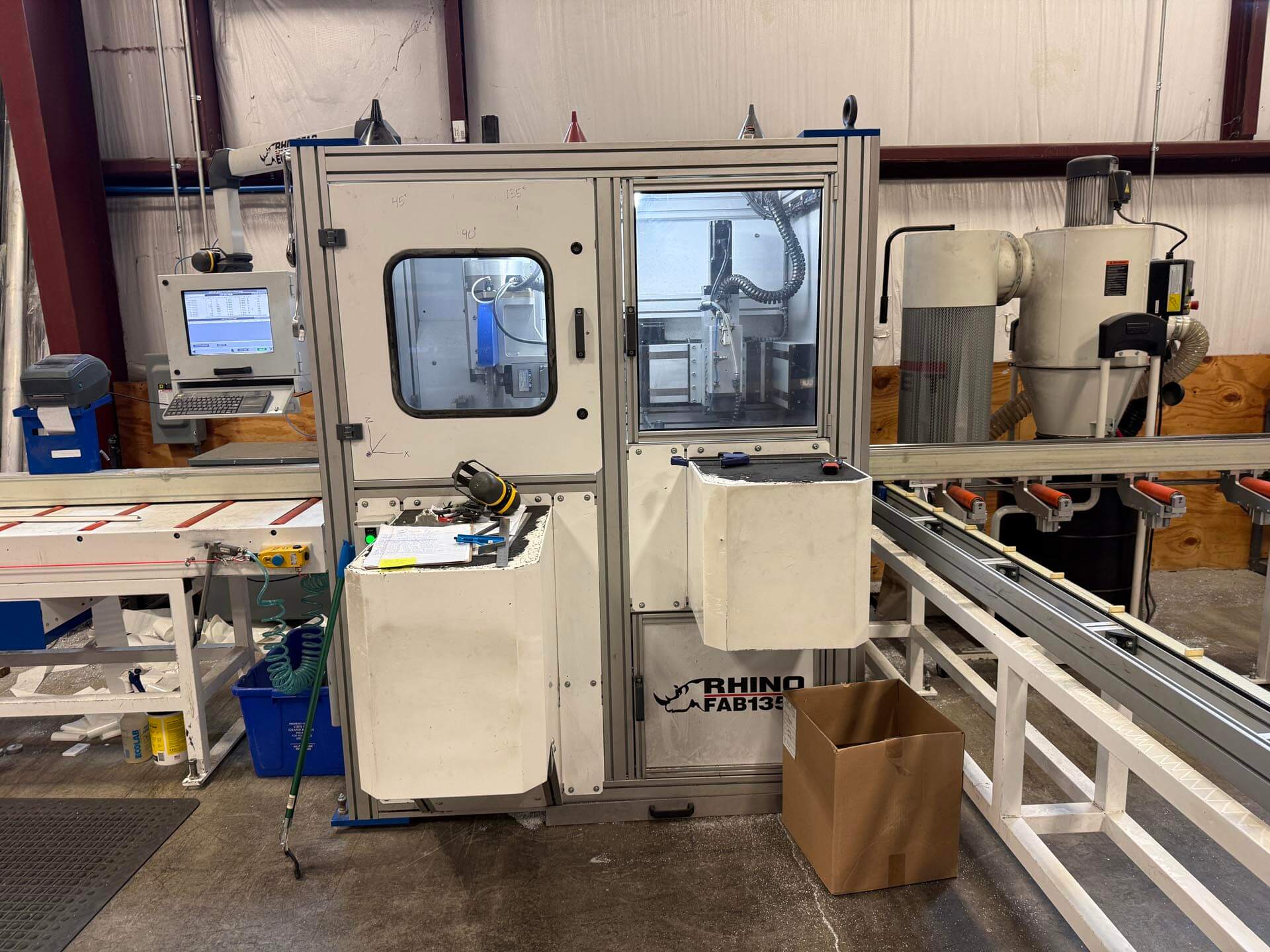
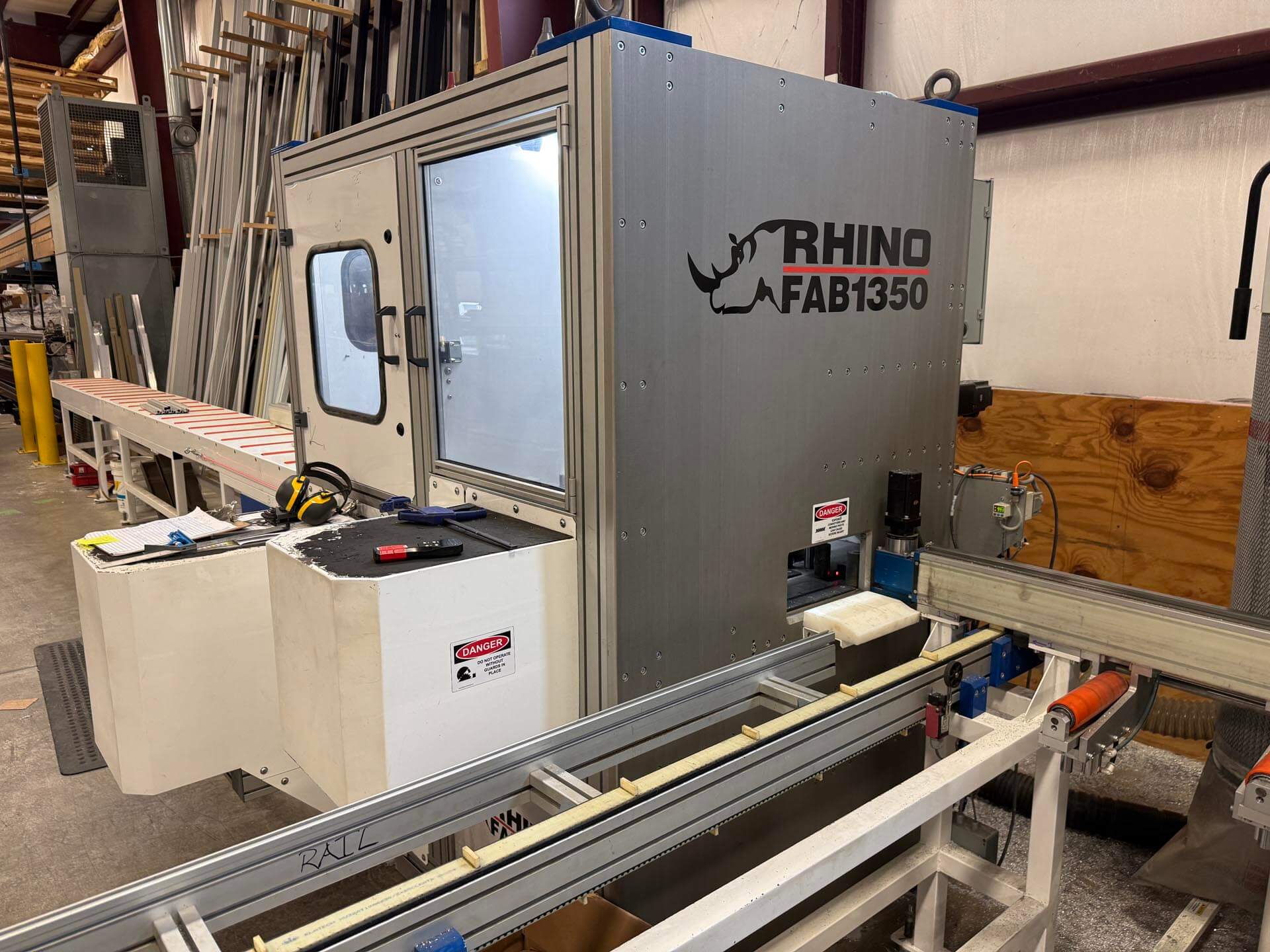
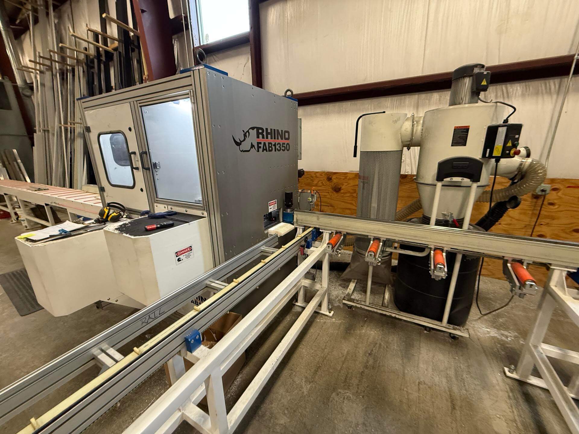
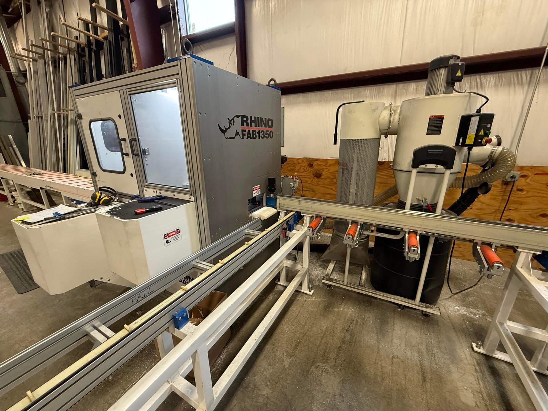
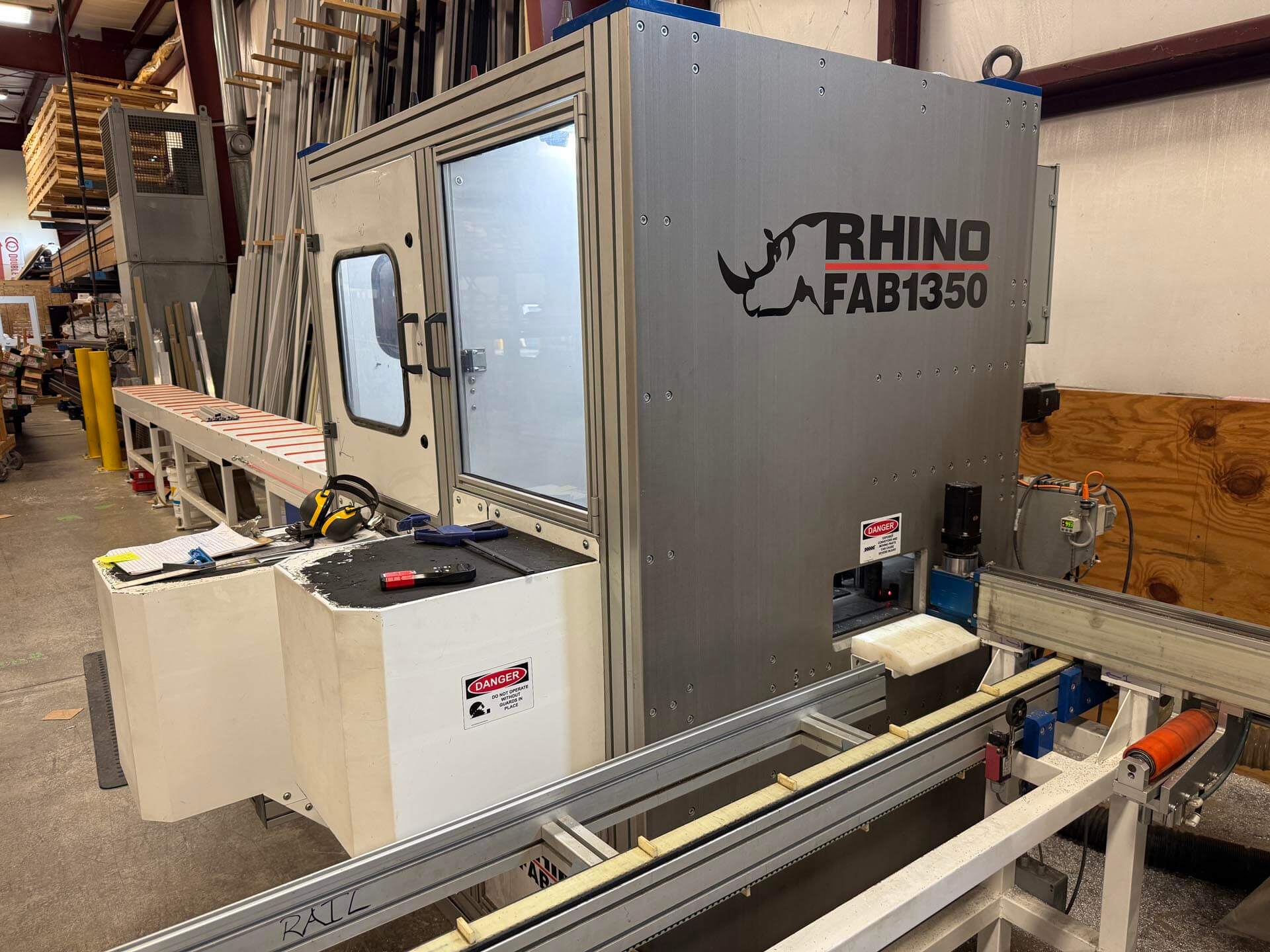
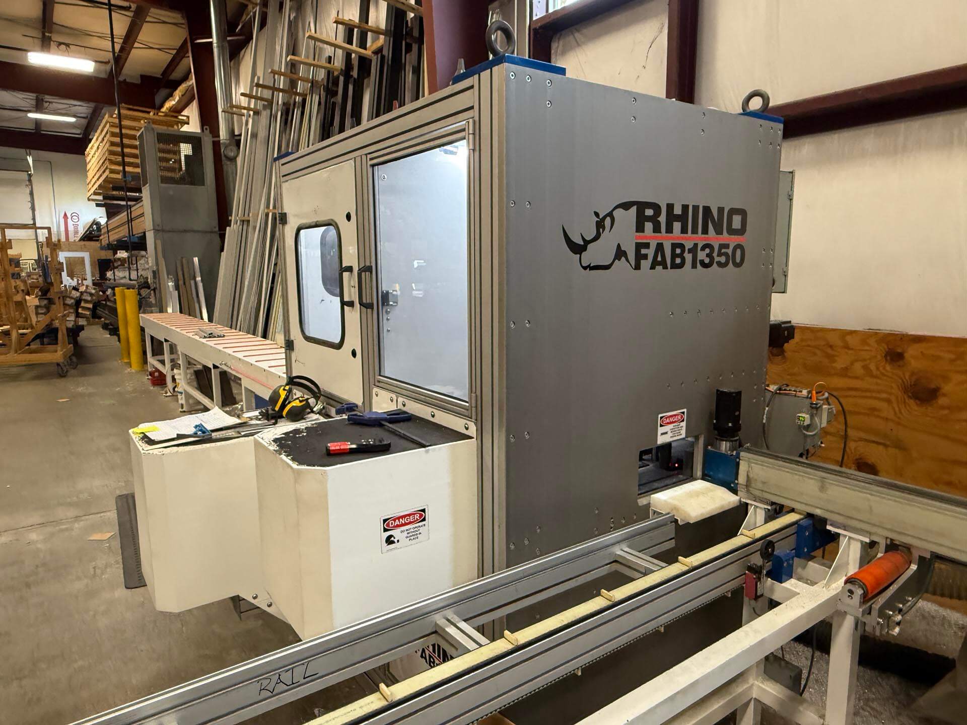
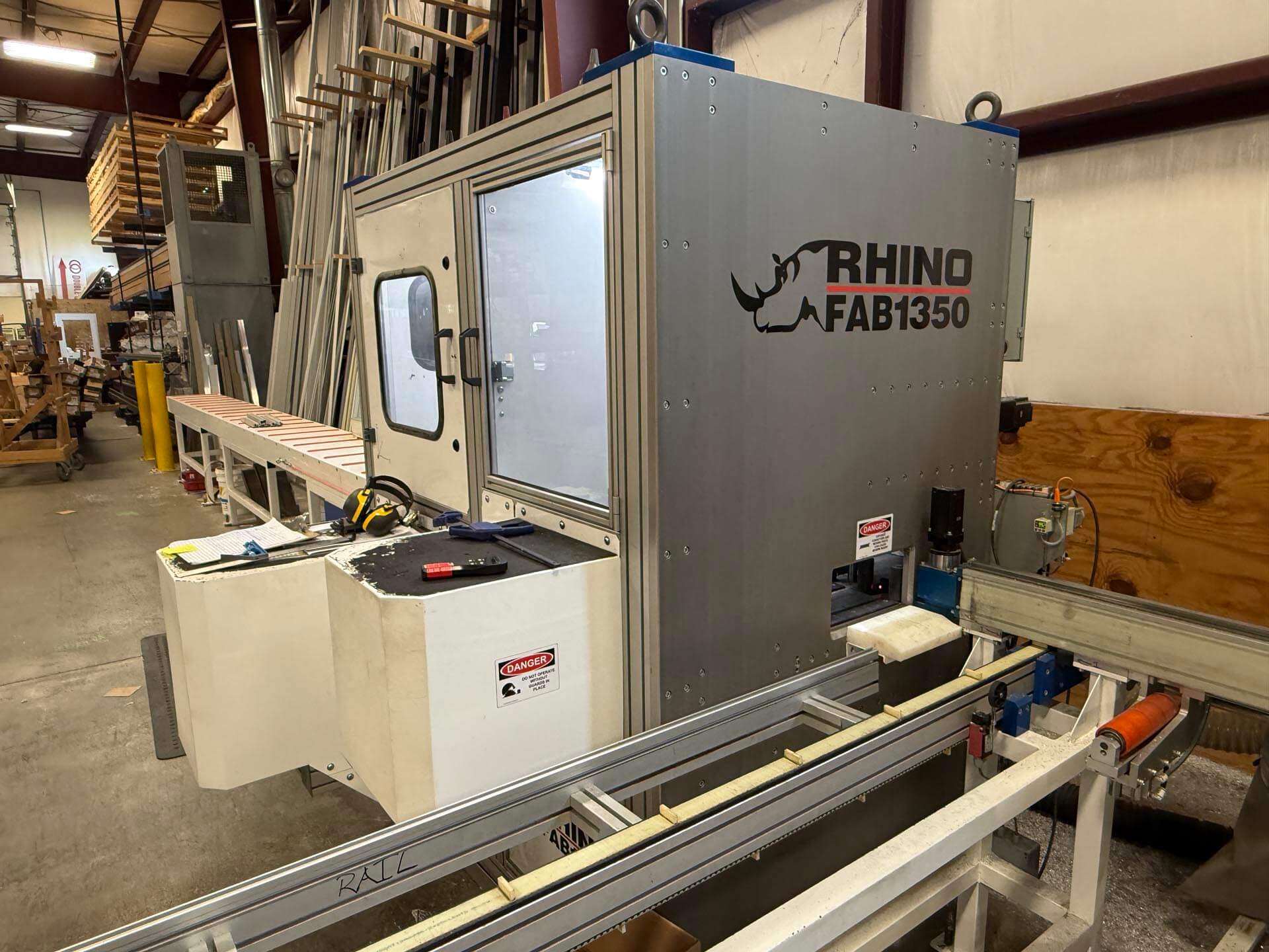
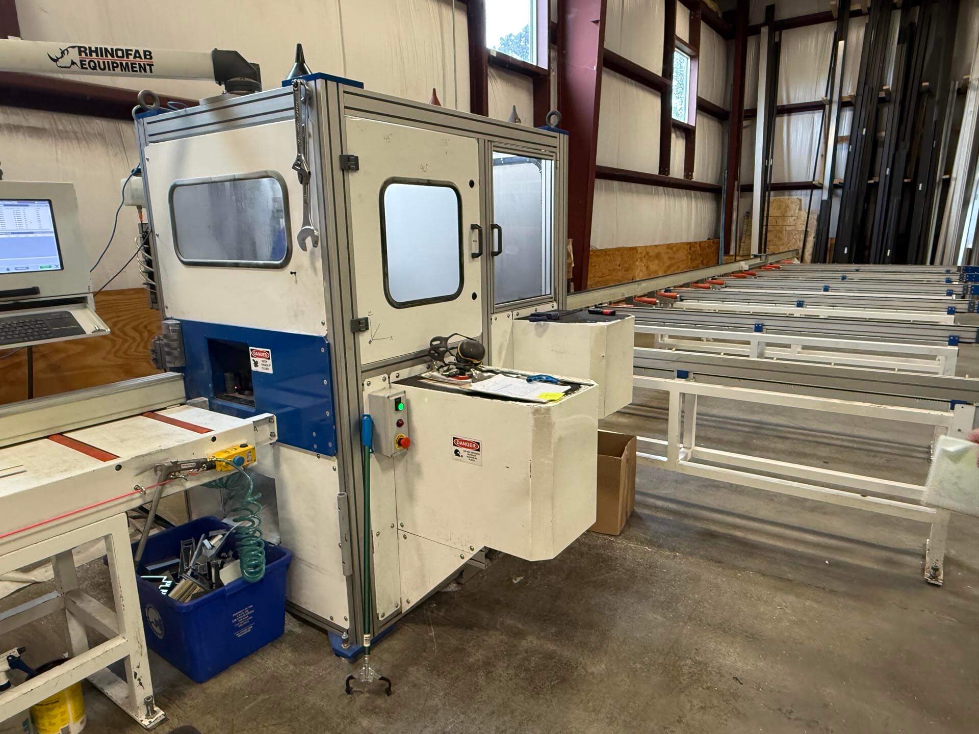
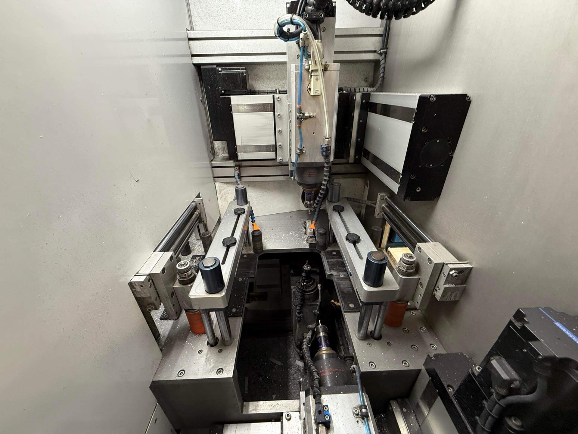
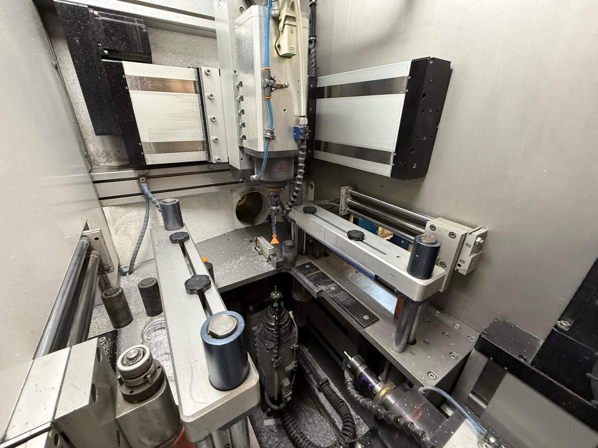
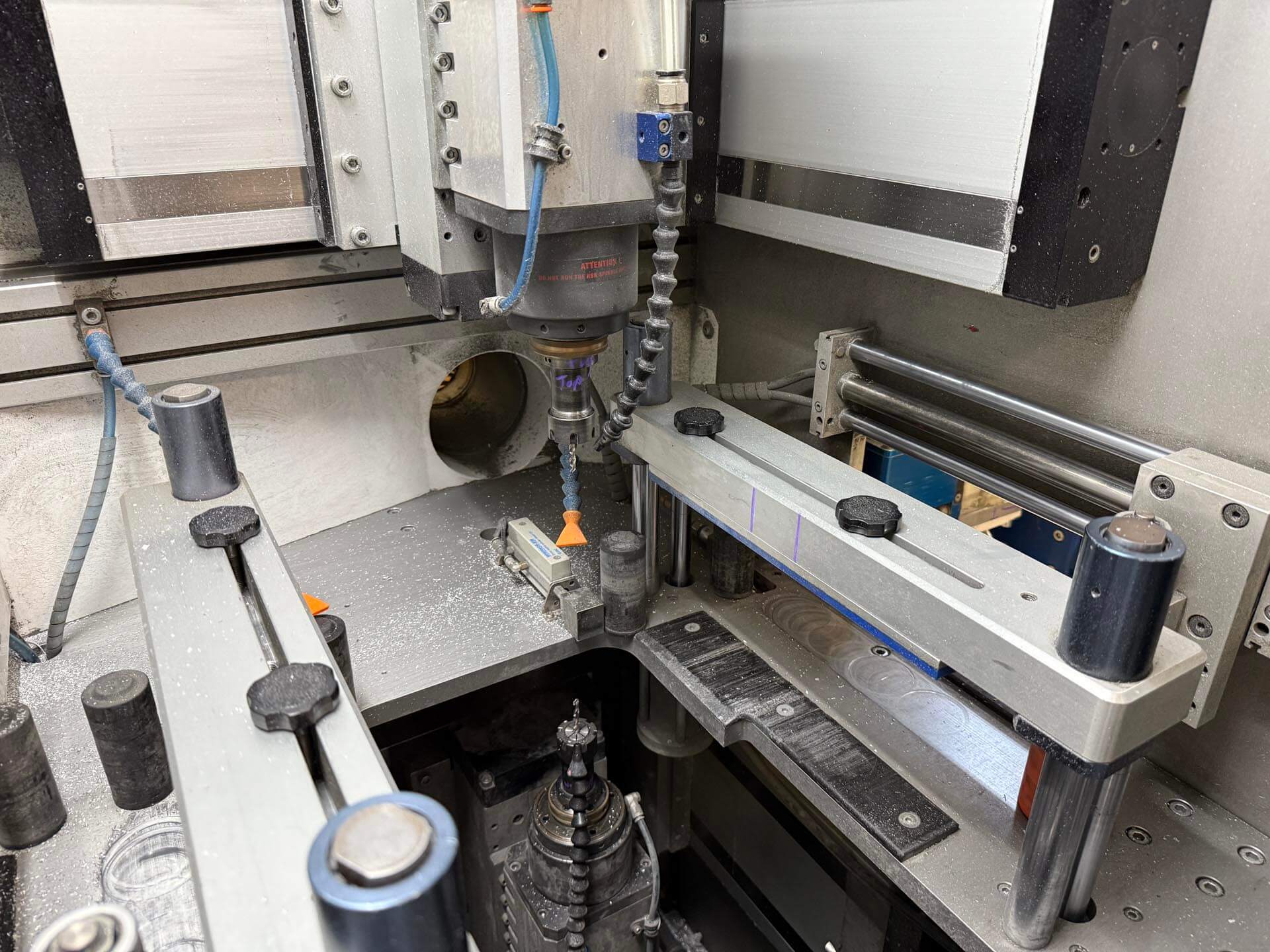
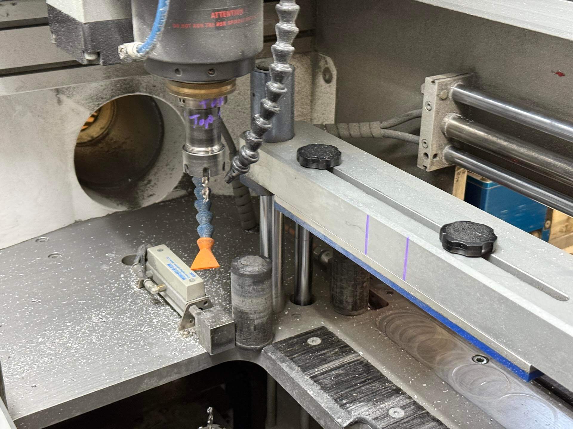
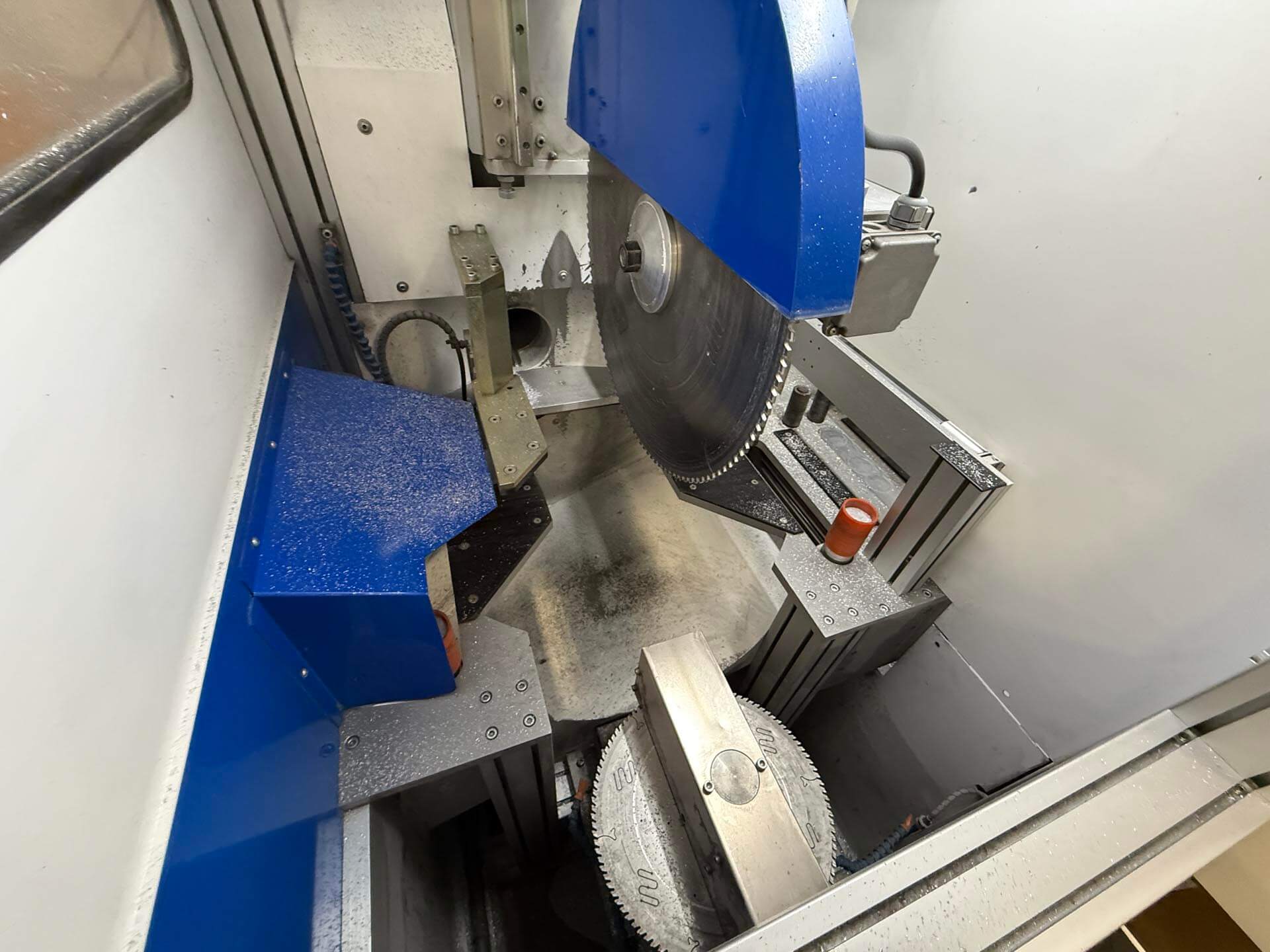
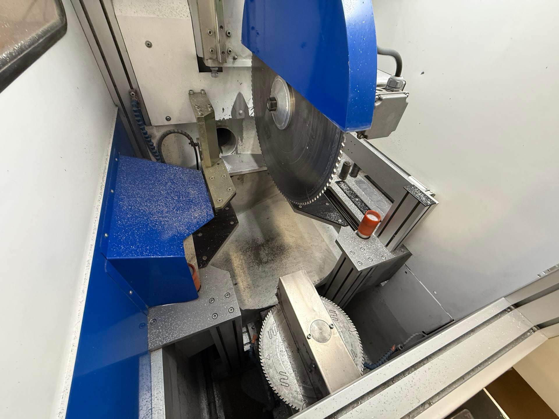


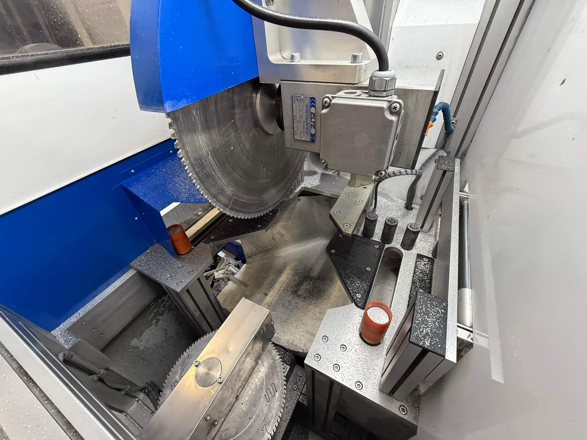
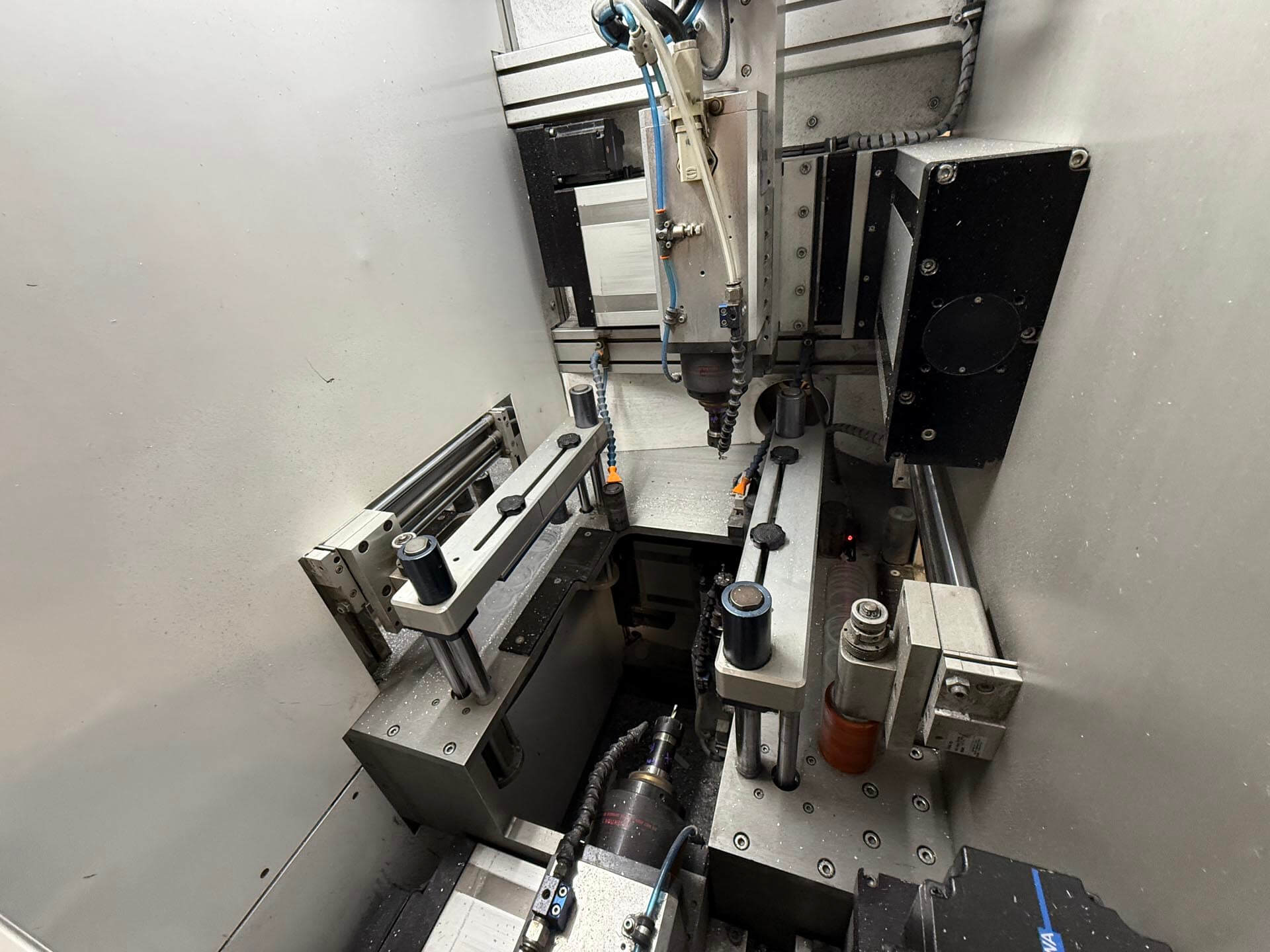
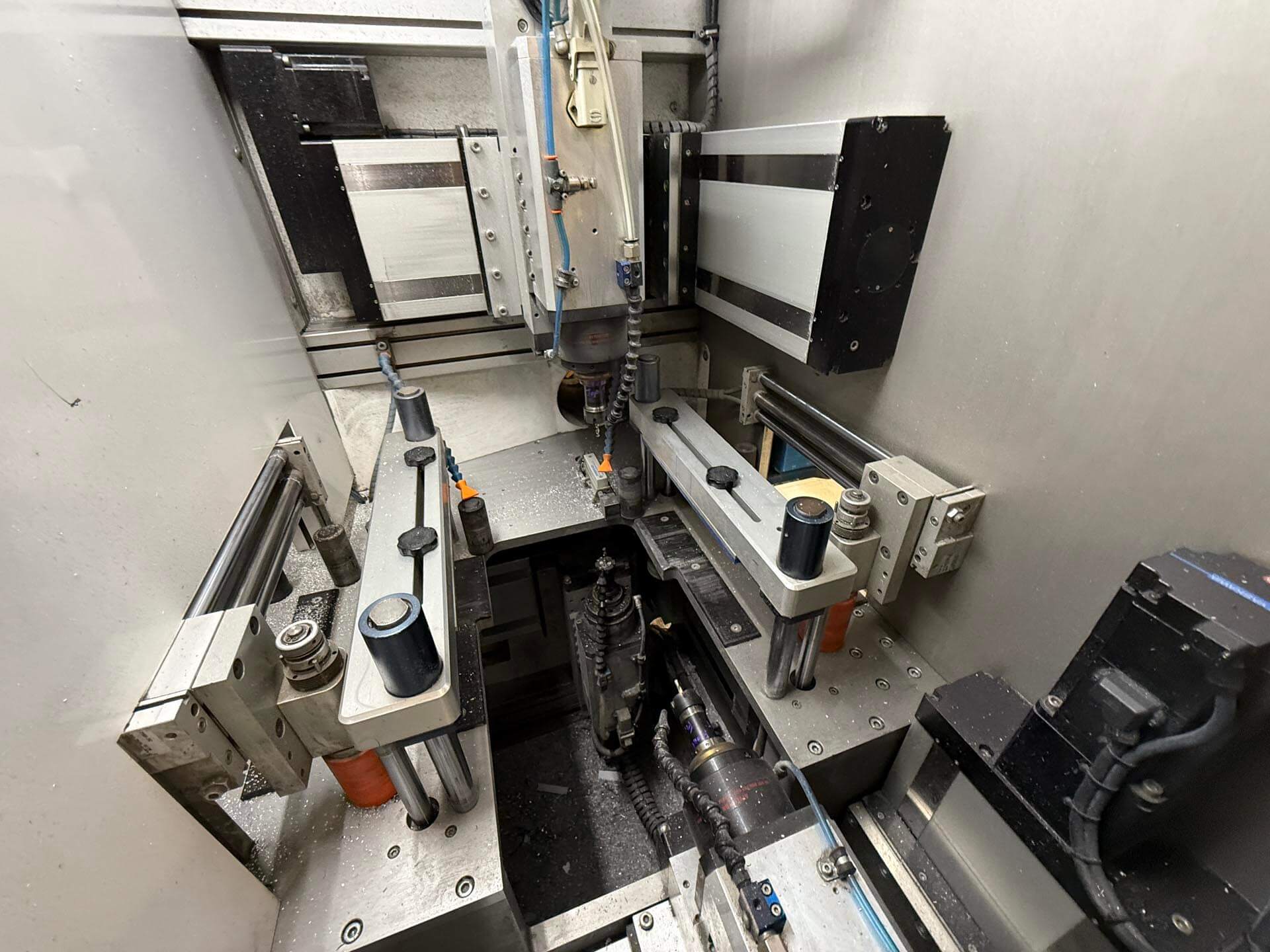
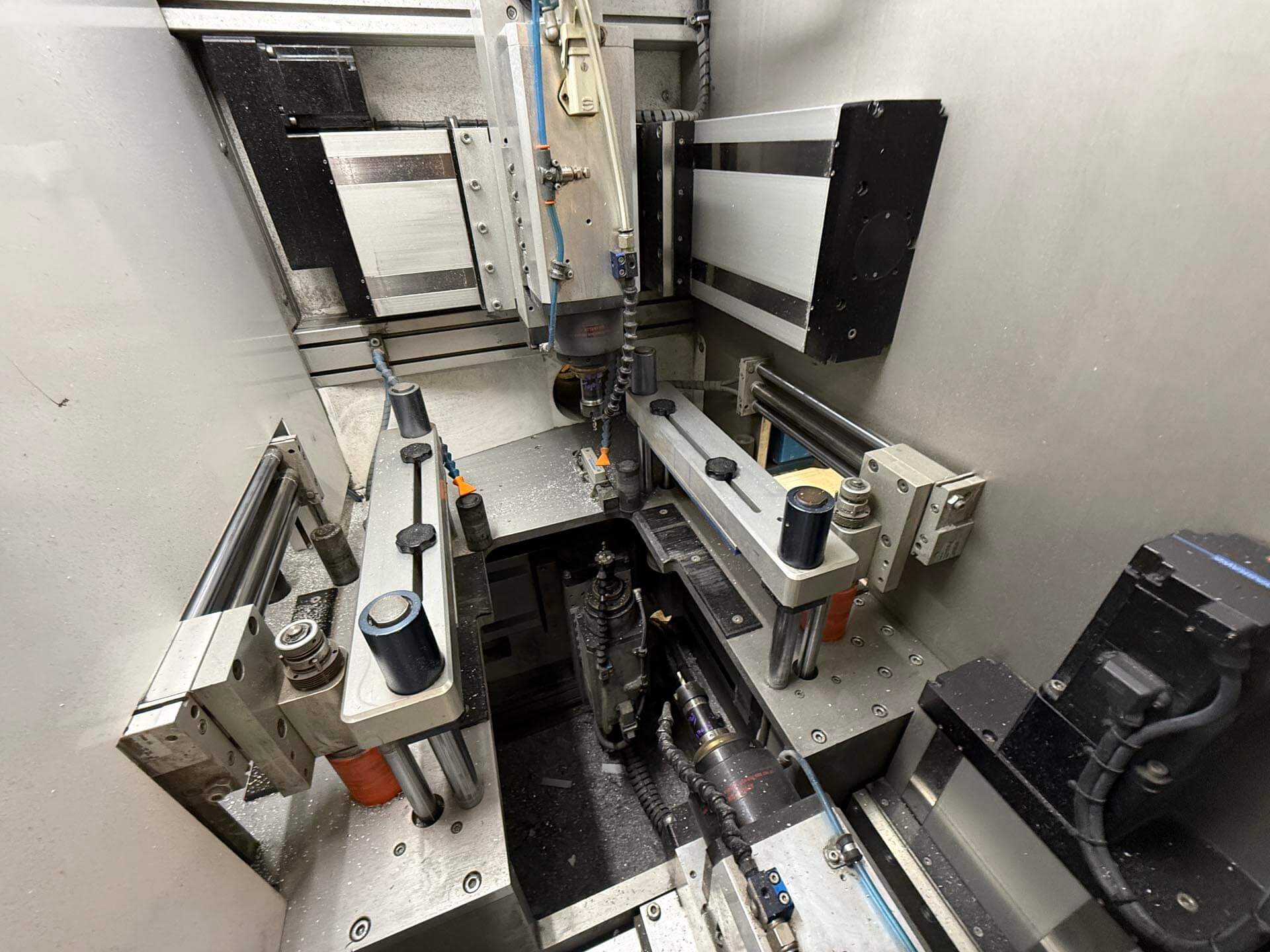
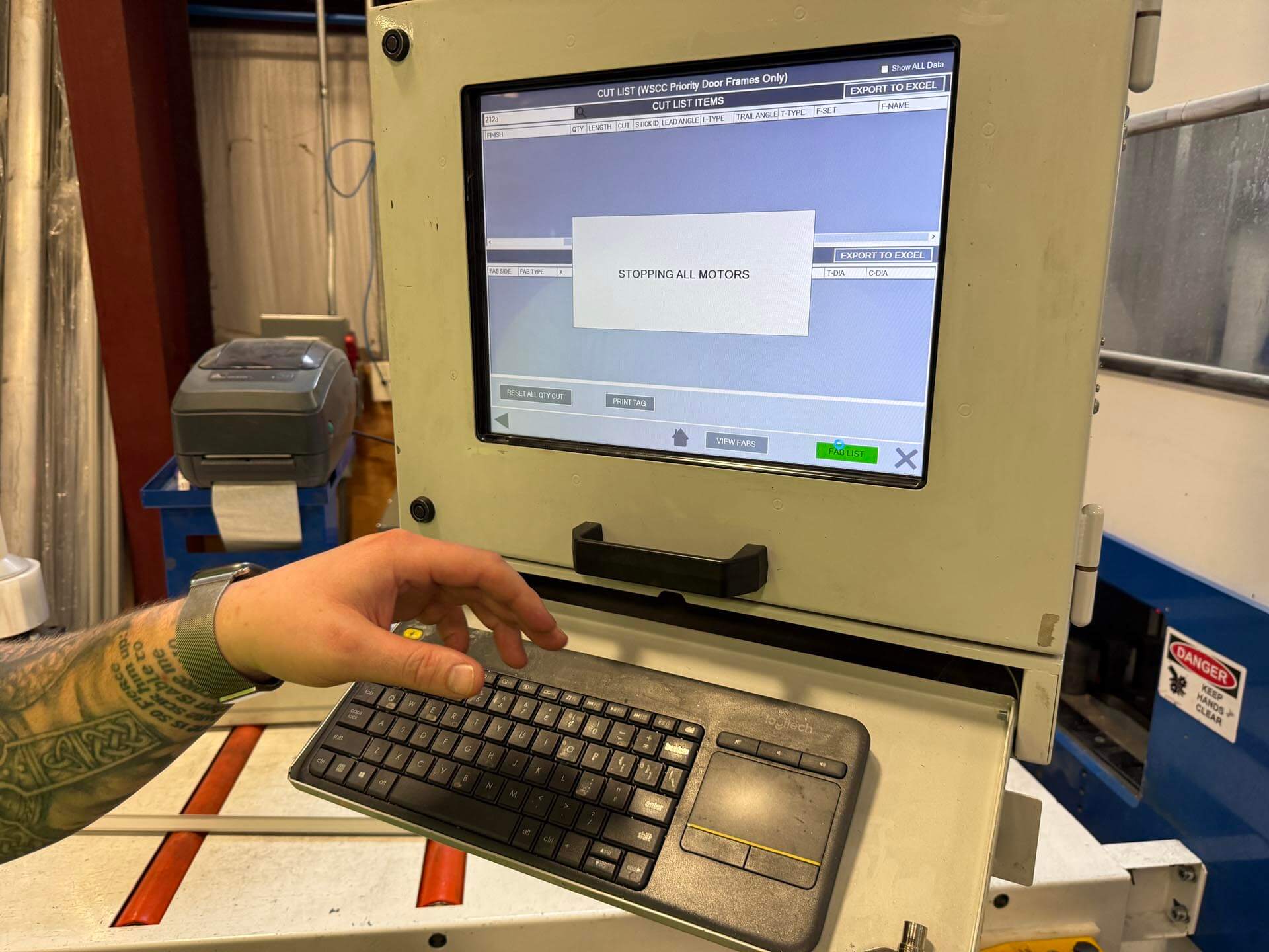
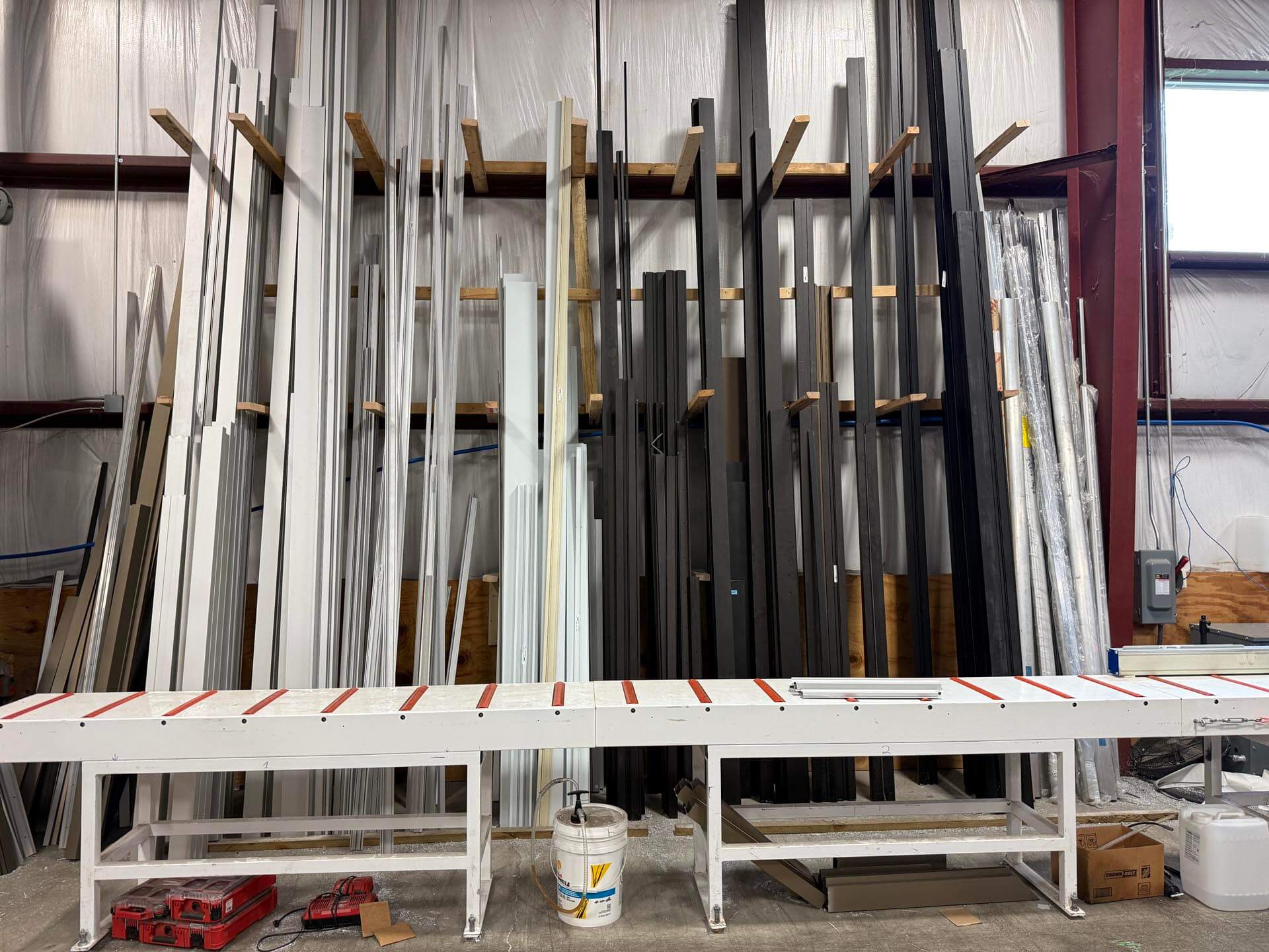
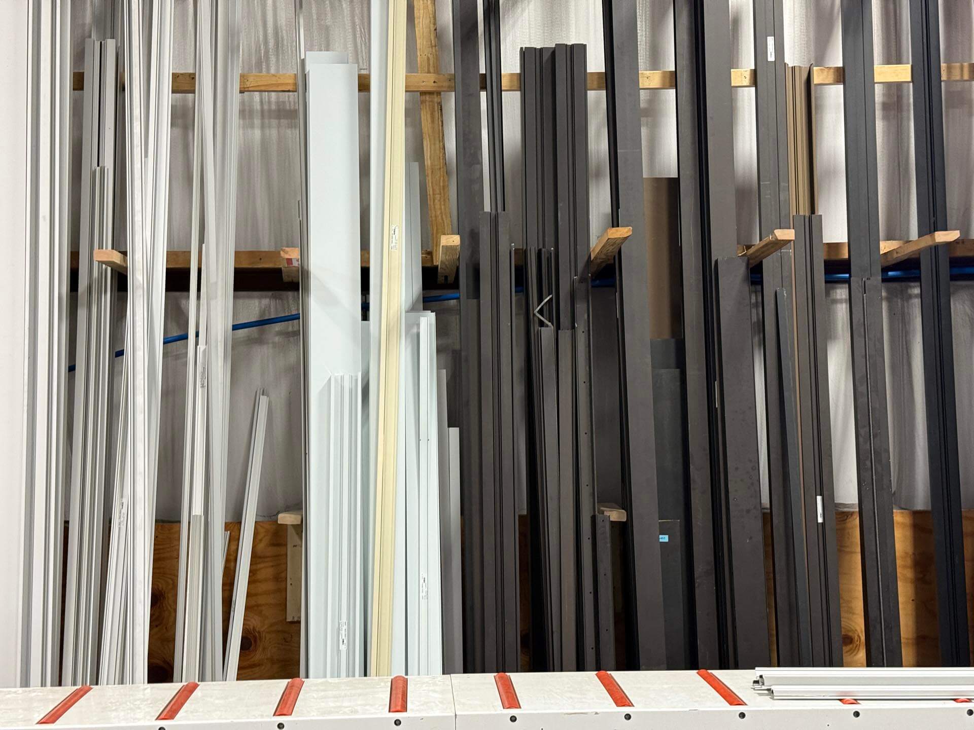
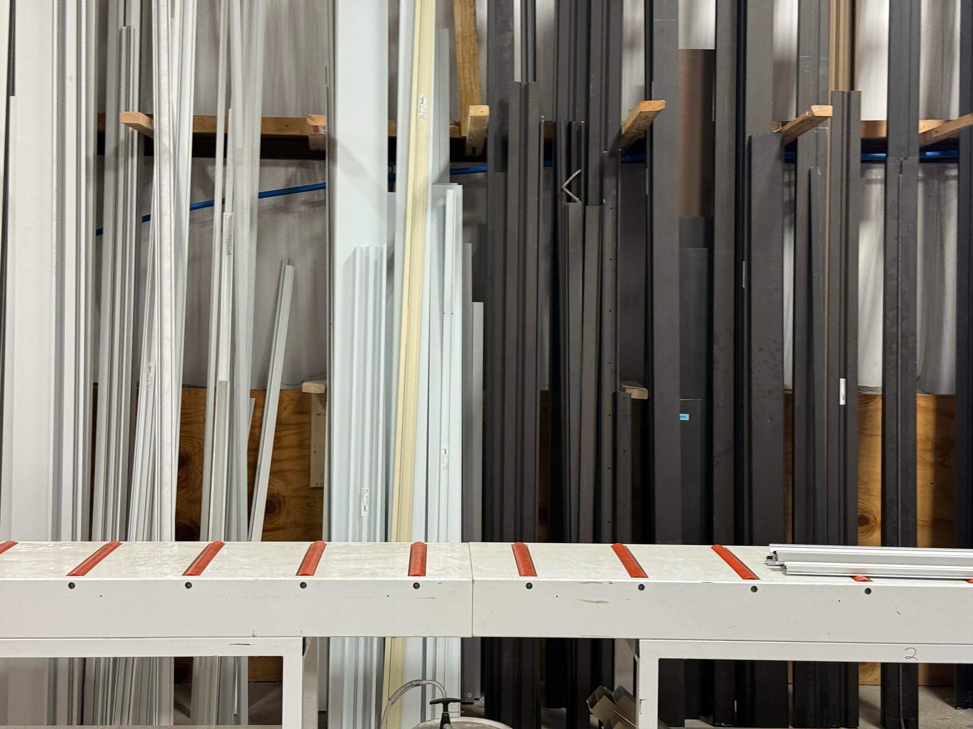
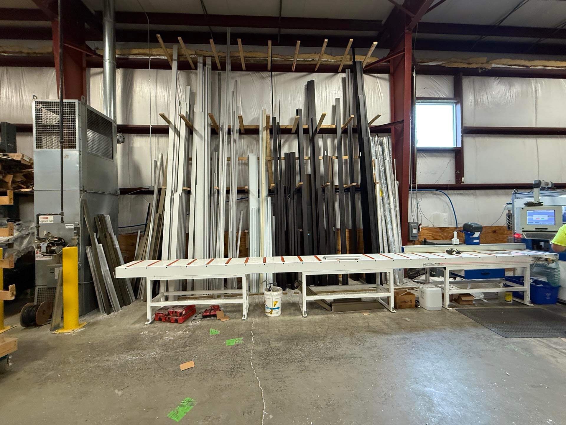
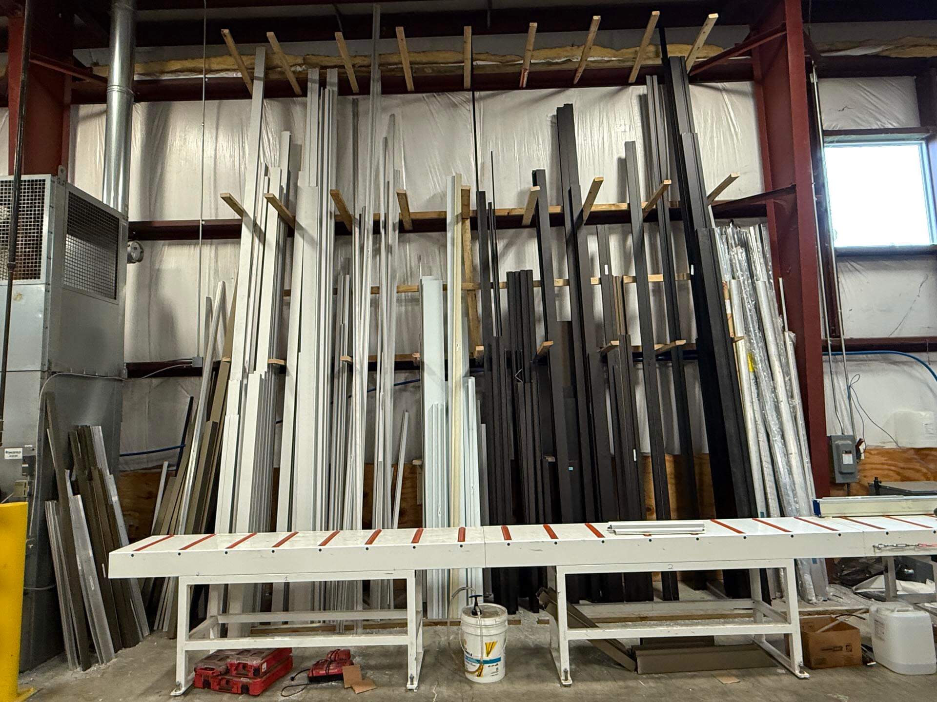
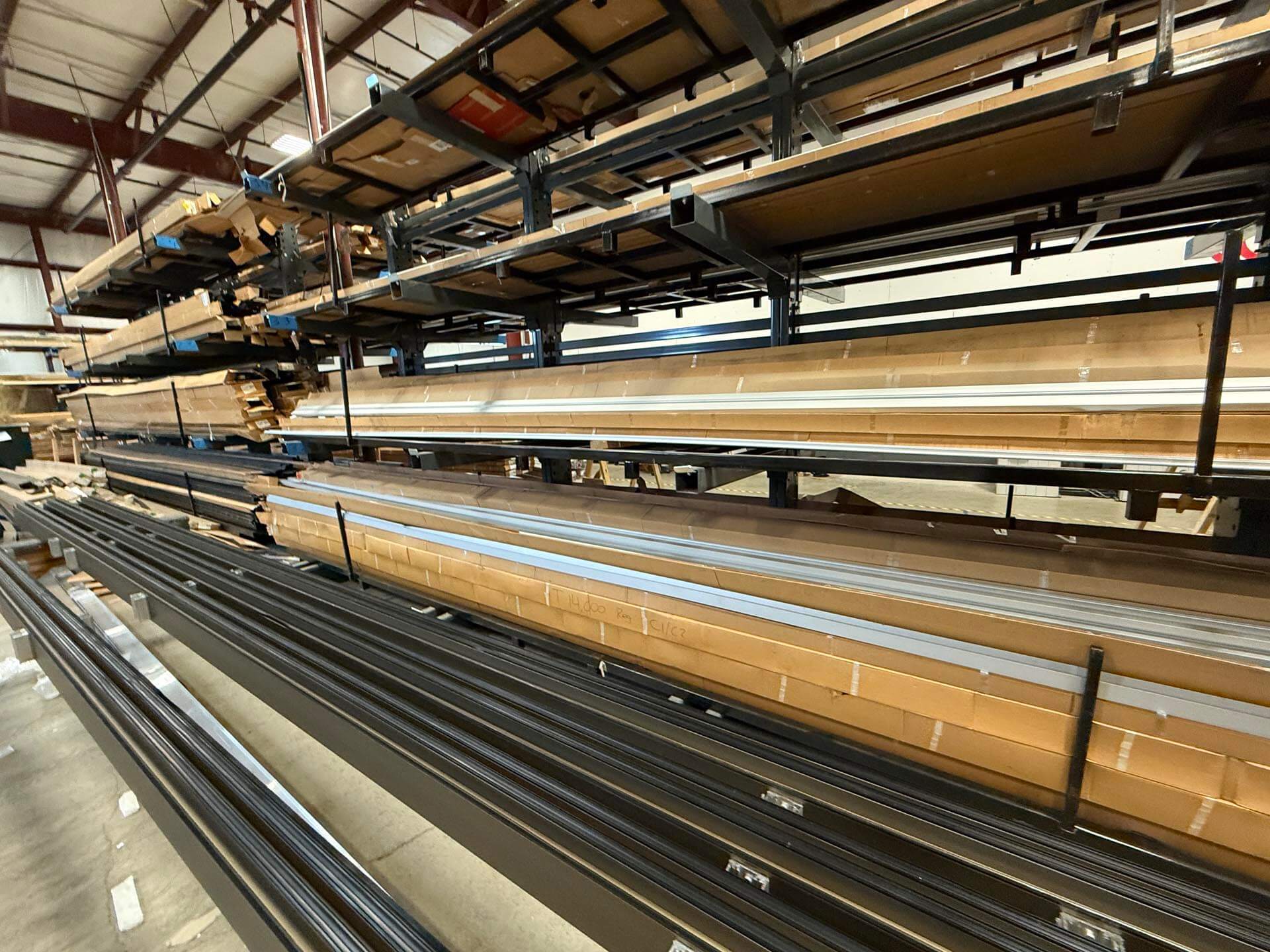
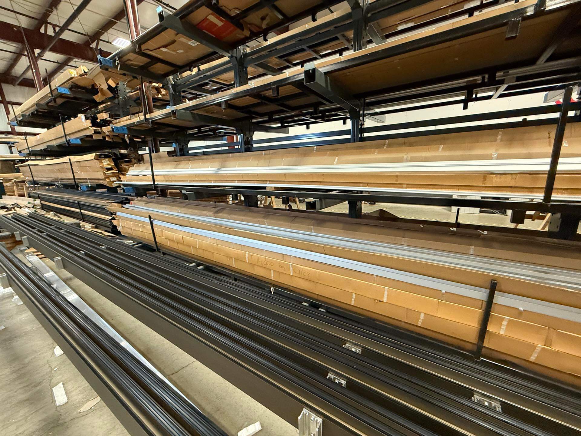
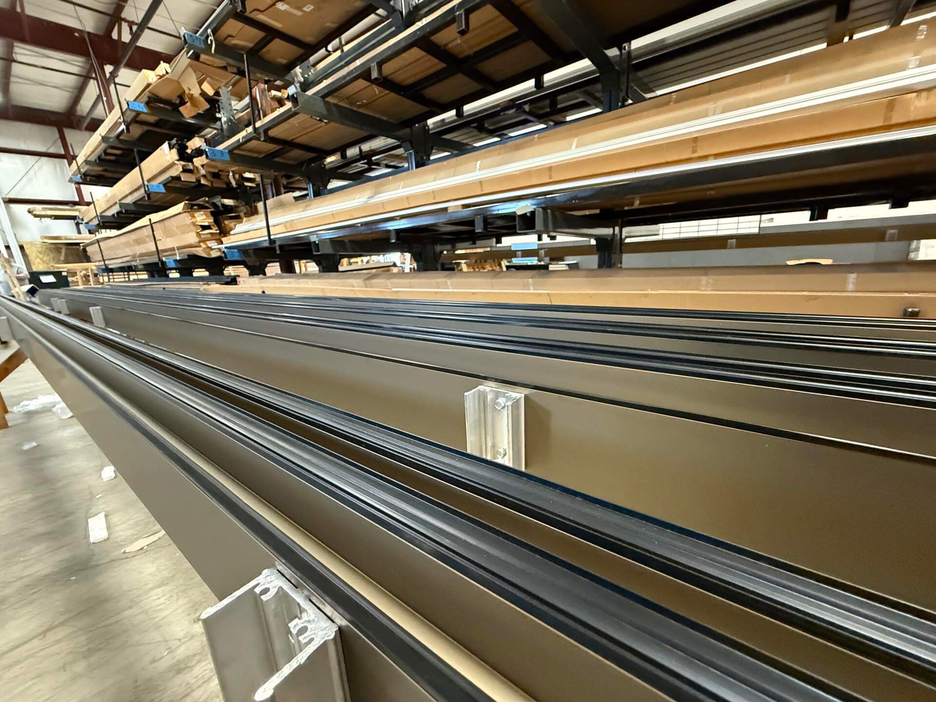
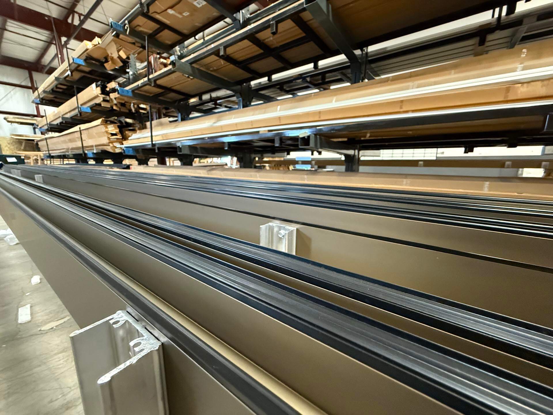
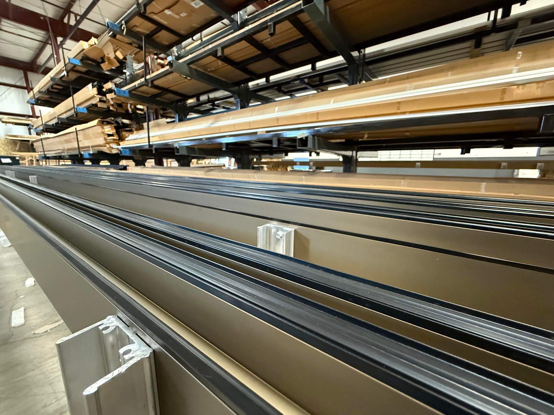
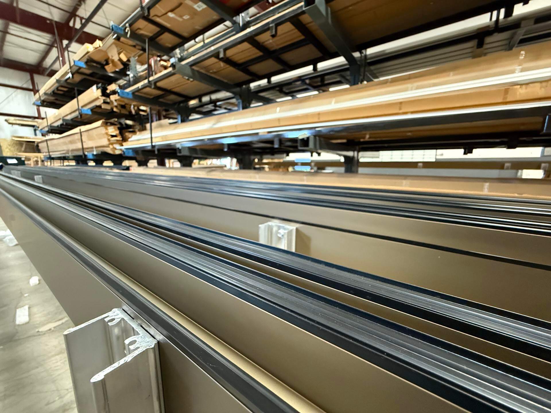
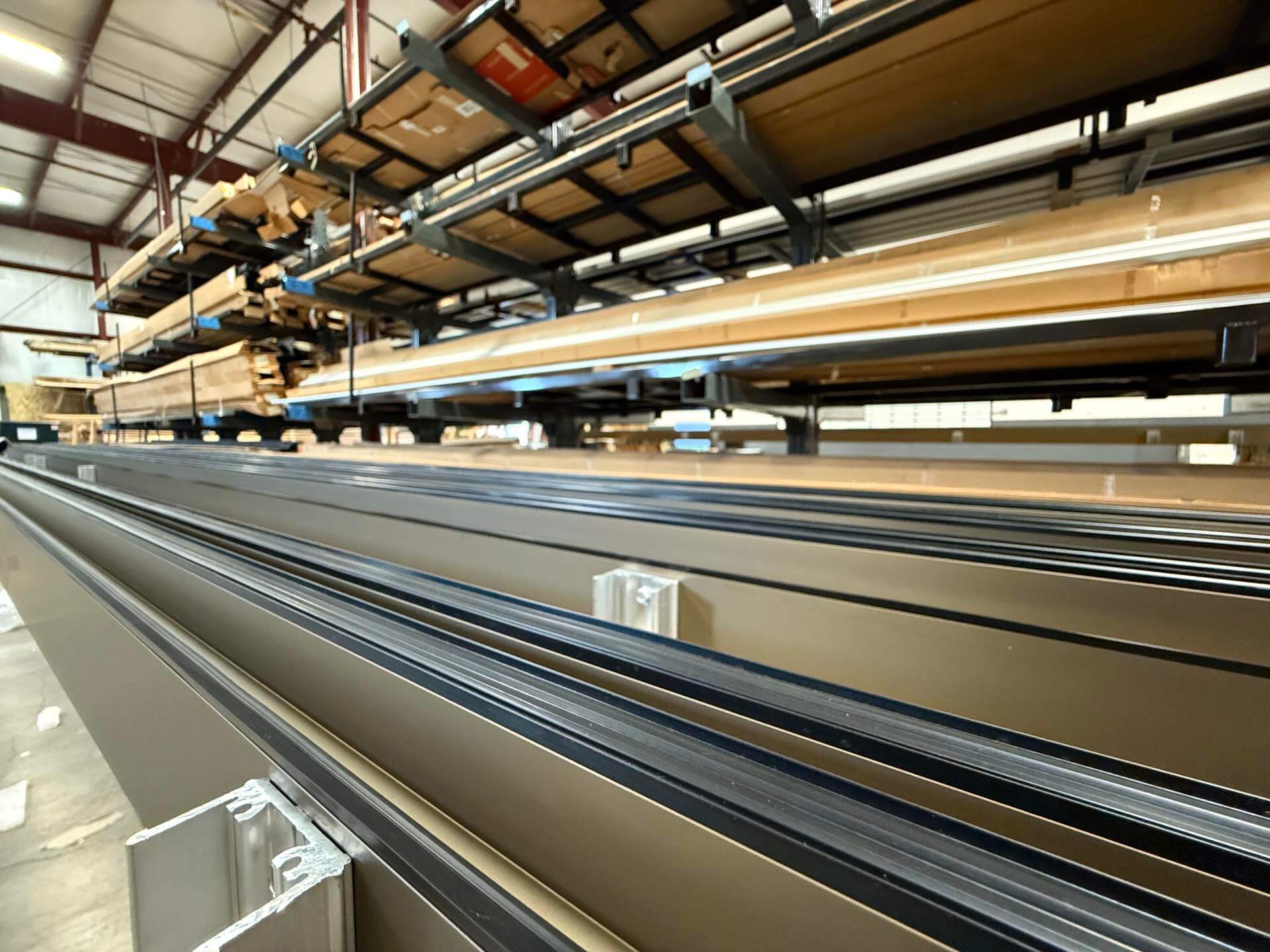
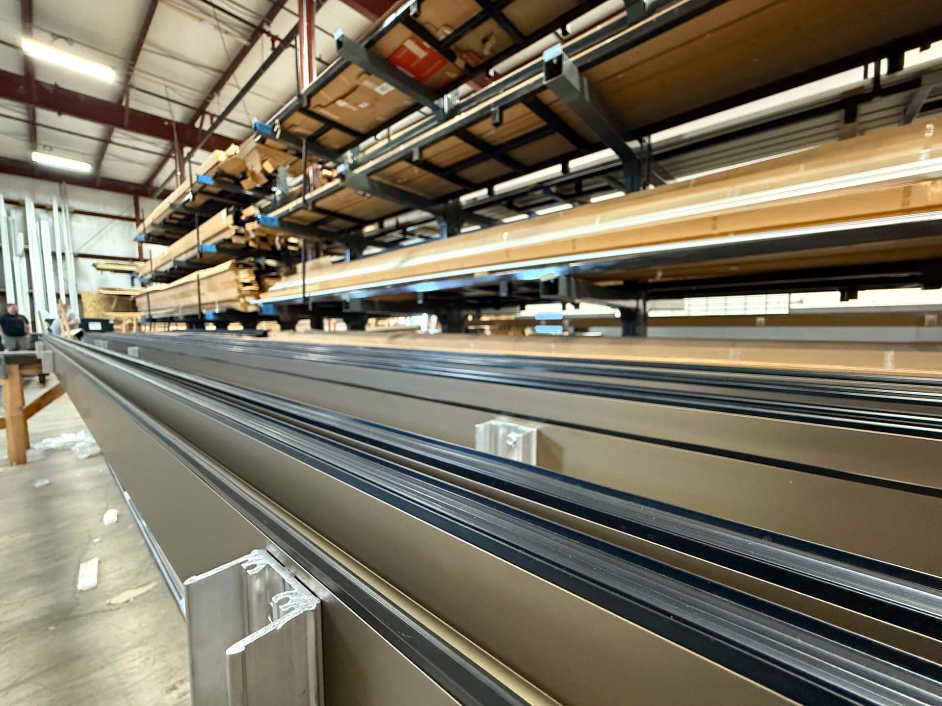
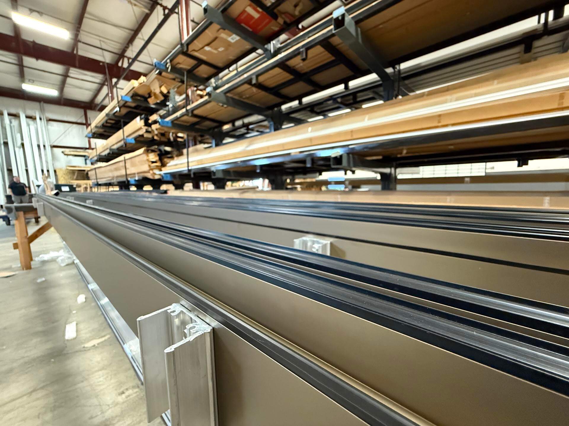


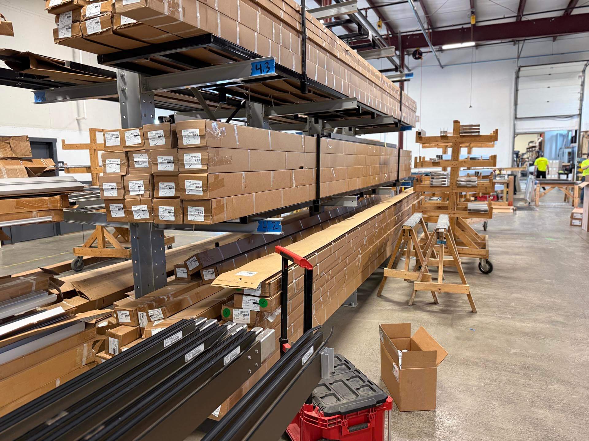
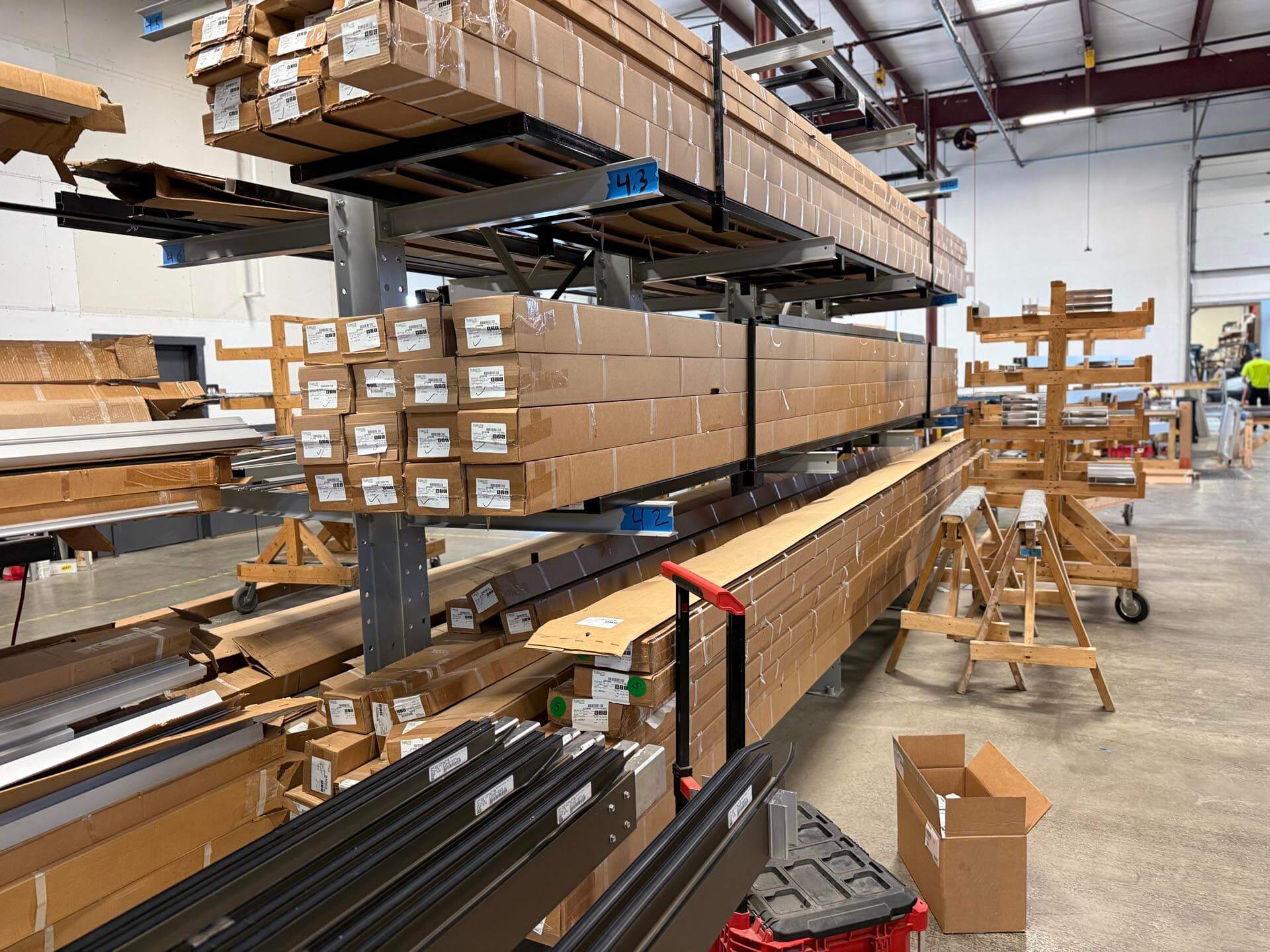
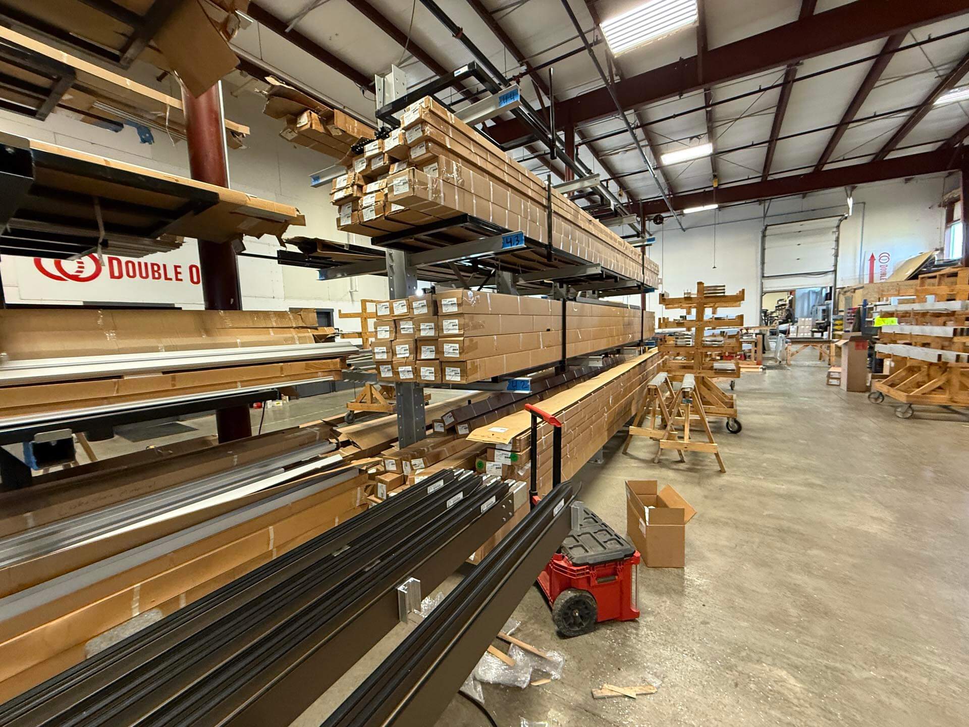
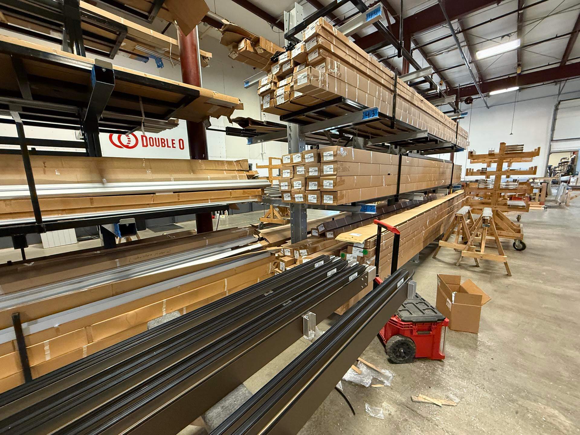
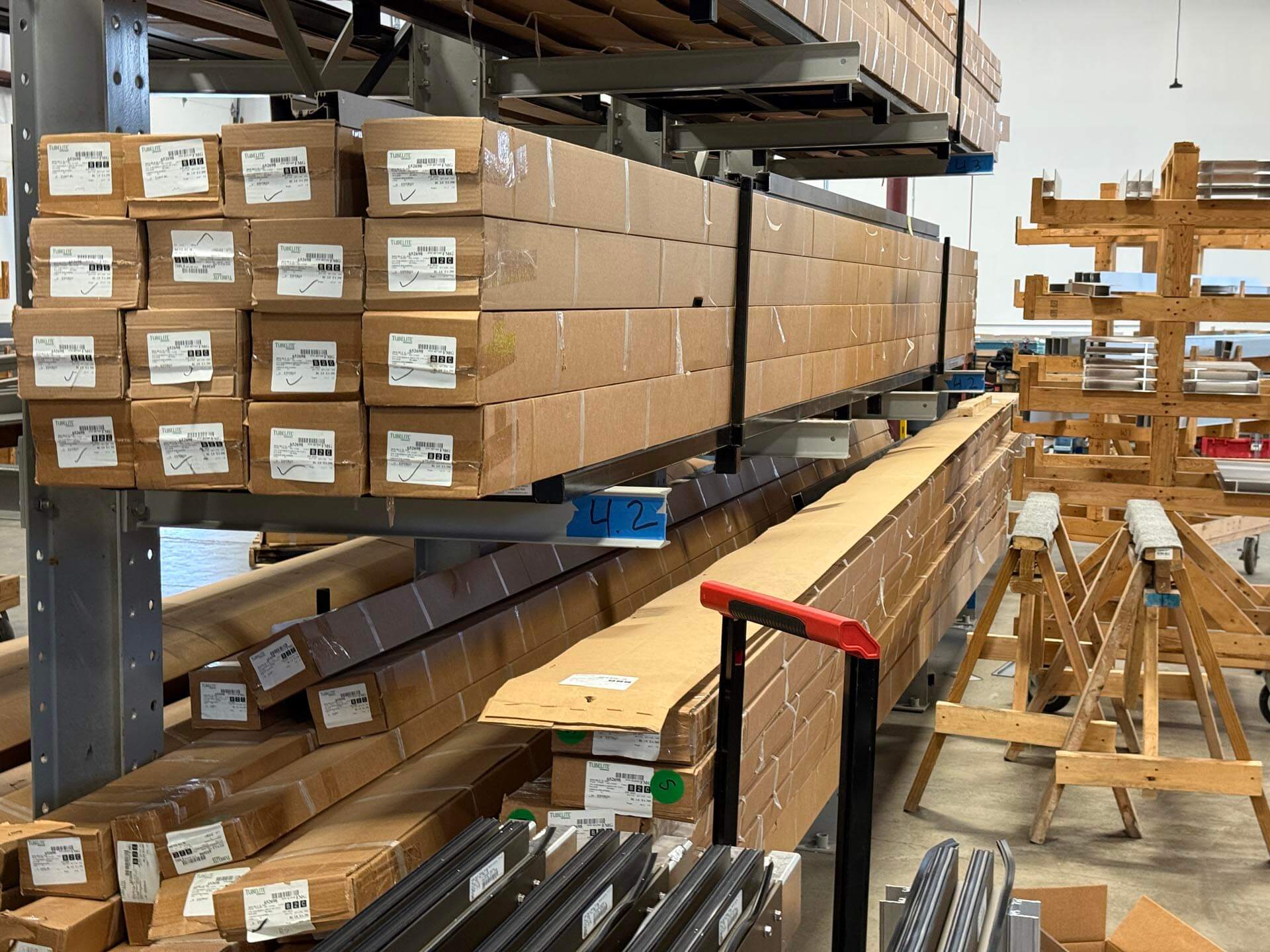
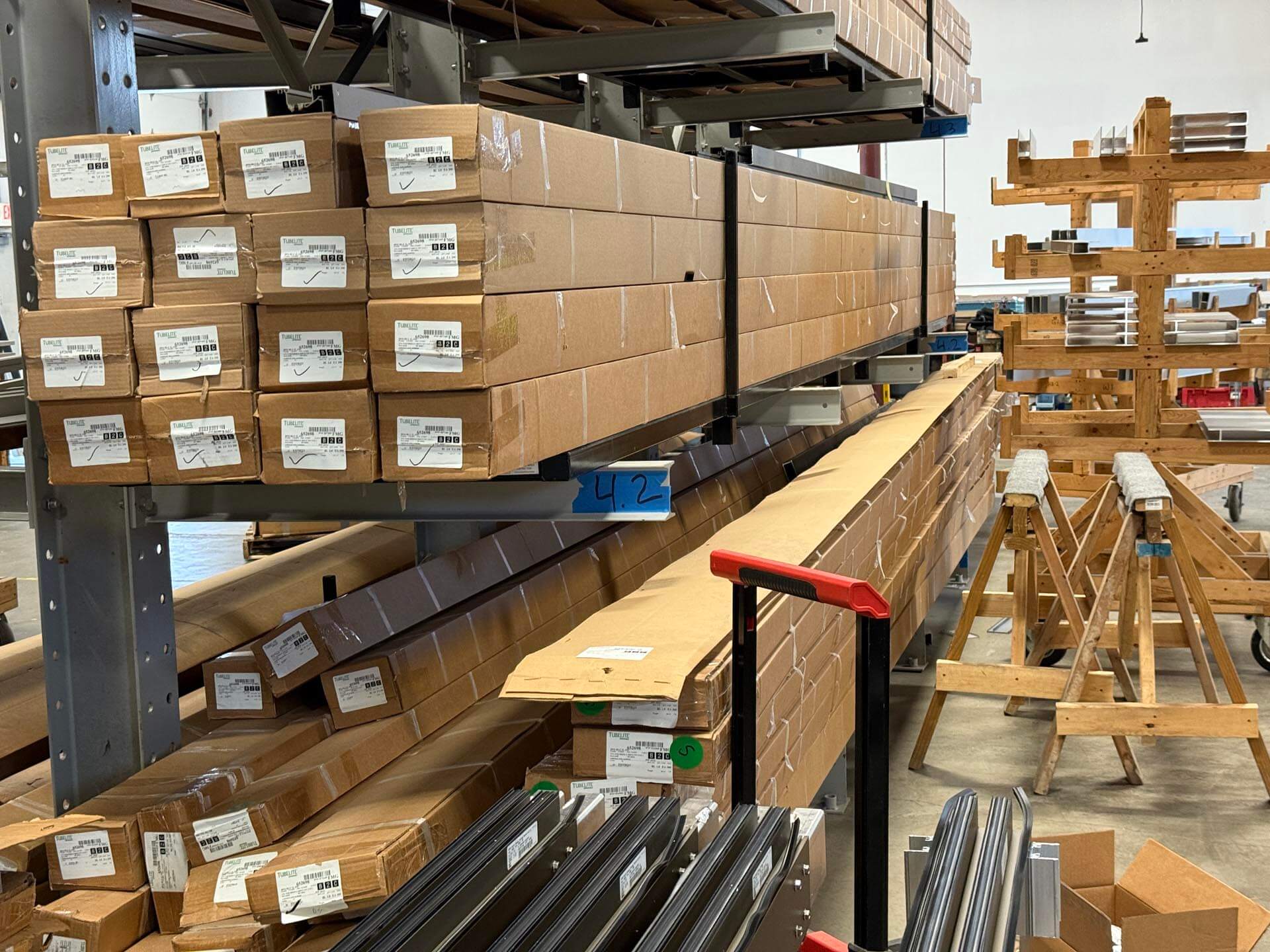
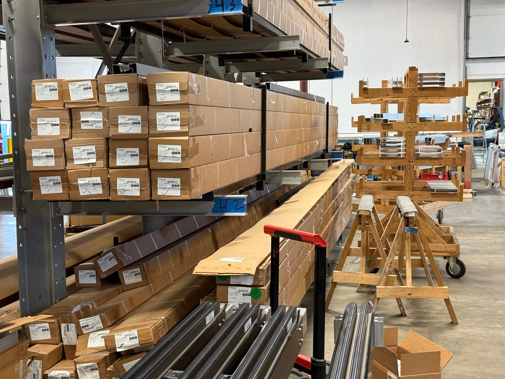

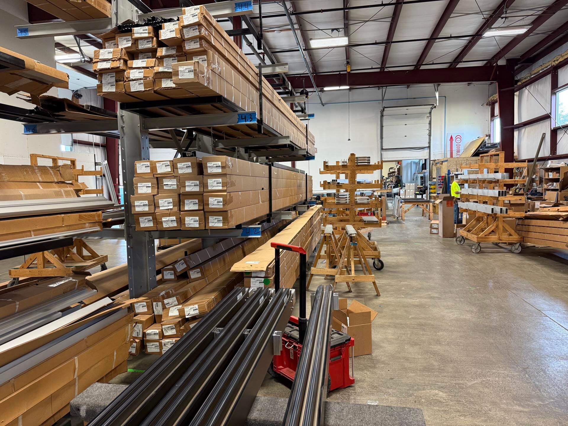
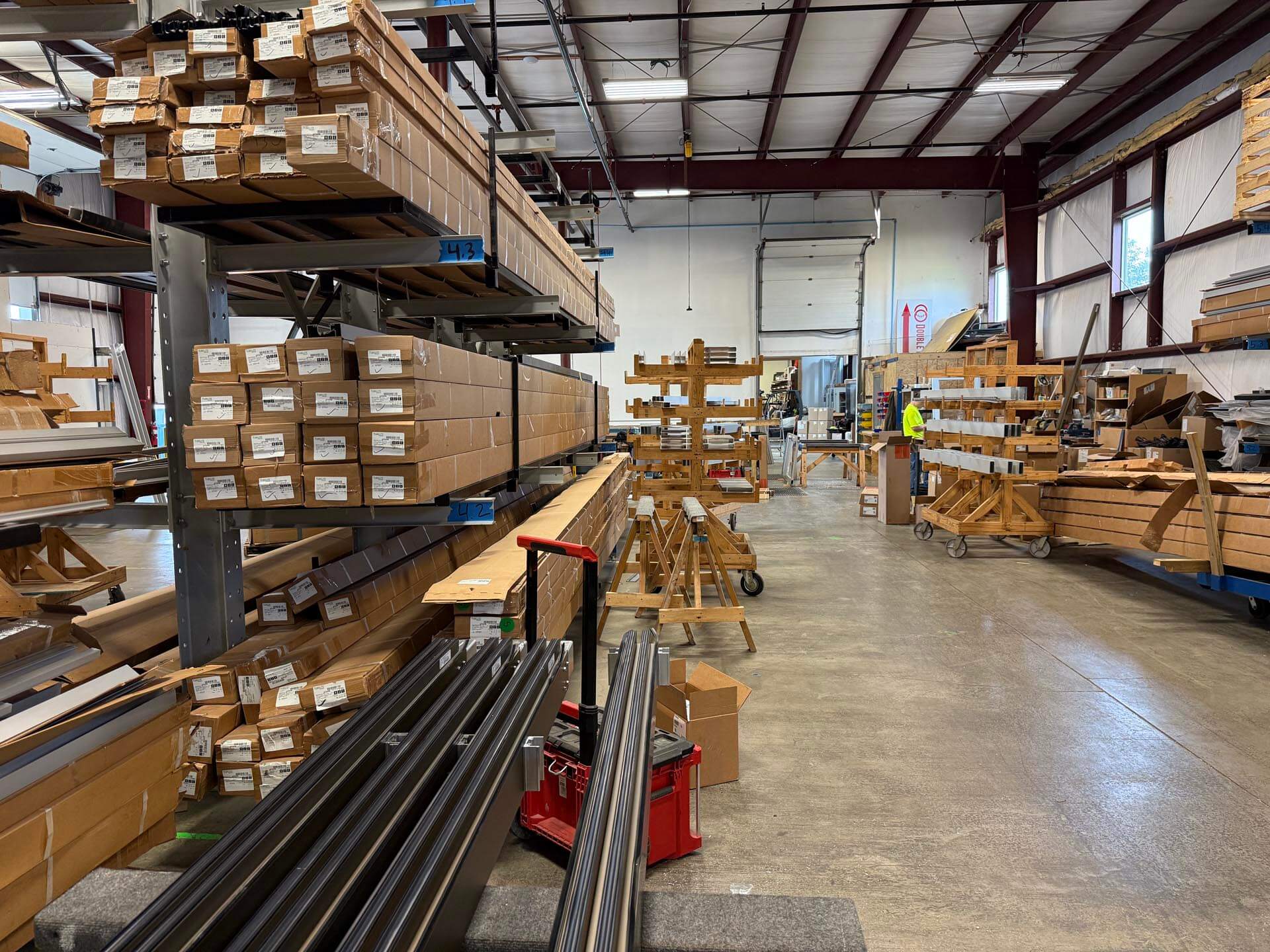
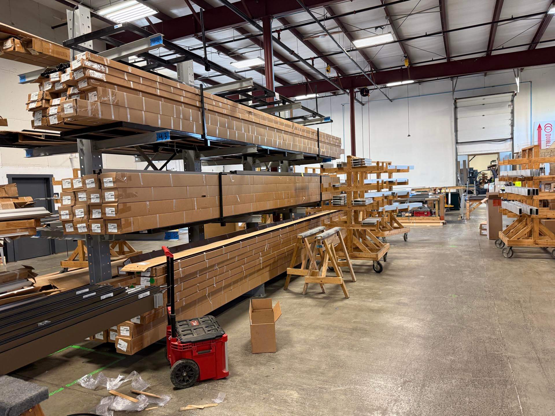
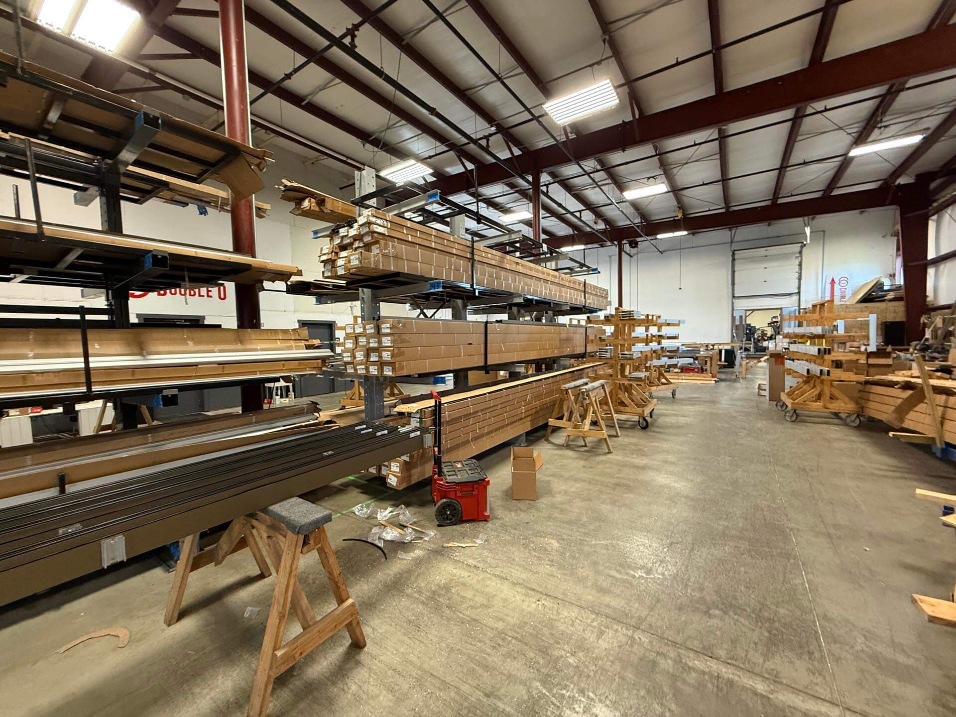
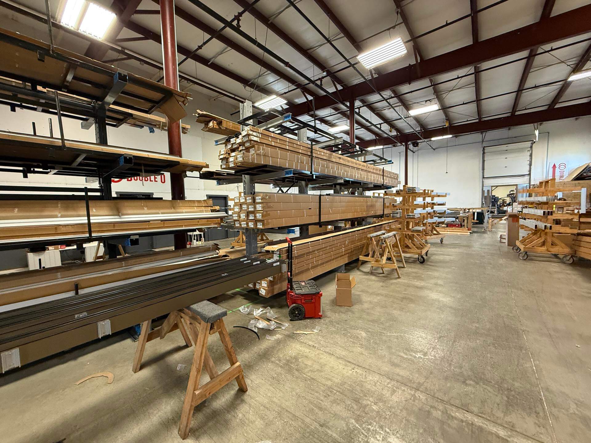
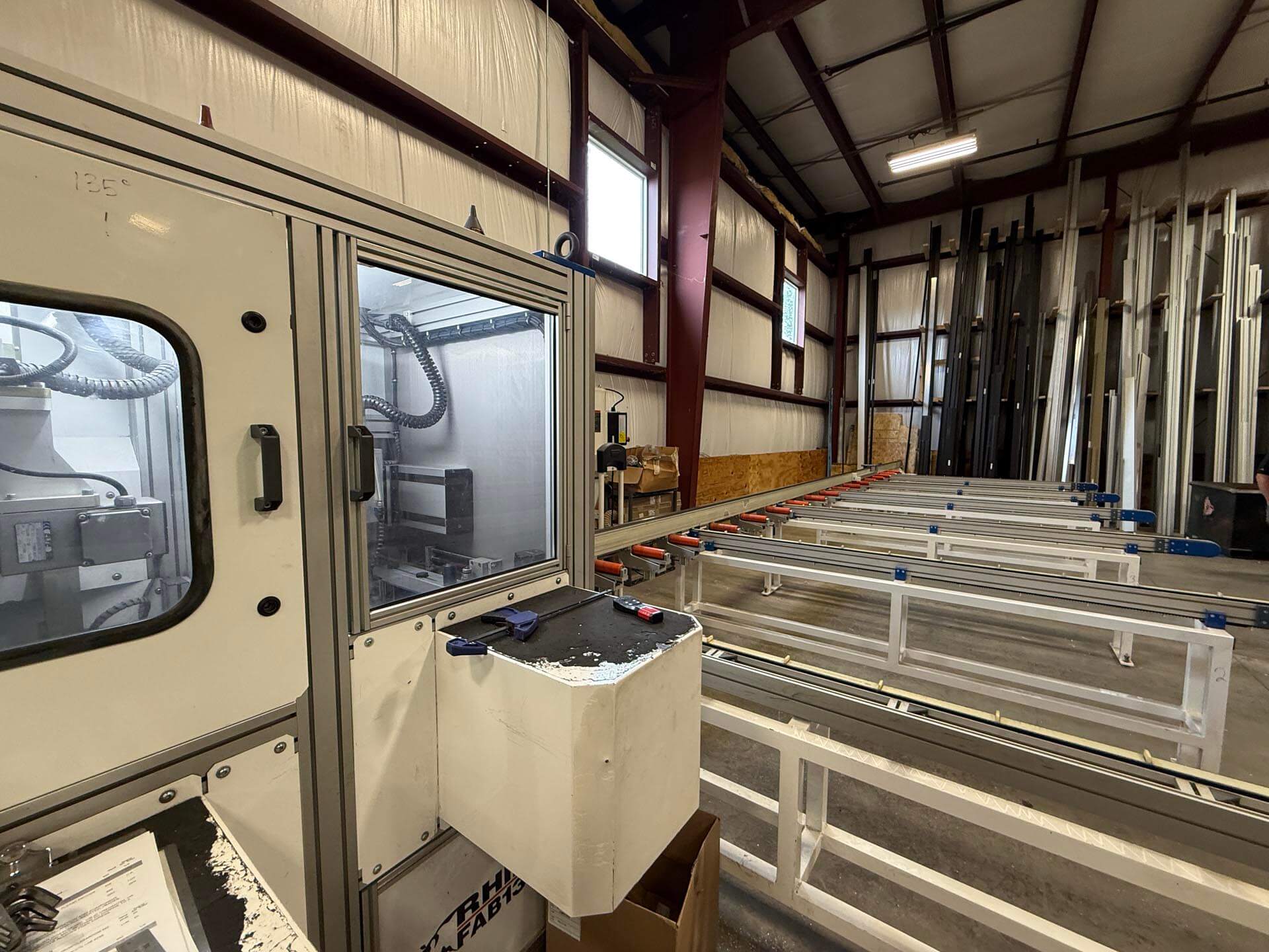
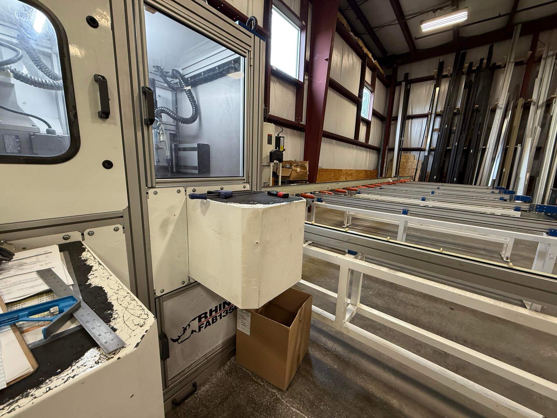
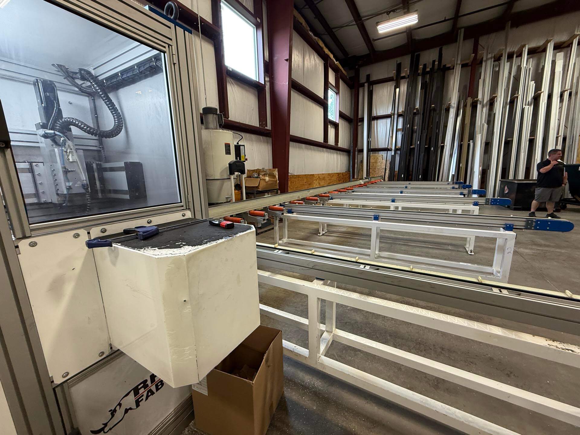
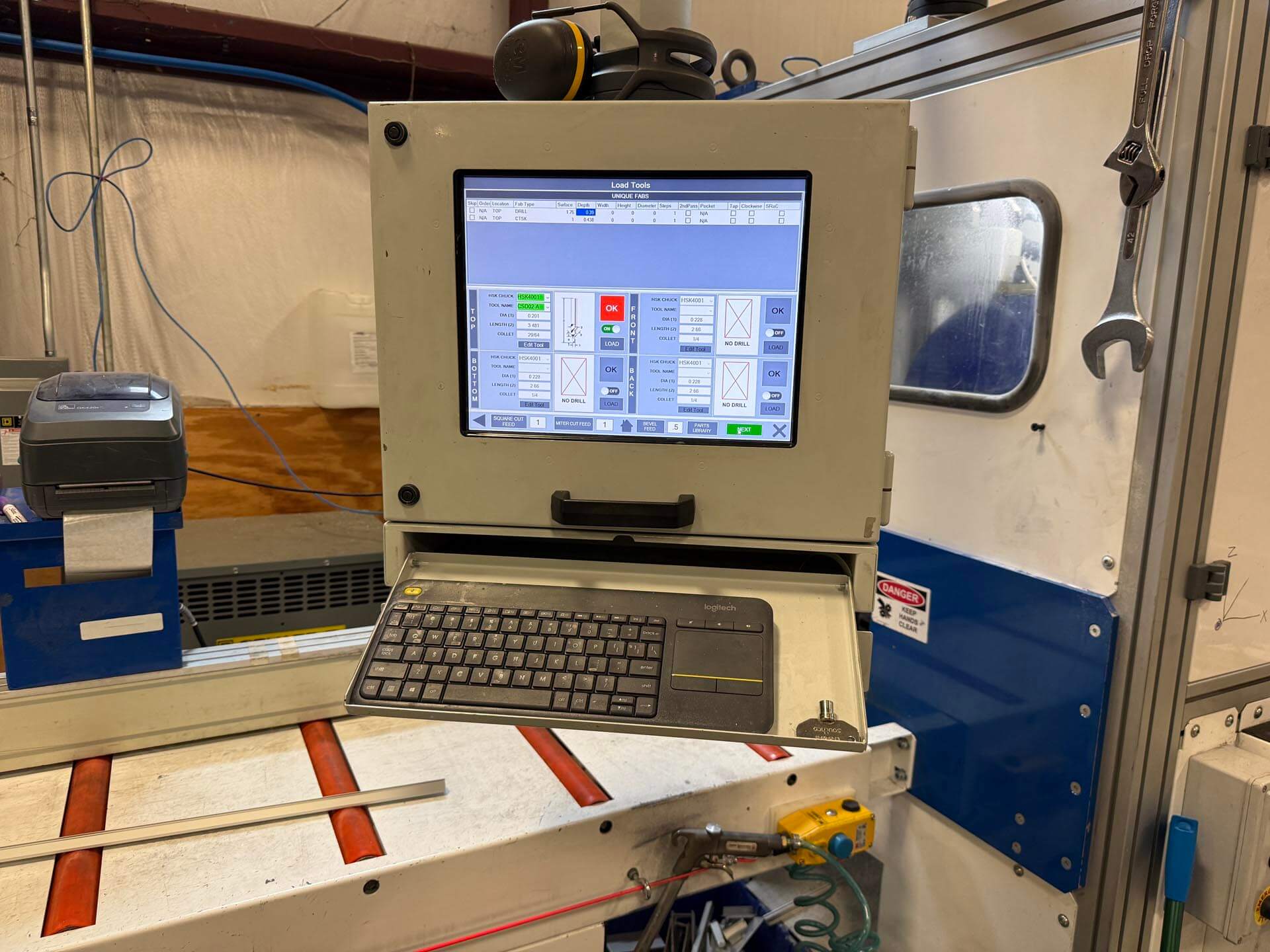
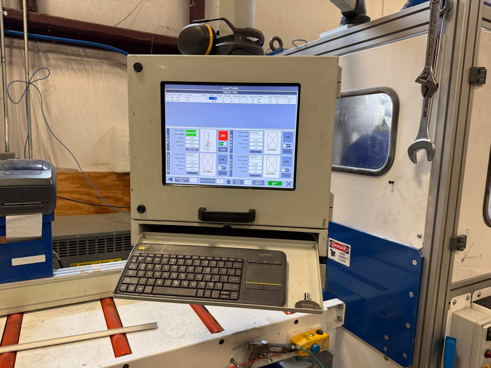
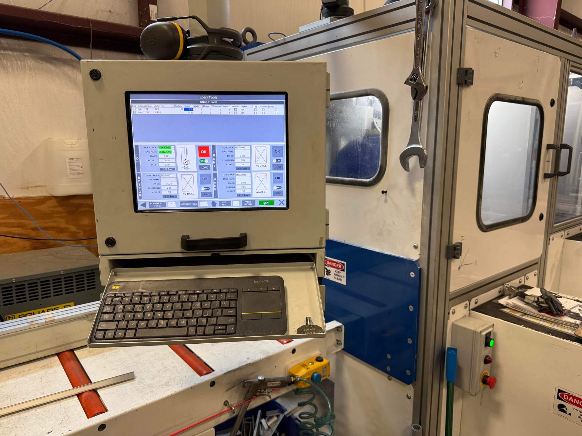
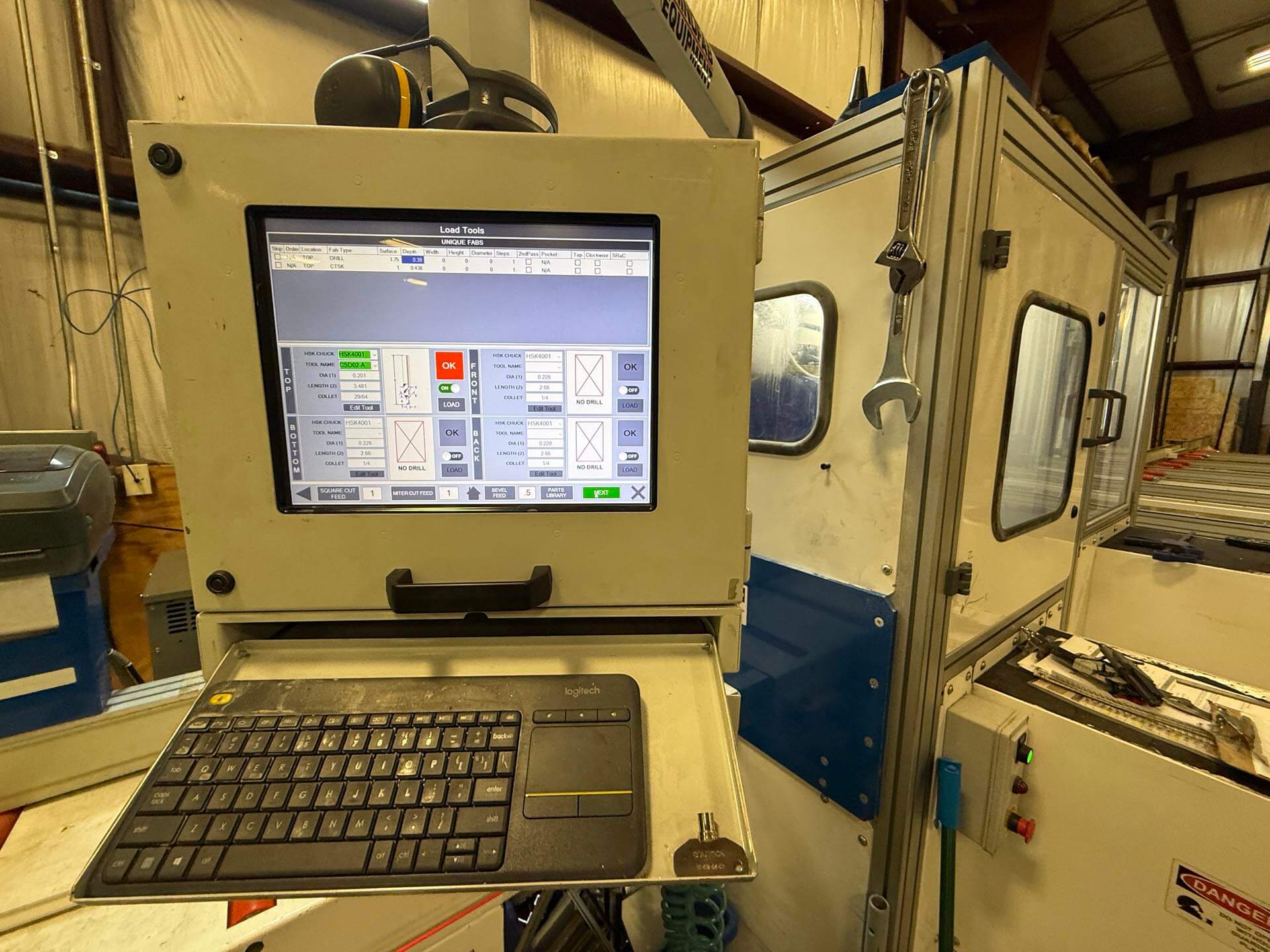
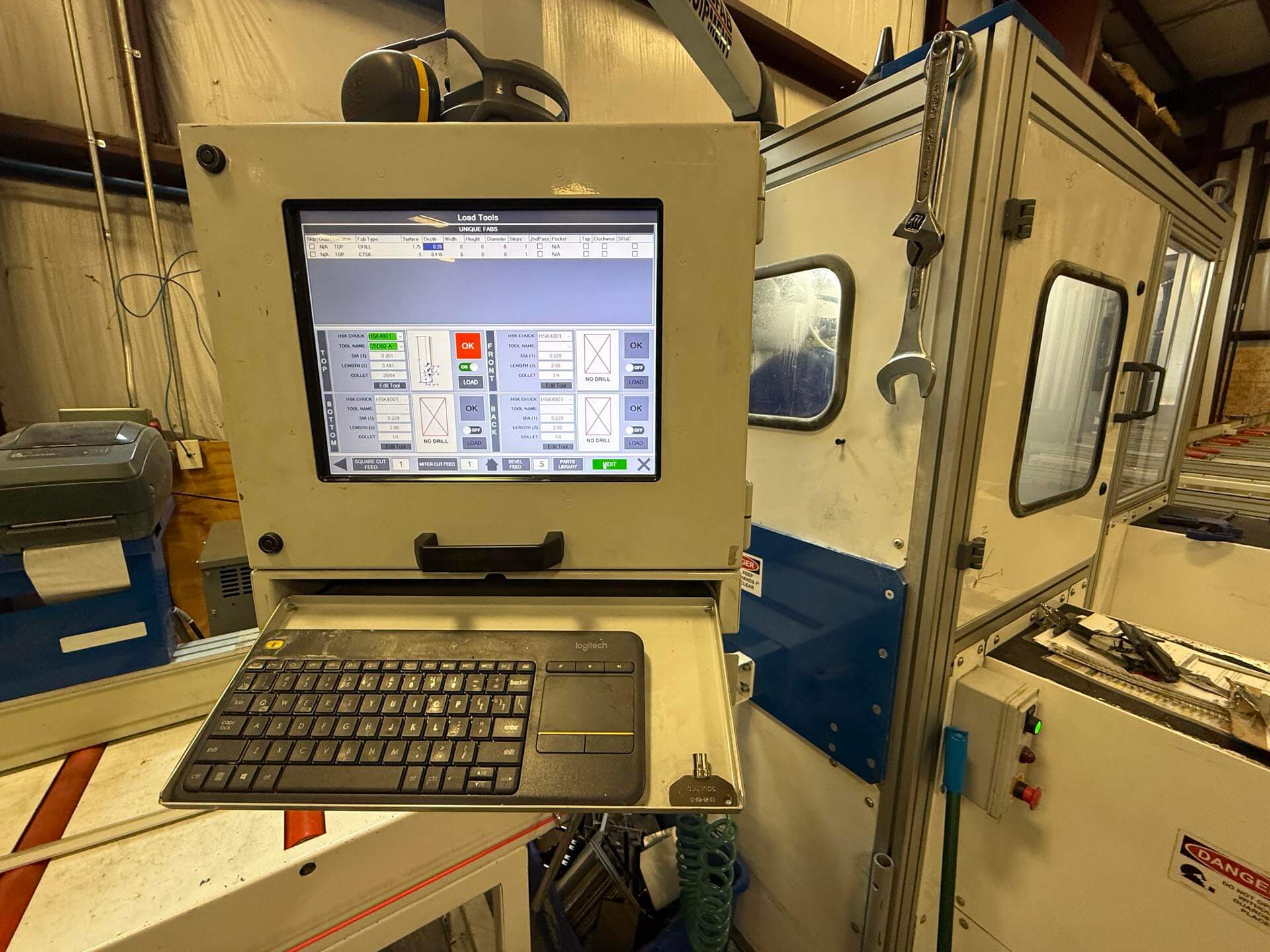
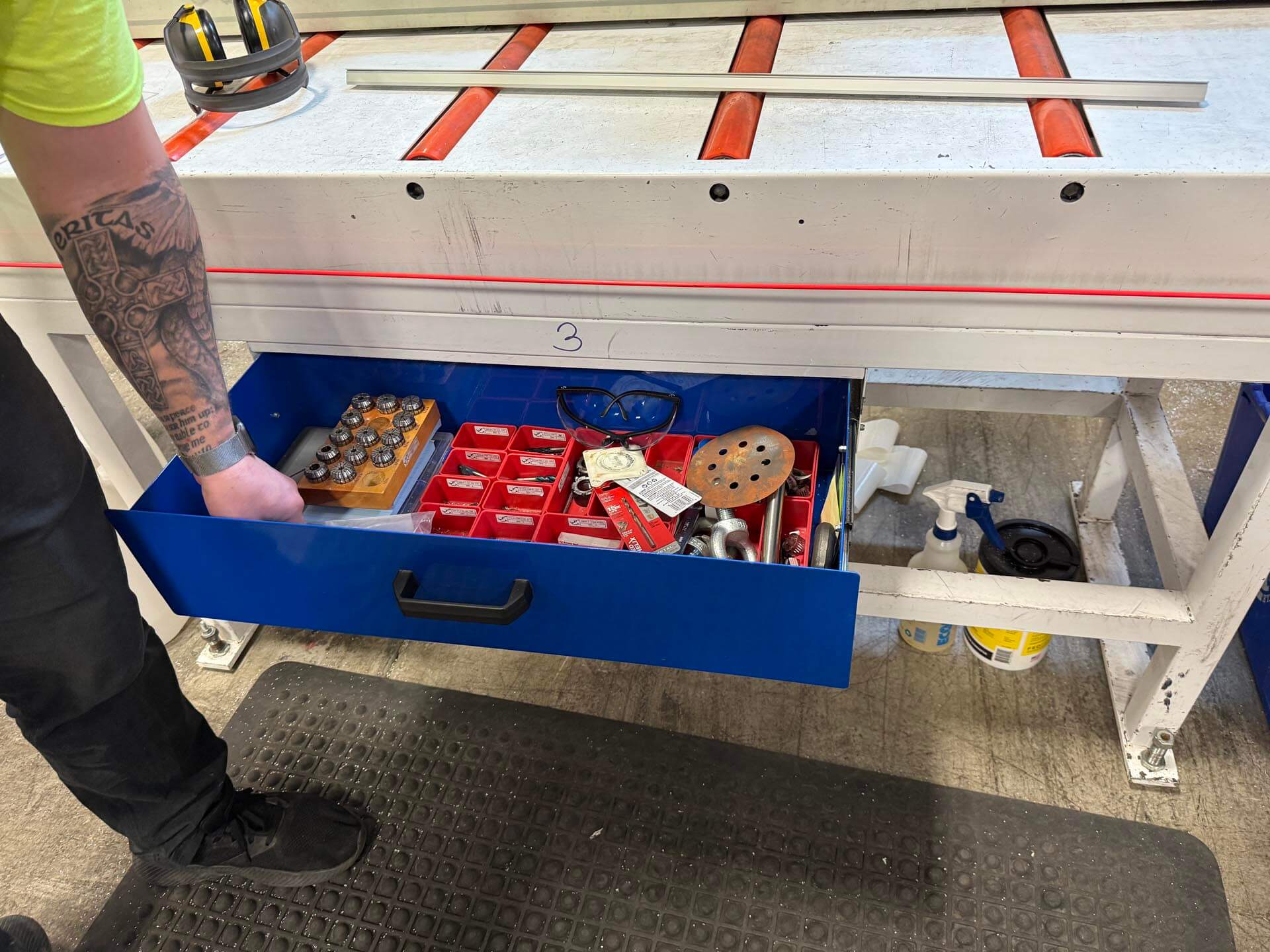
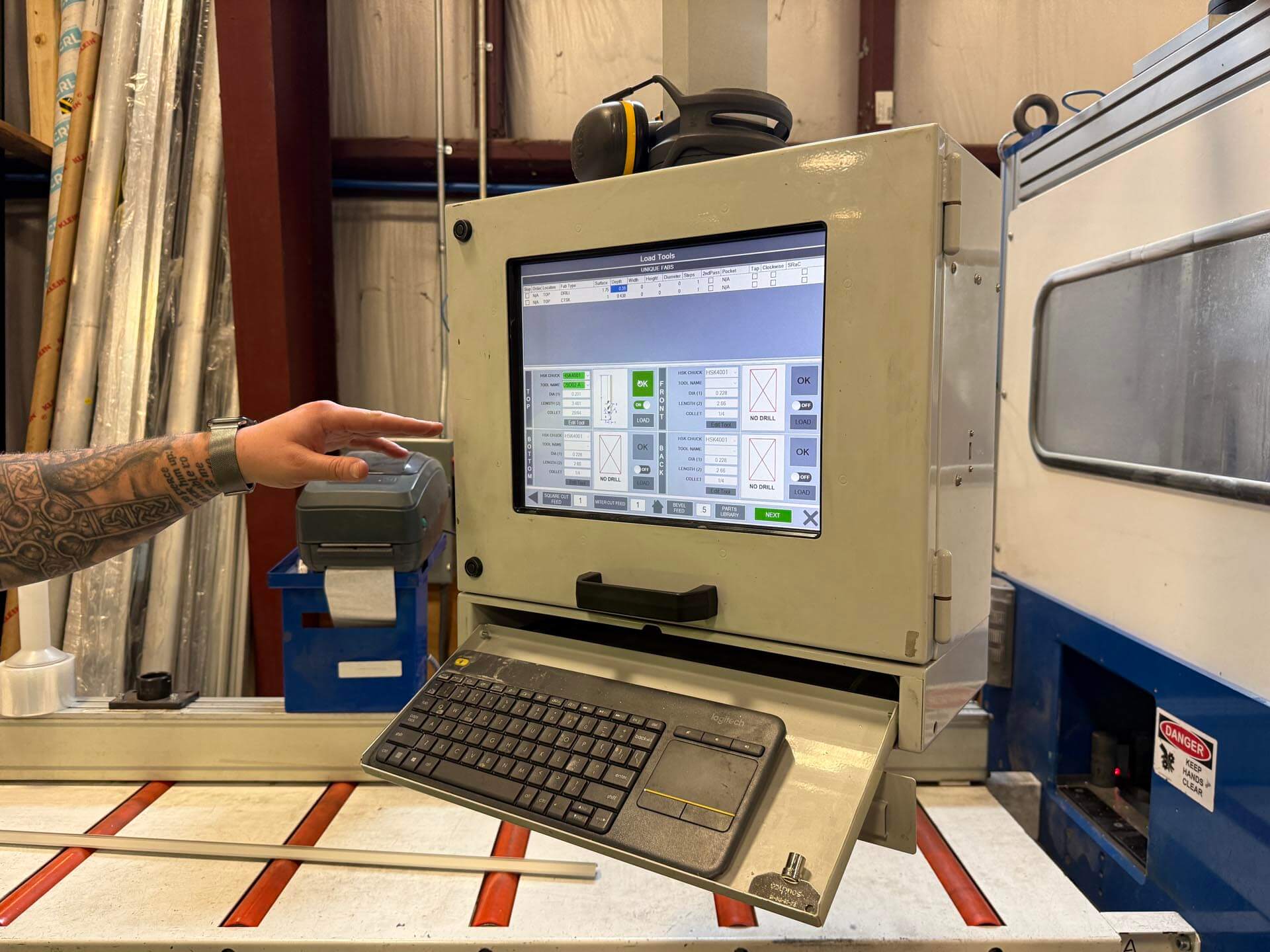
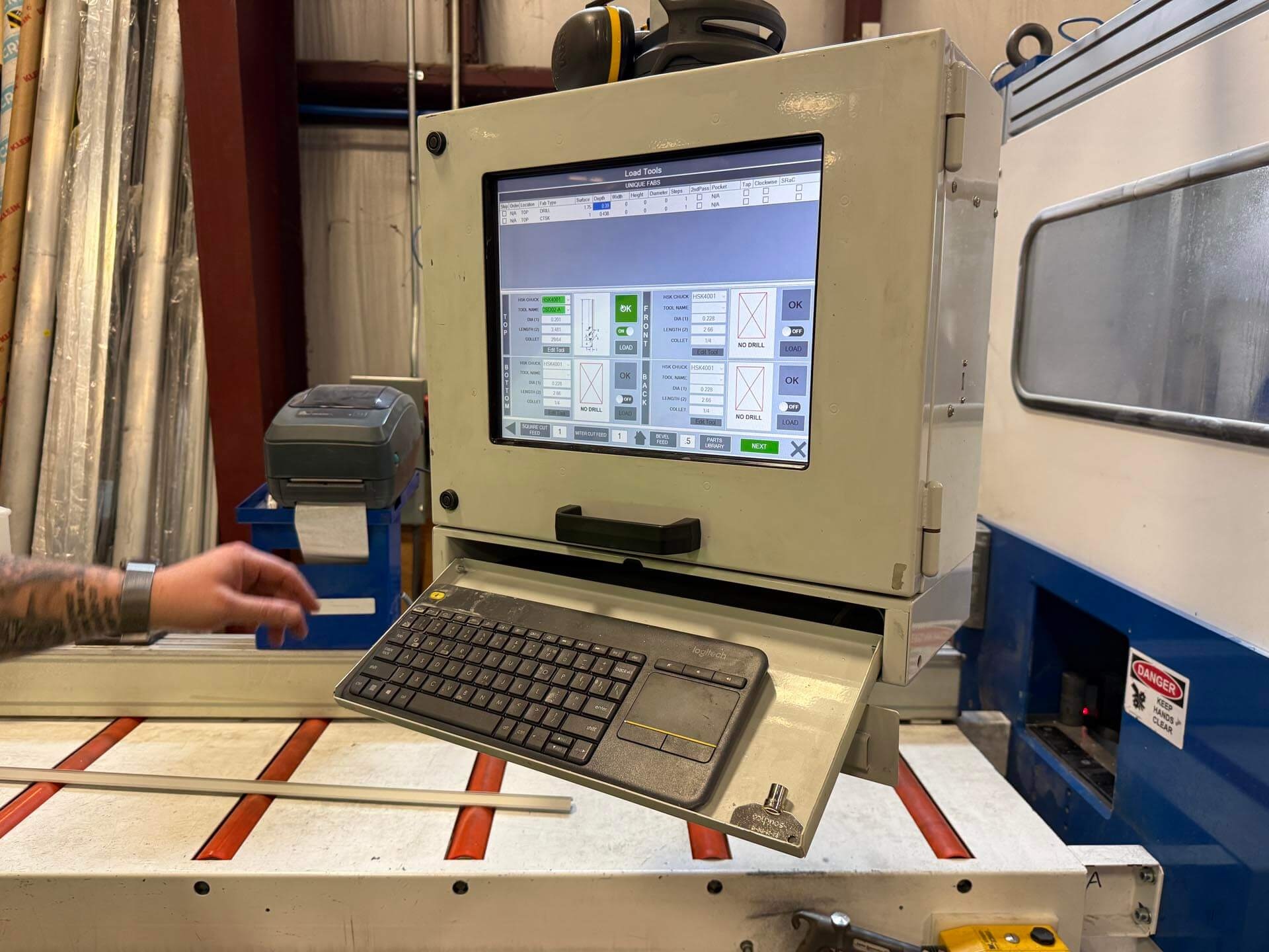
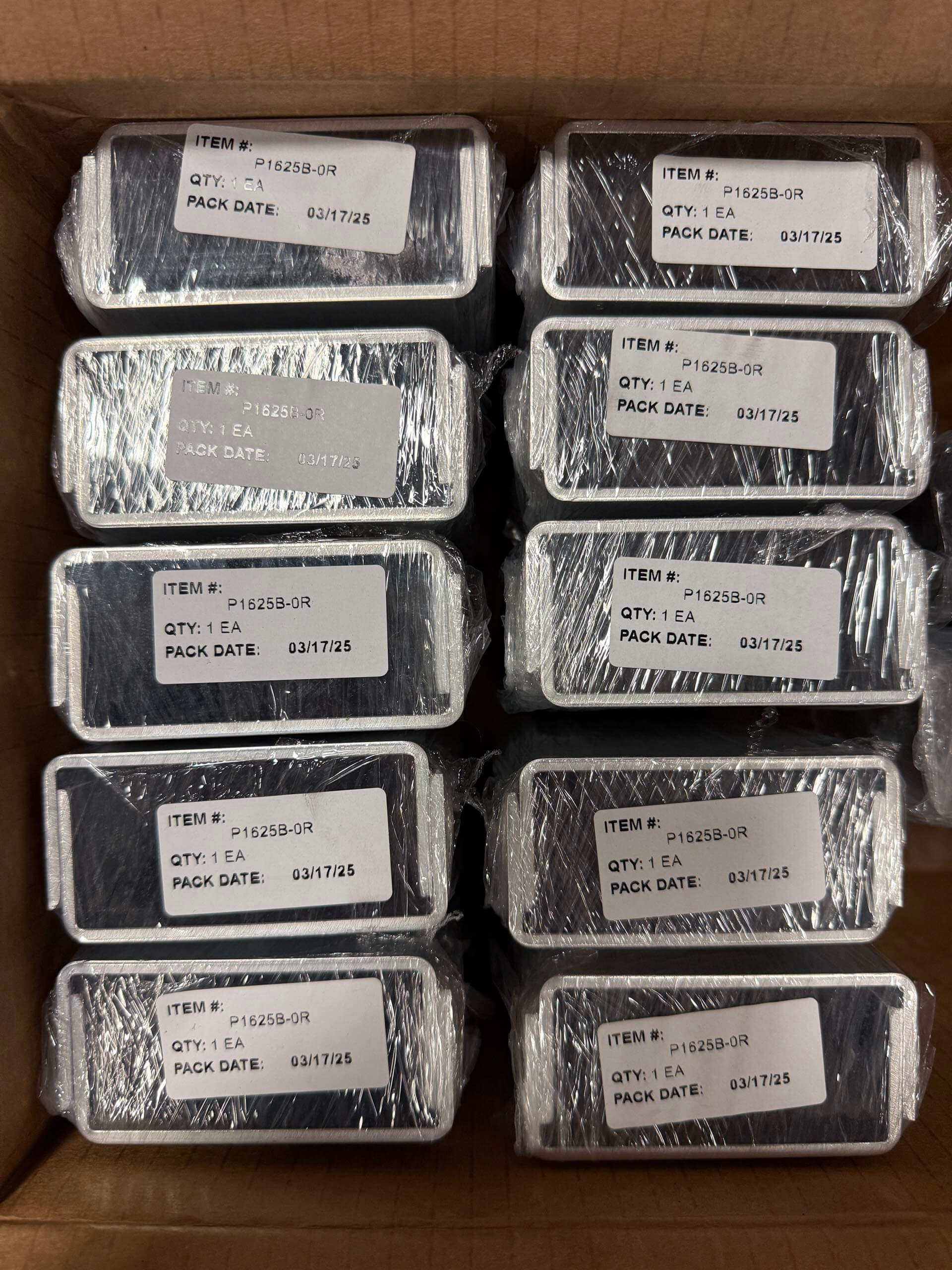
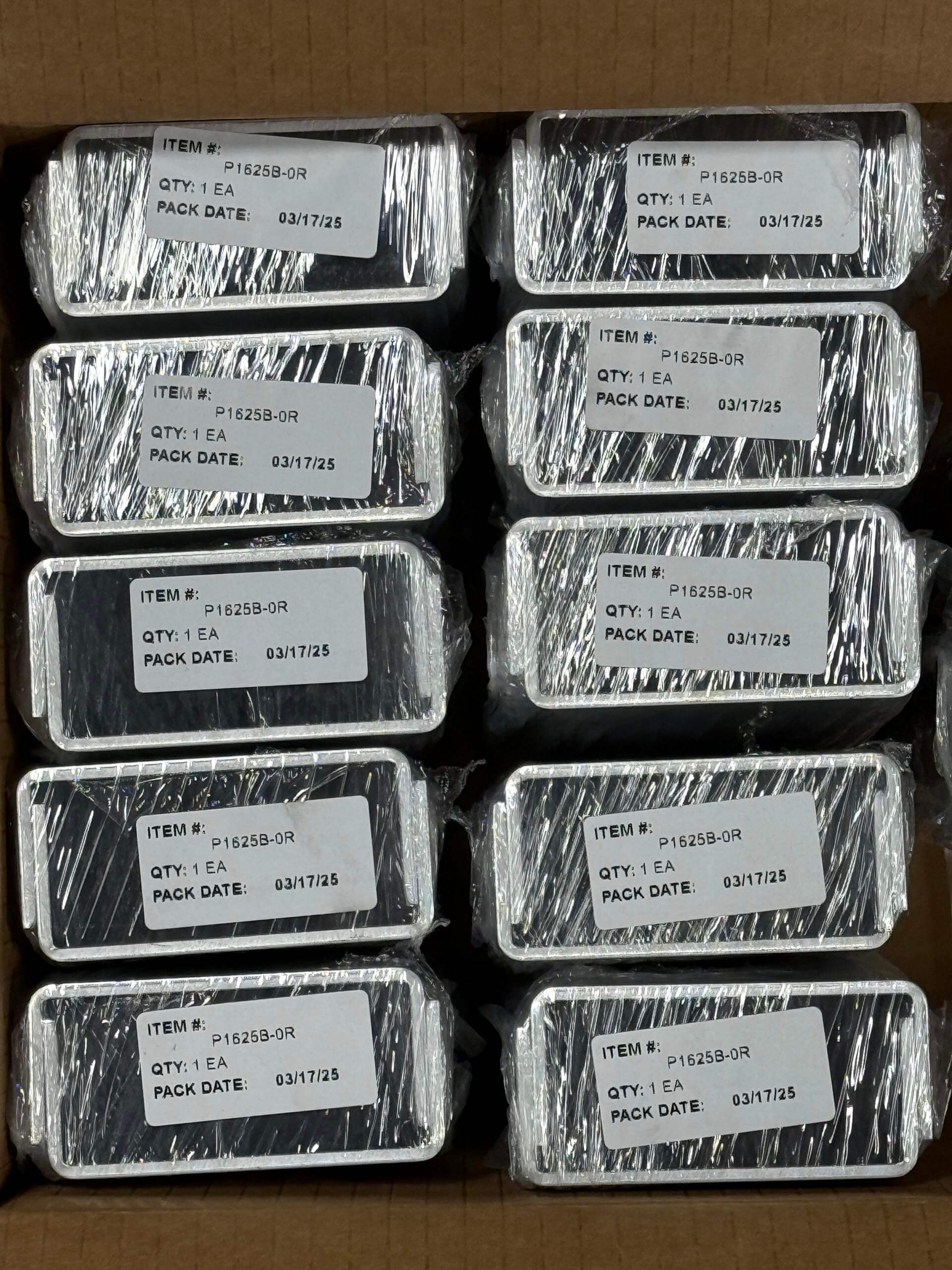
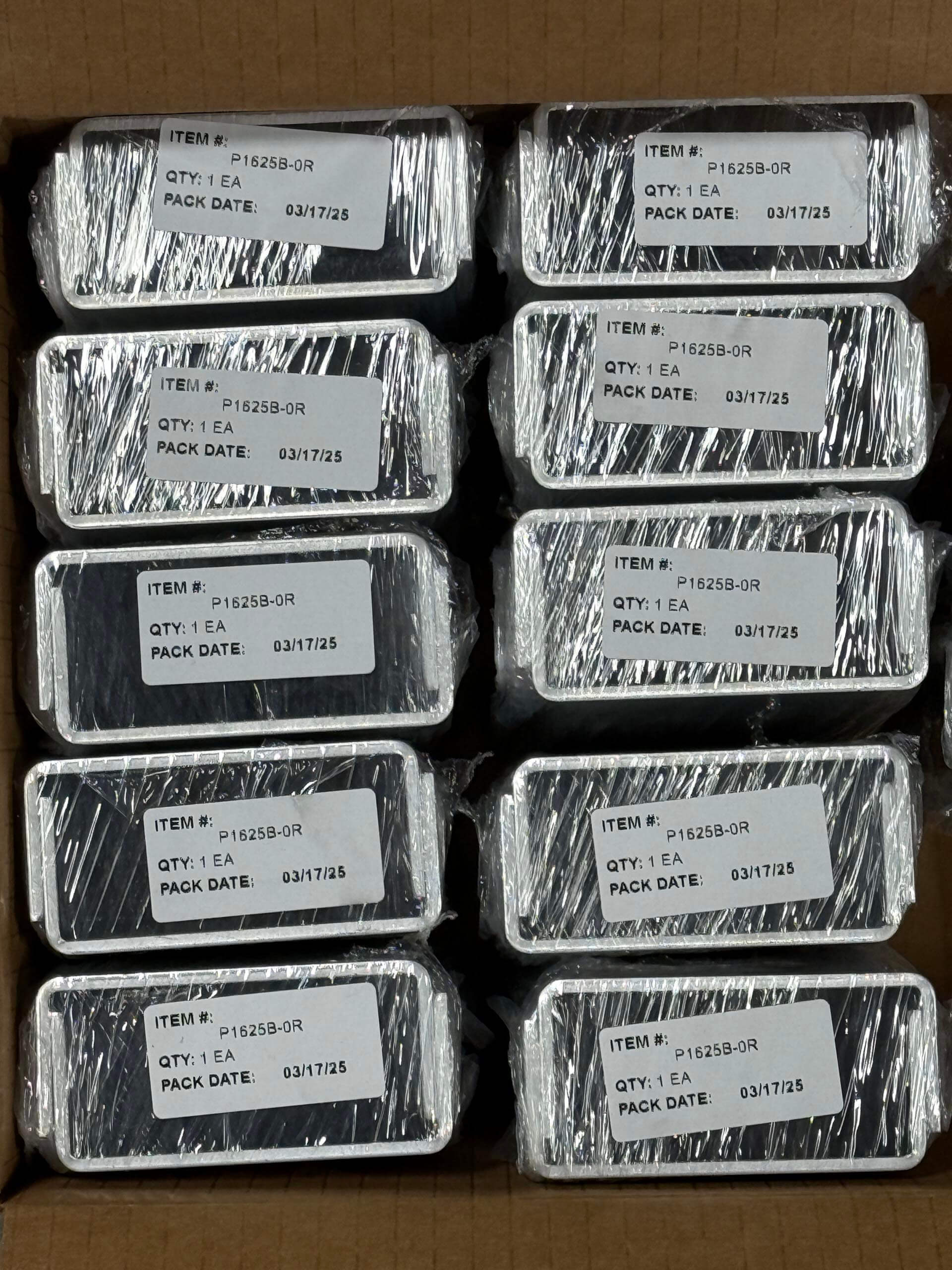
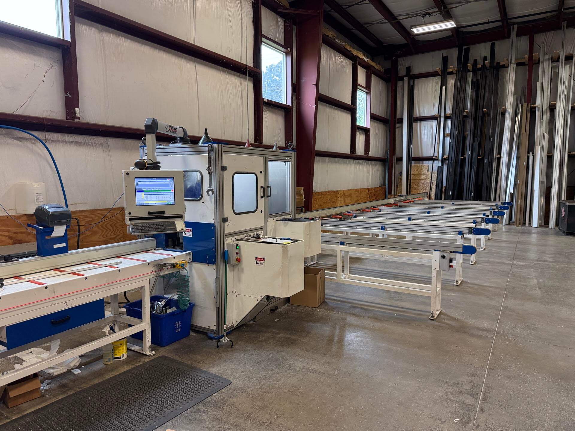
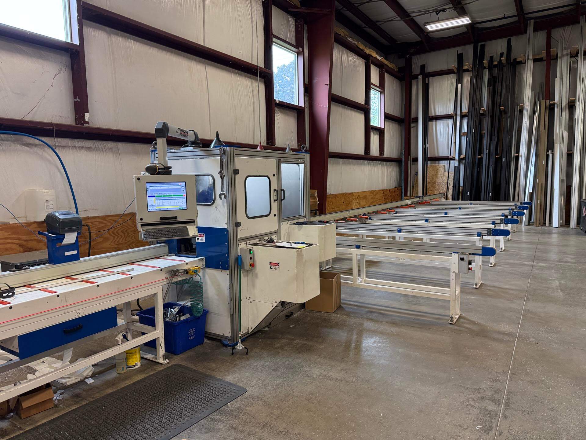
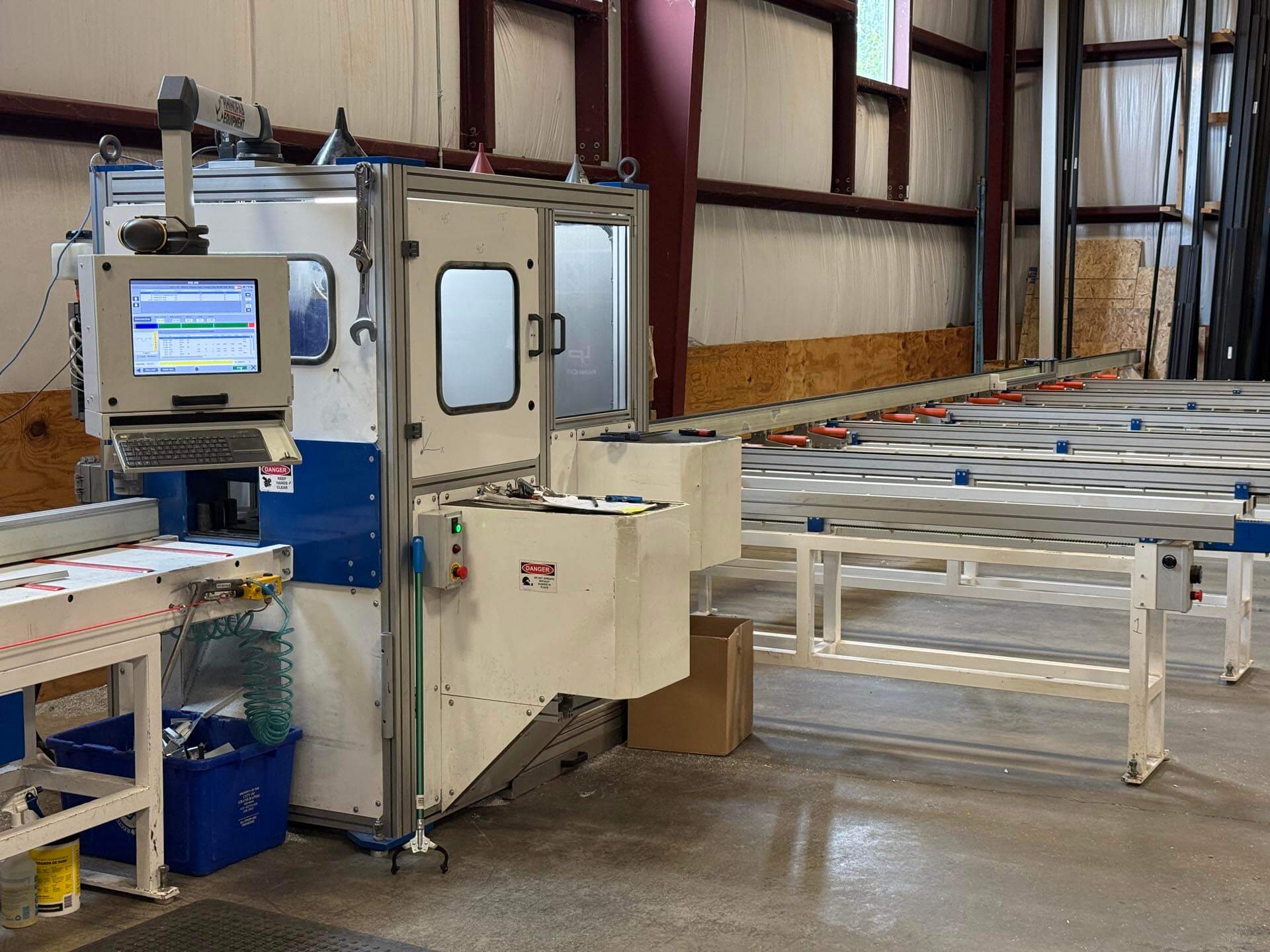
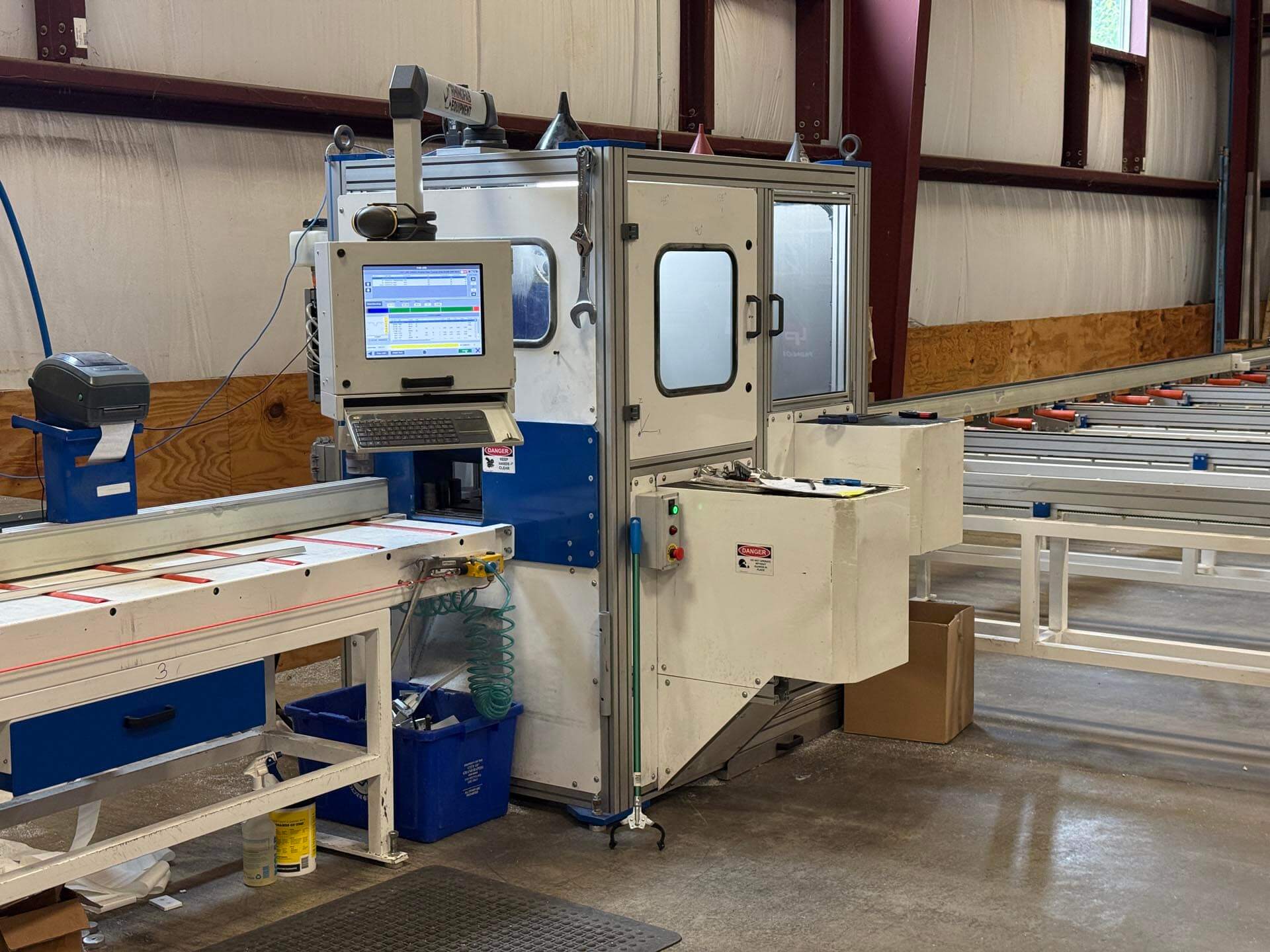
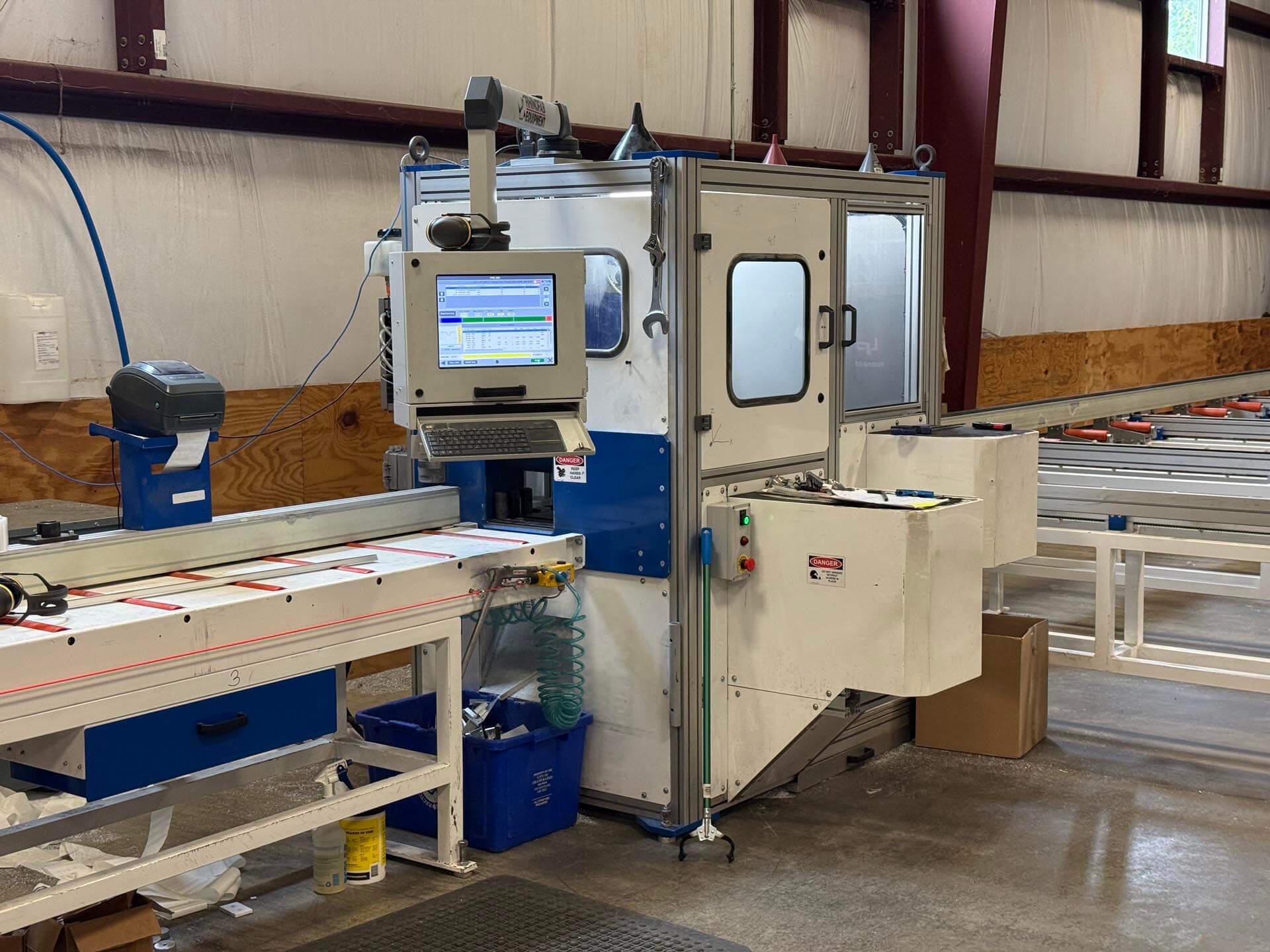
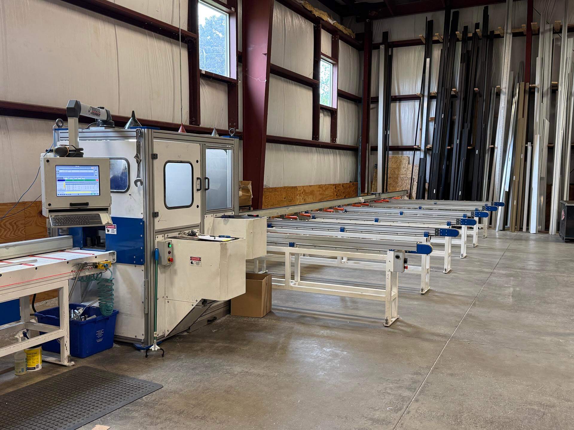
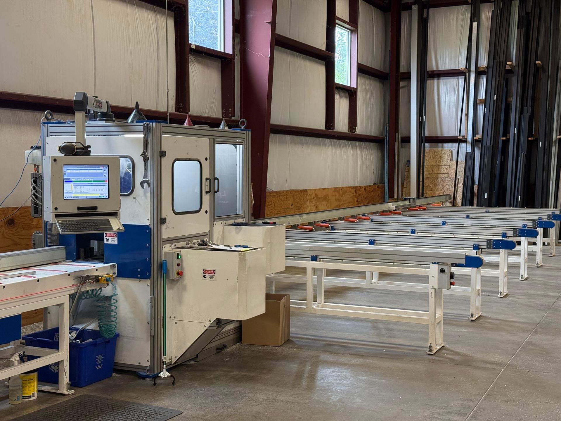
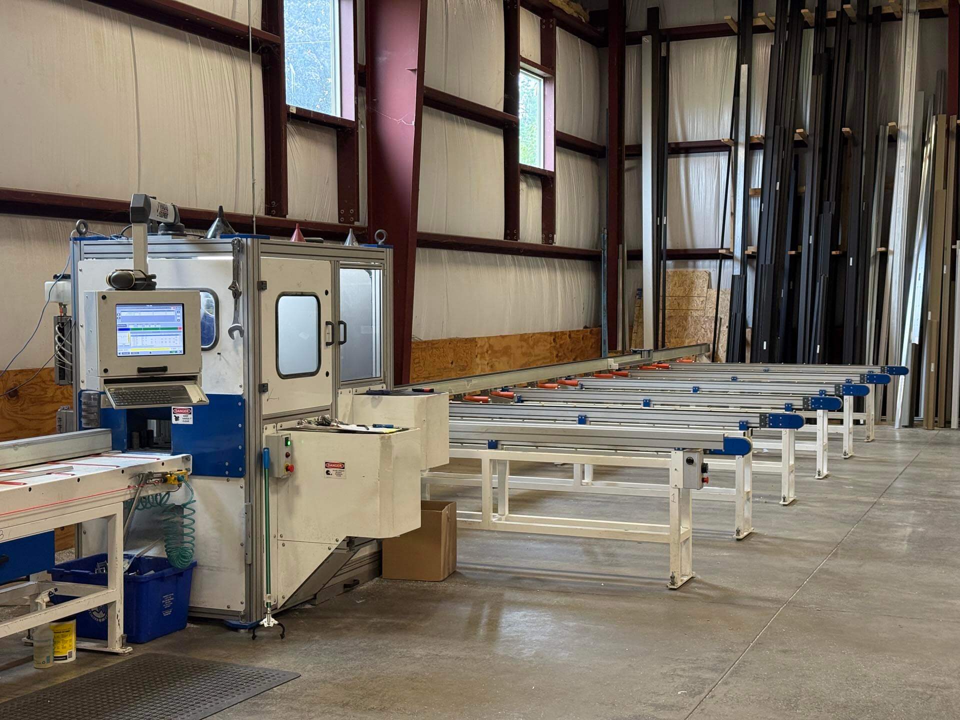
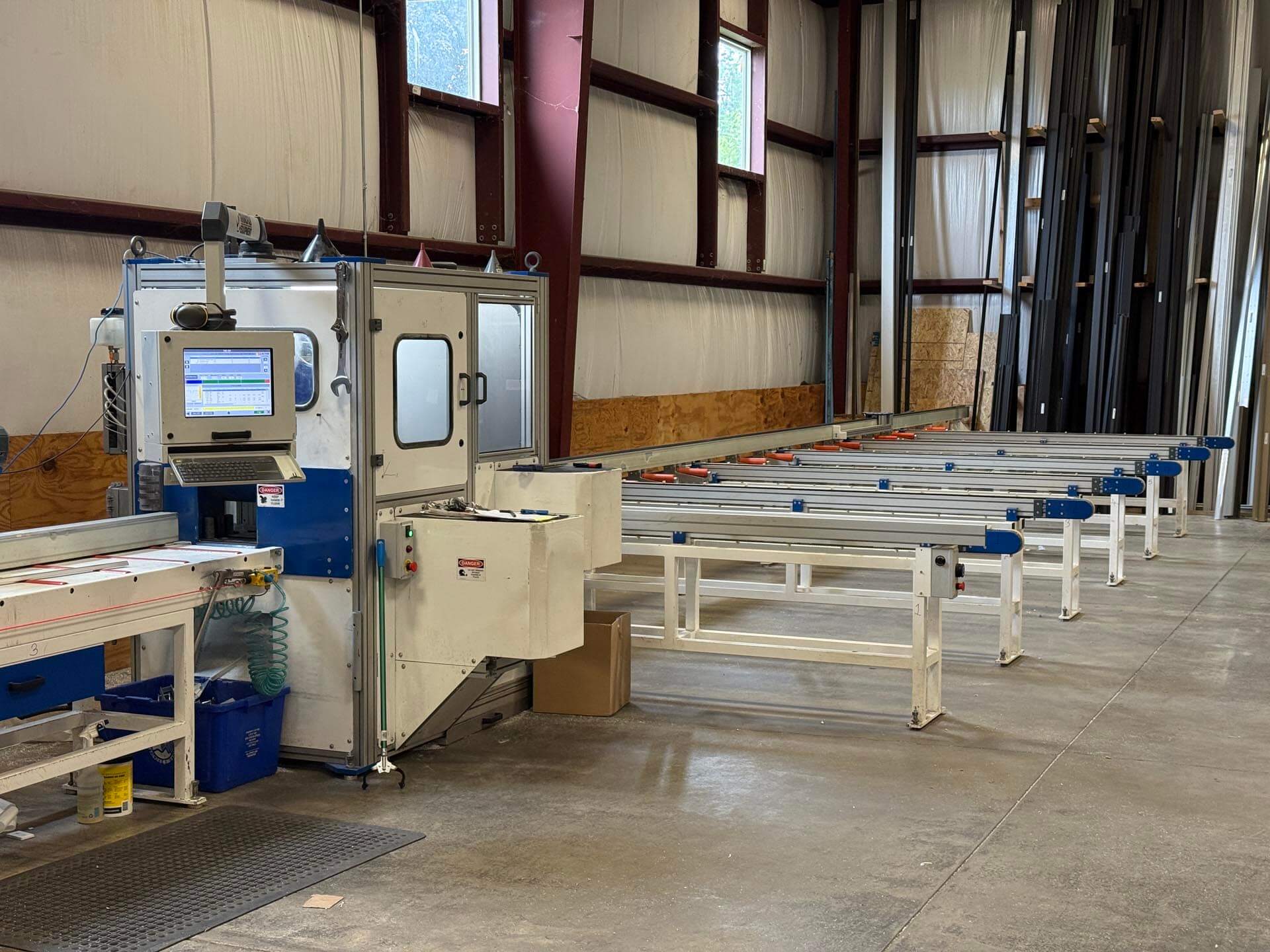
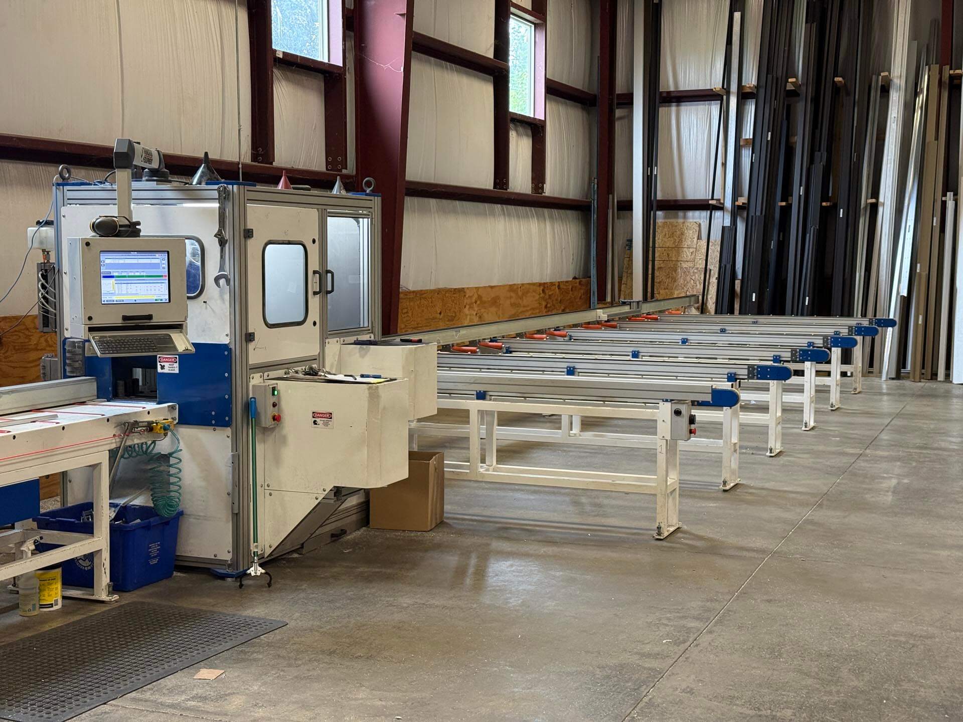
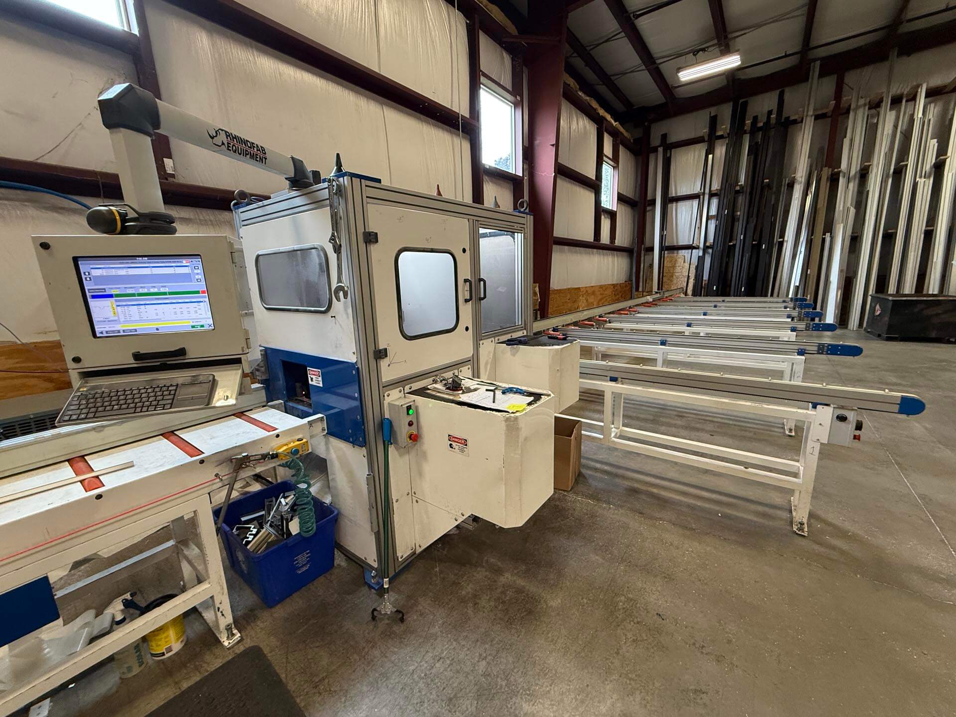
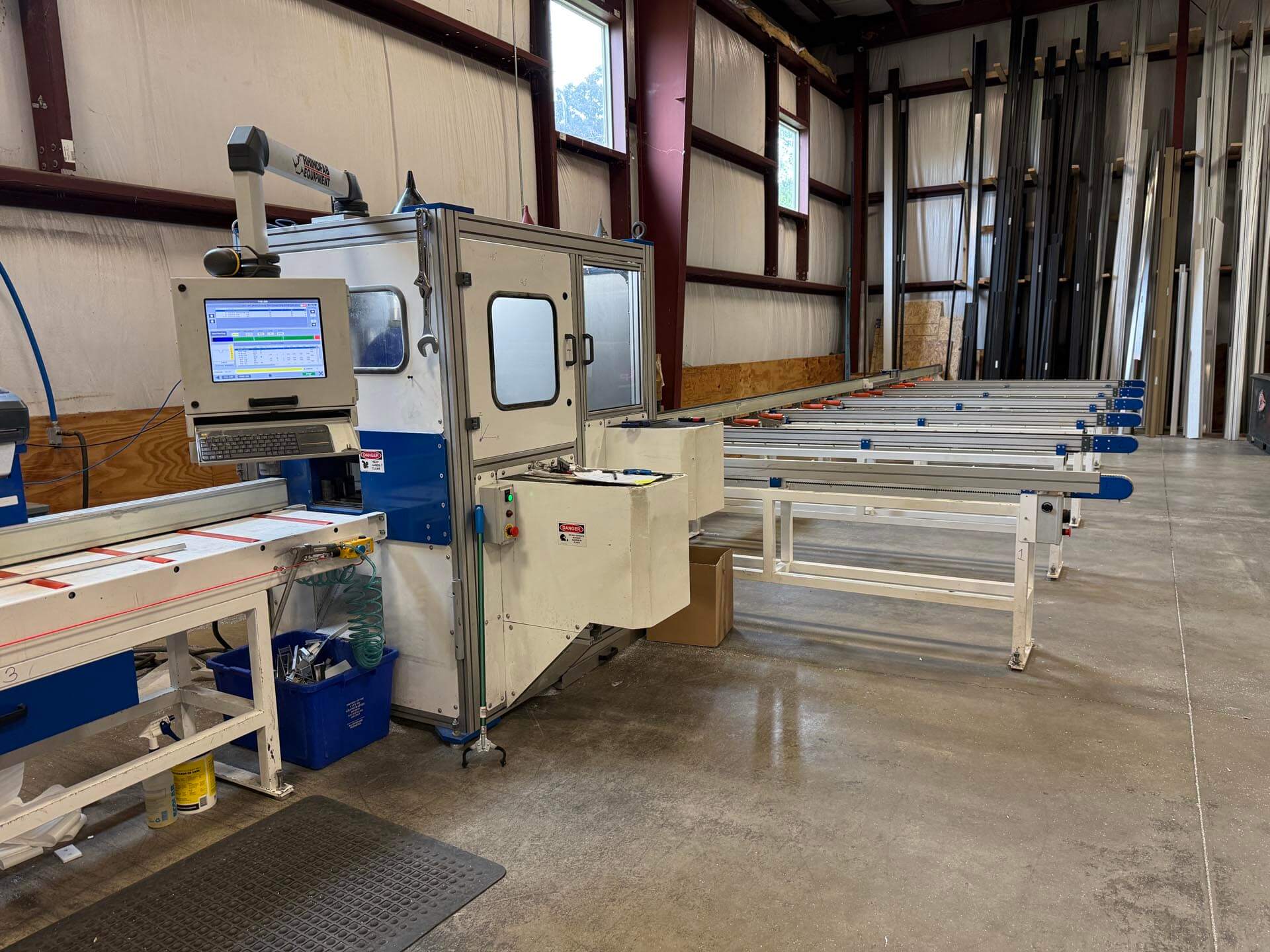
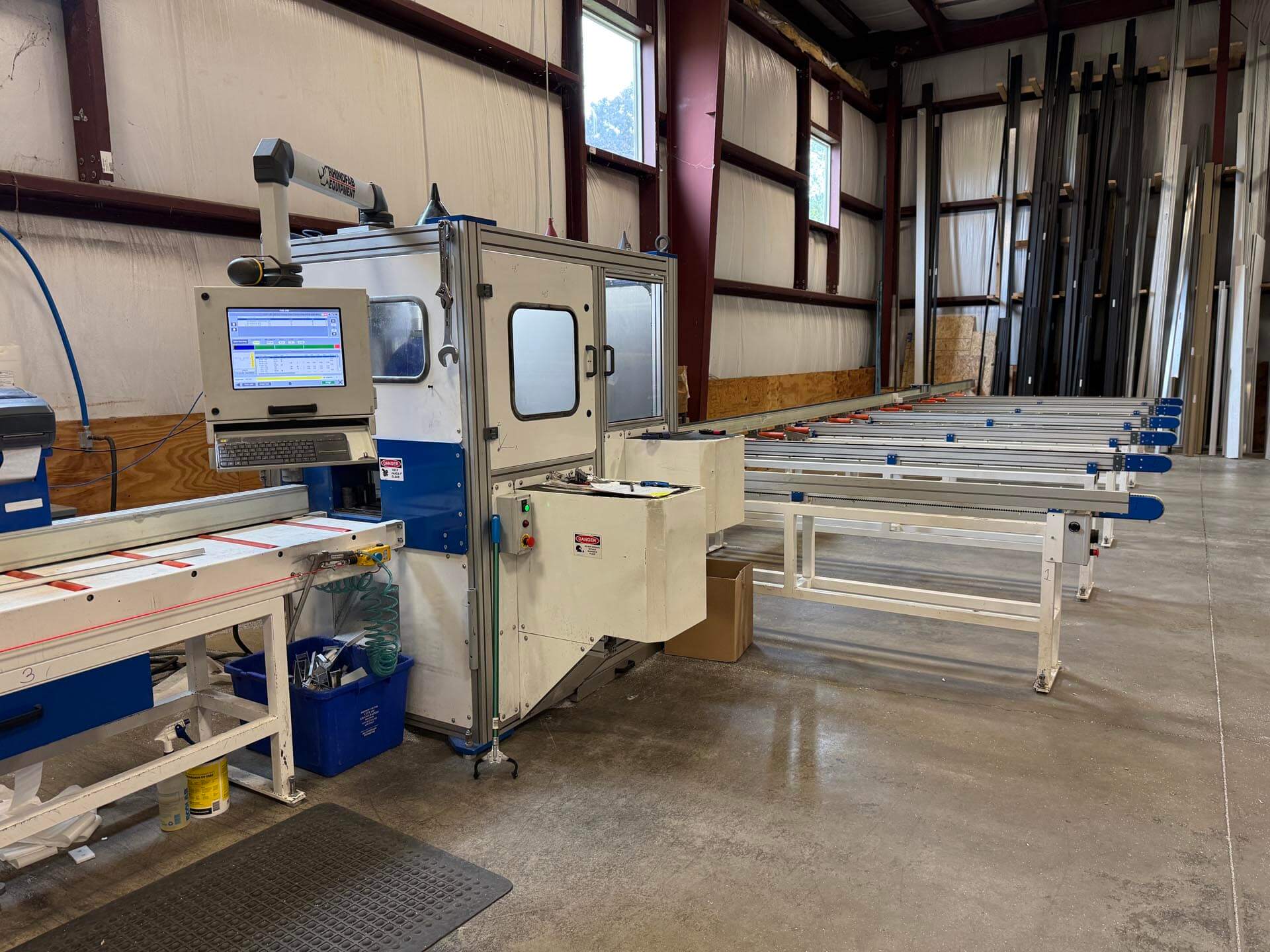
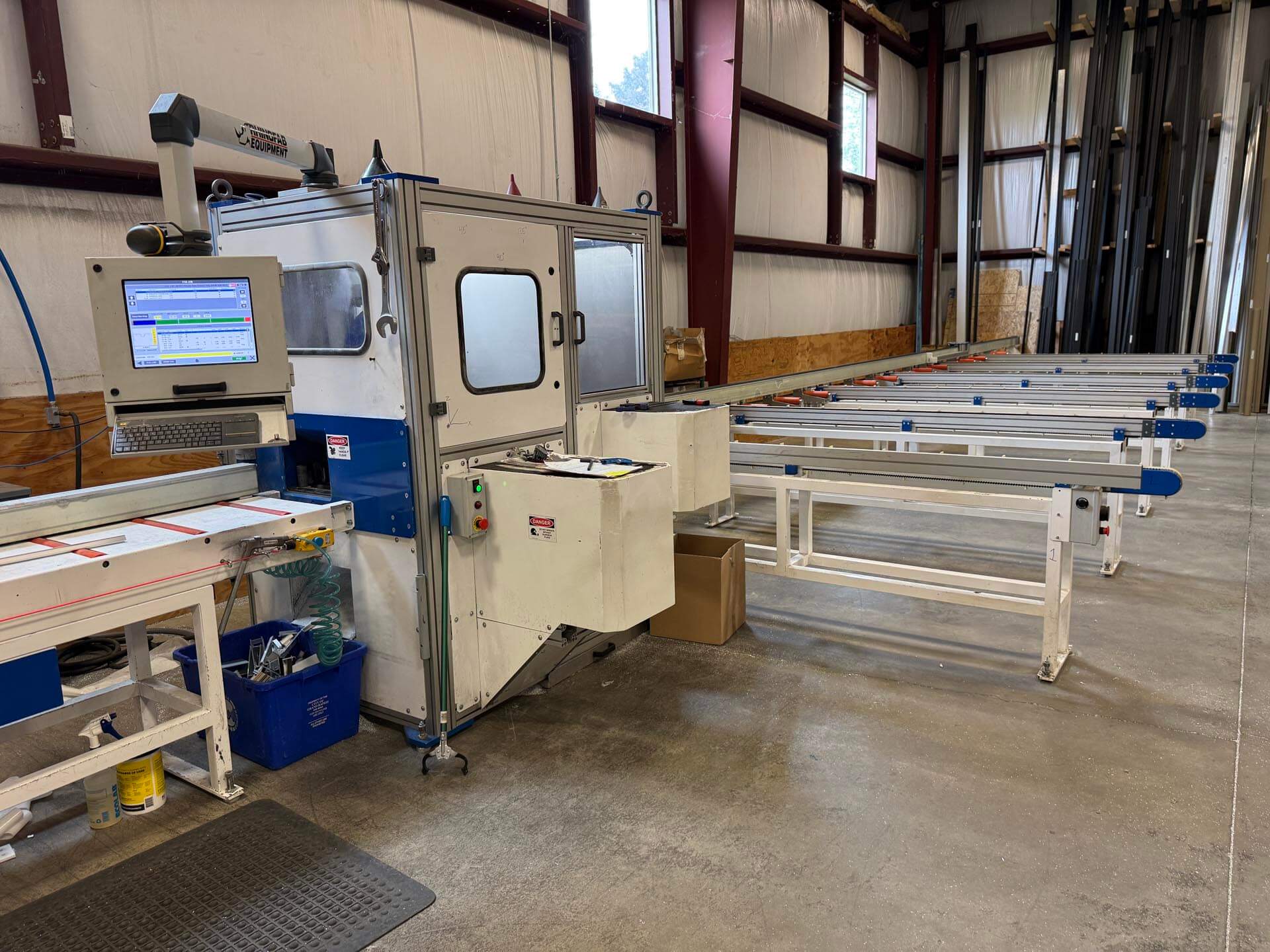
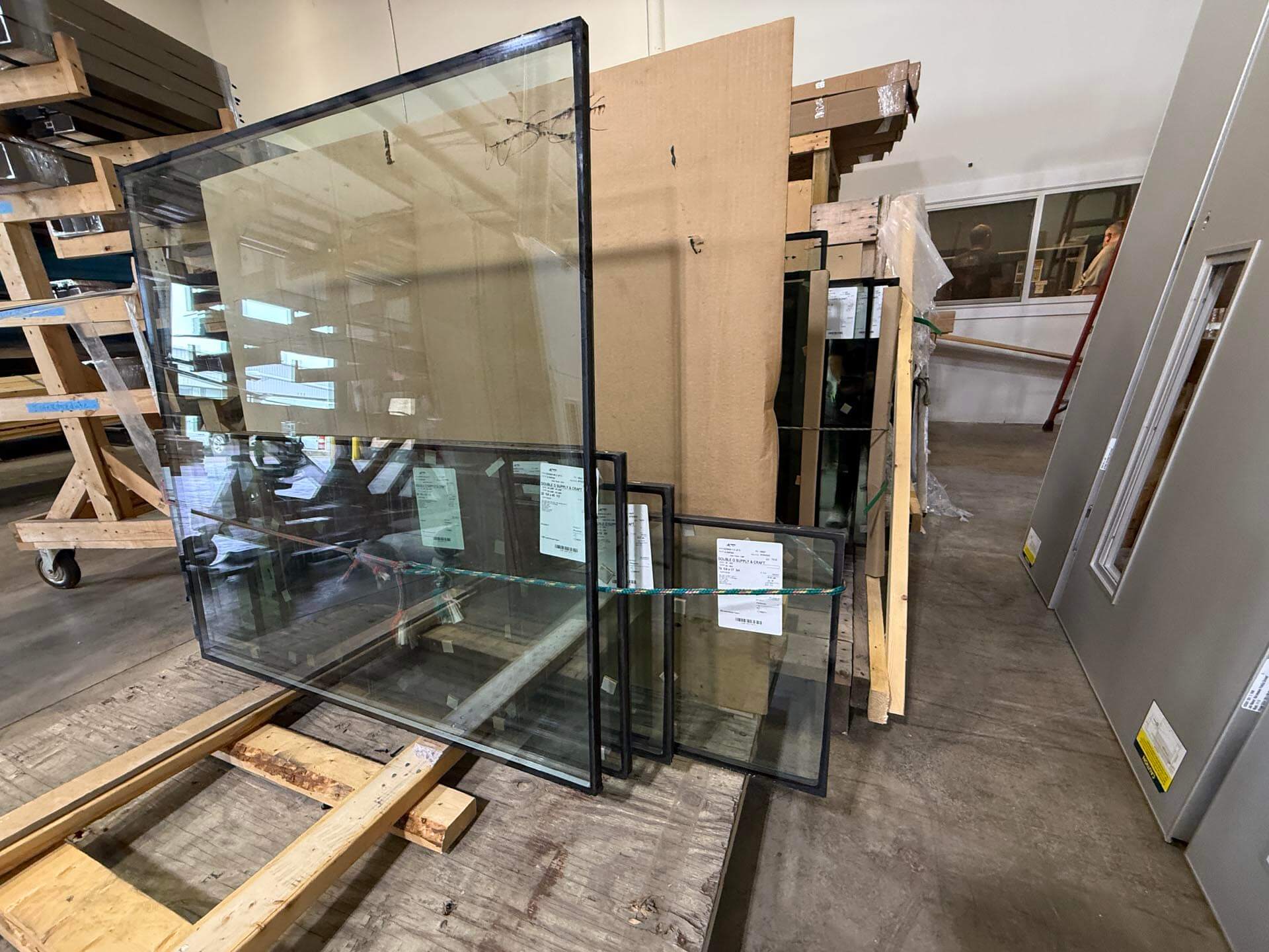
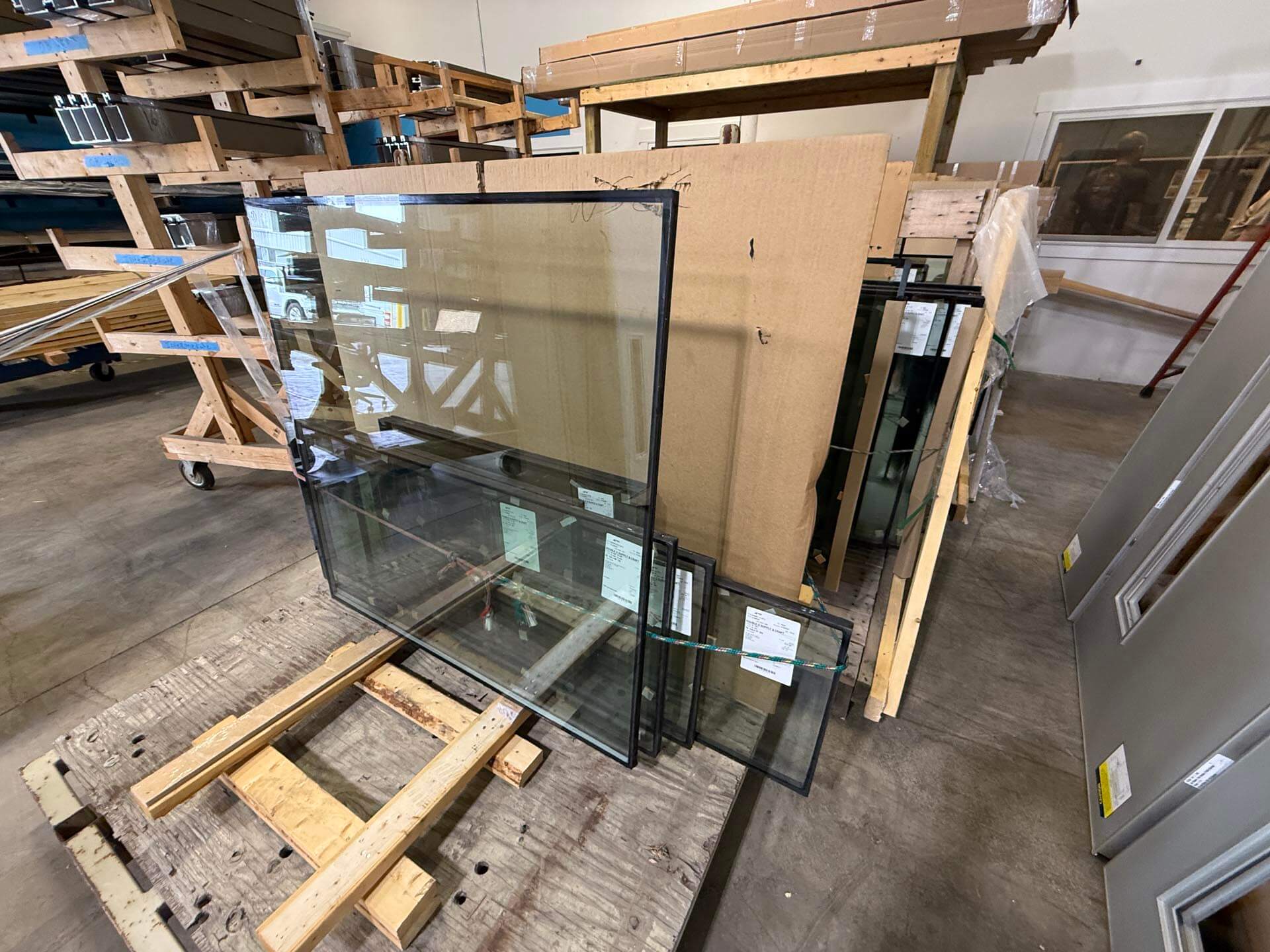
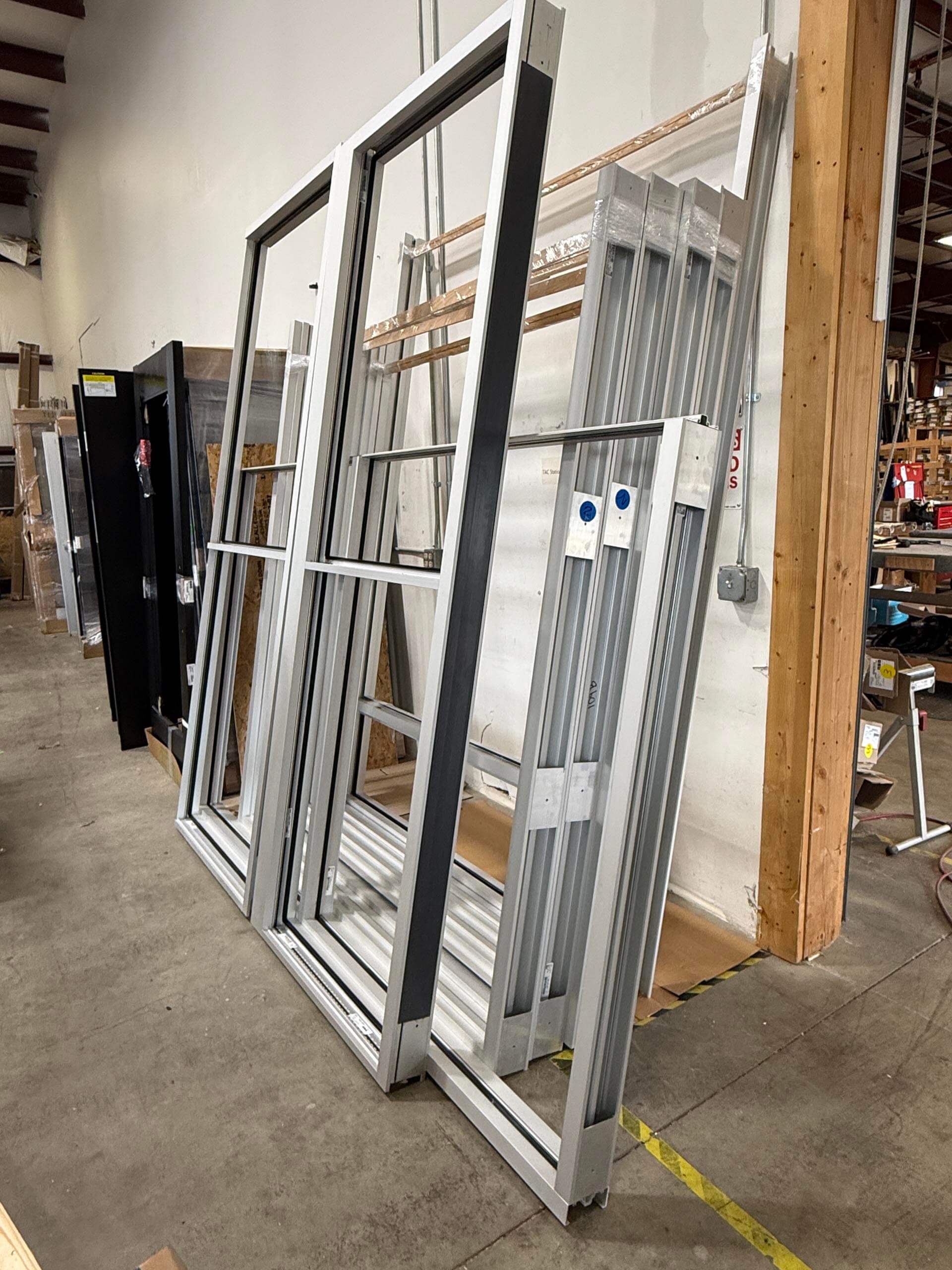
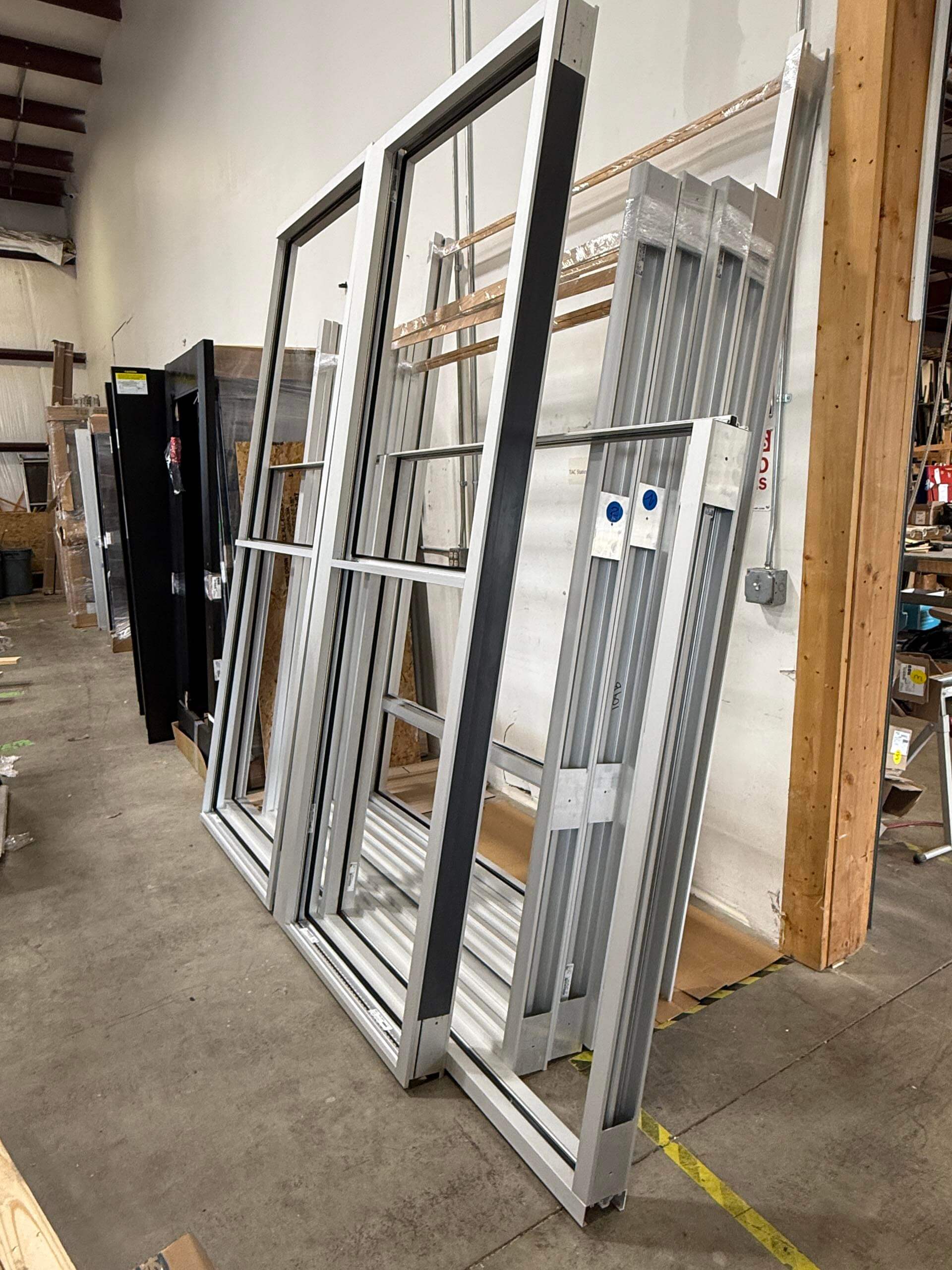
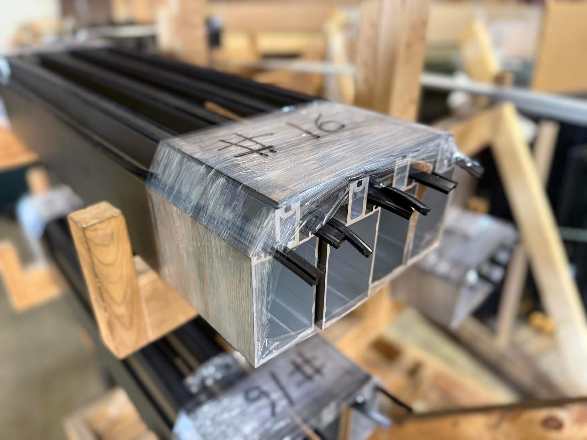
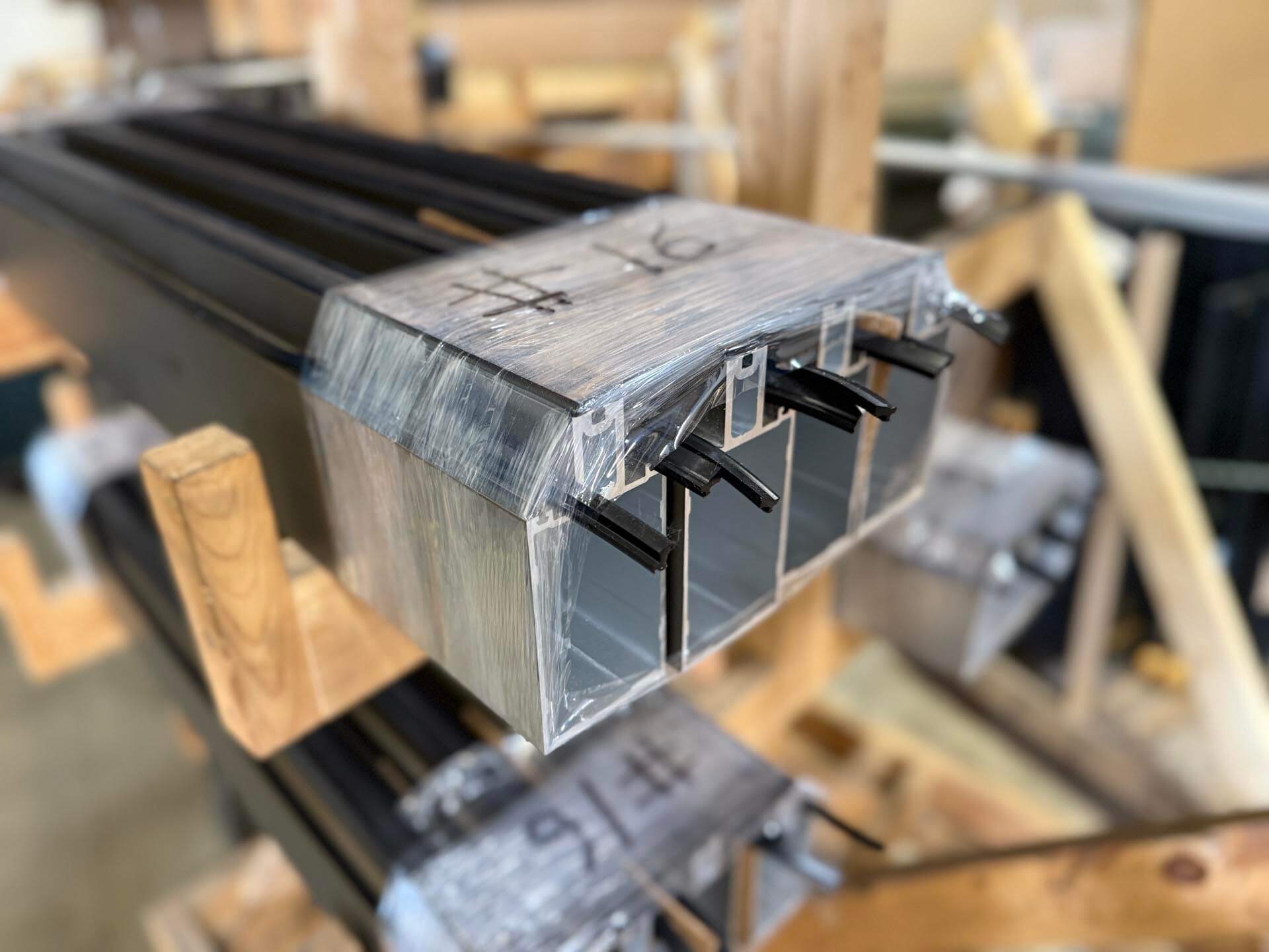
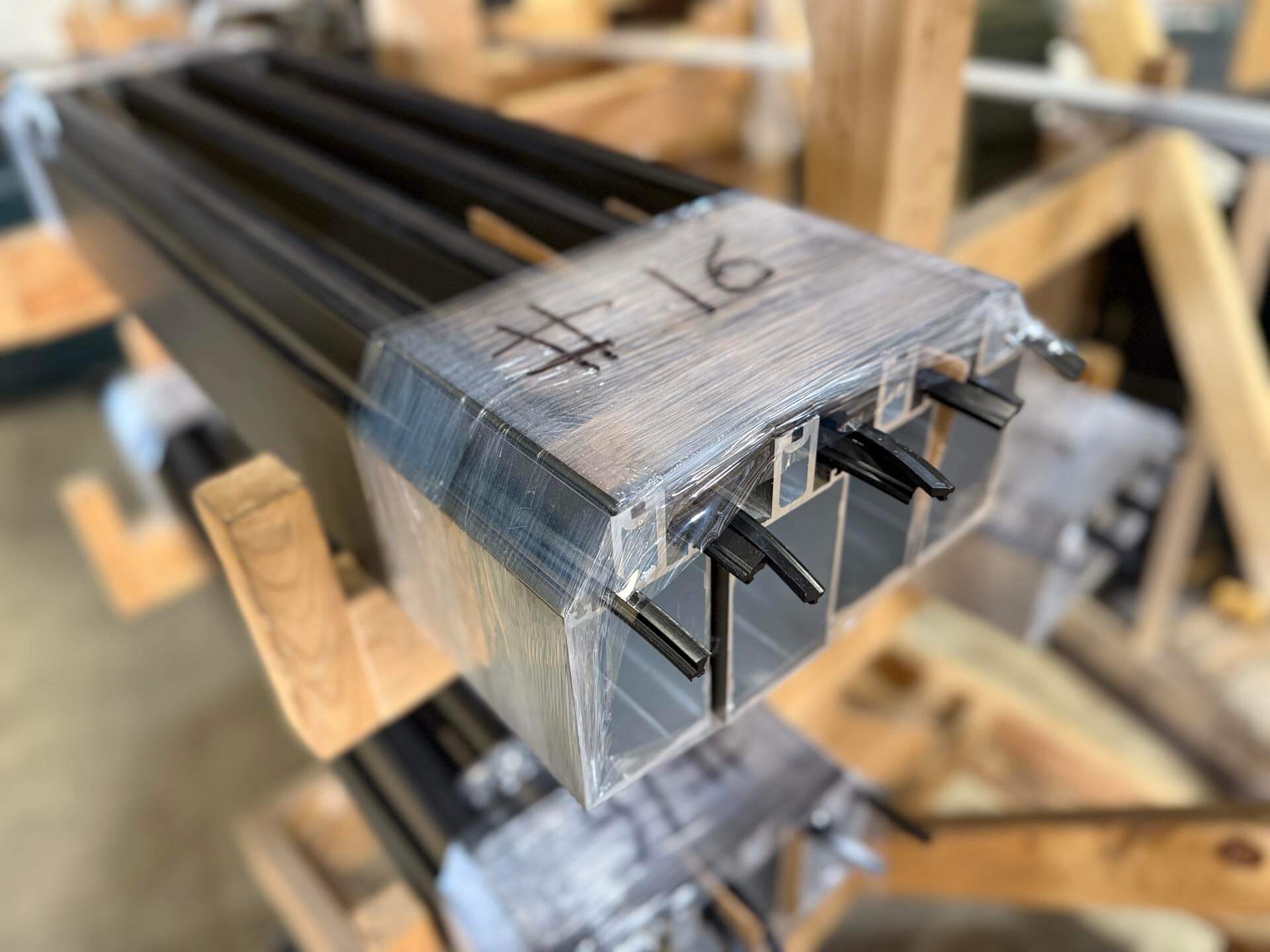
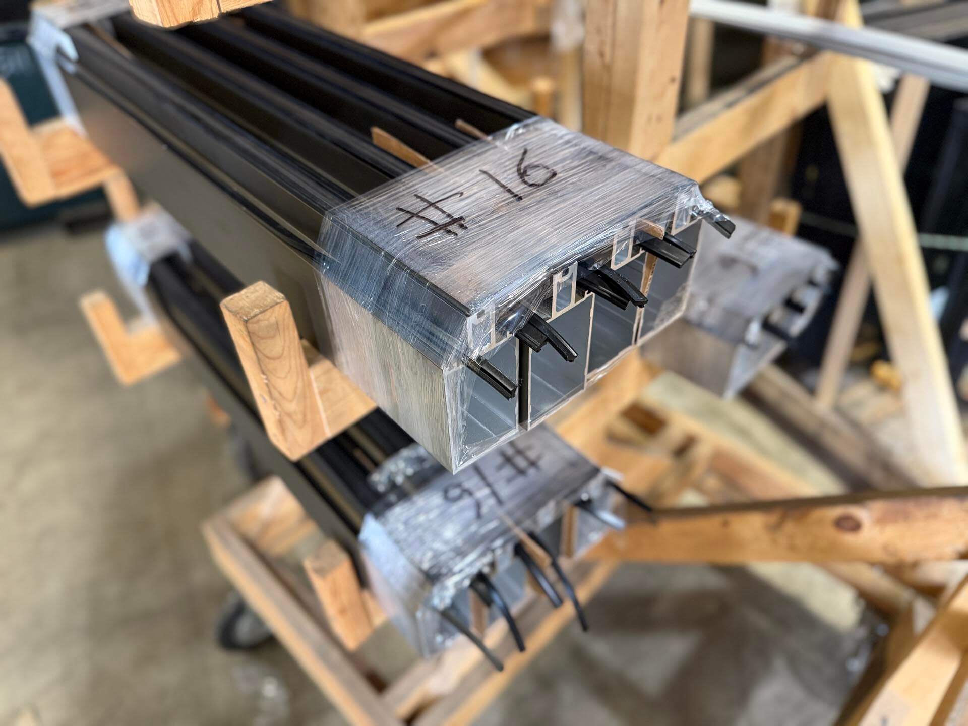
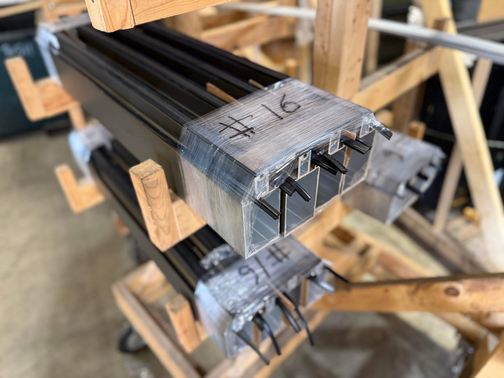
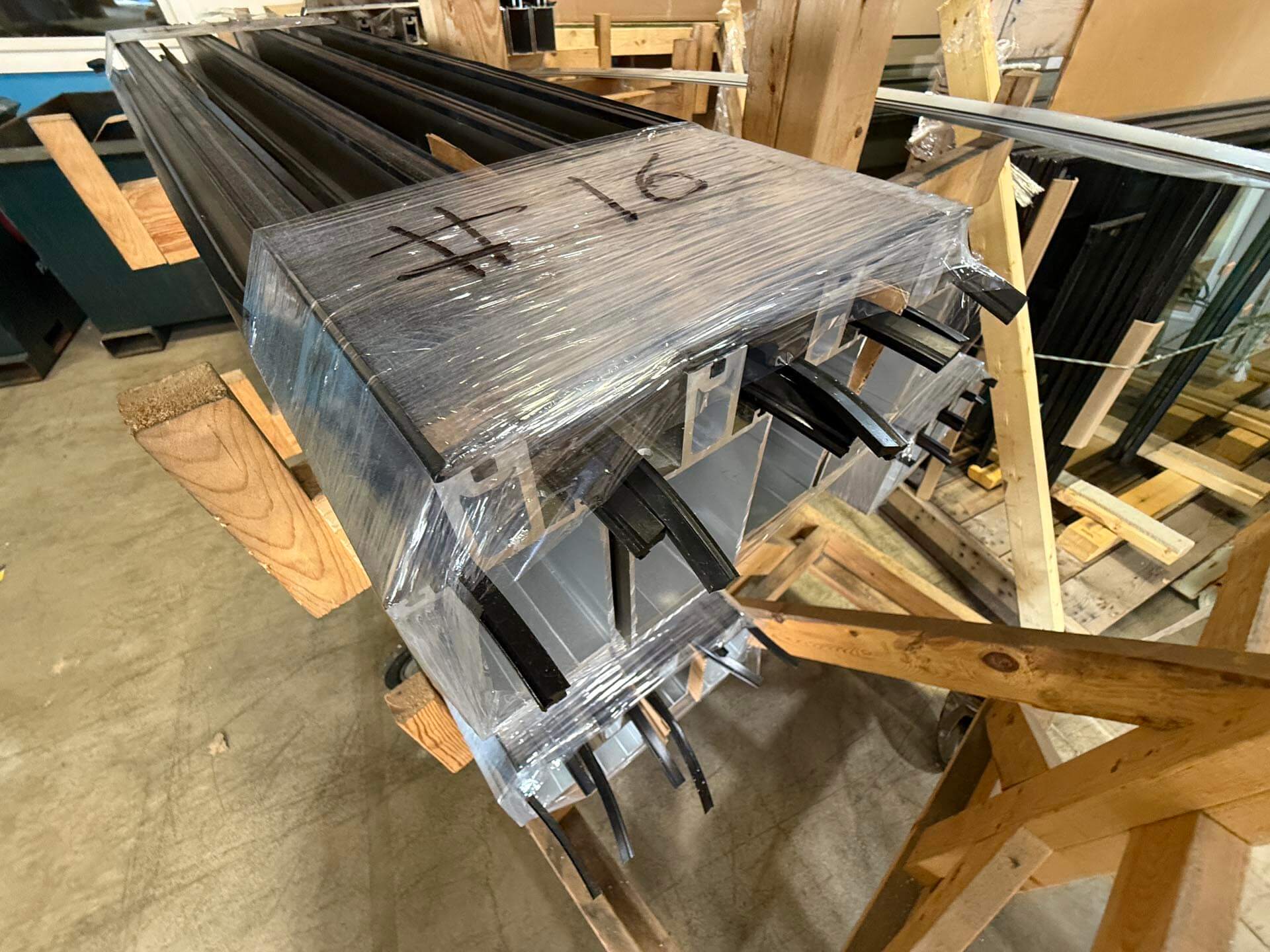
Browse 18 thumbnails per page. Click any image to open the full library in the lightbox, then use its previous/next controls or arrow keys.
03 / Color
Blue carries the brand. Neutrals do the work.
WestMetal Blue is the primary brand and action color. Dark blue adds depth; steel and greys establish structure. Reserve semantic red and green for feedback—not decoration.
Success
#66CB18Error
#BA3C3CFocus
#4A90E2Surface
#F7F9FBContrast rule: use white text on WestMetal Blue or Blue Dark, and charcoal/black text on light blue, steel, grey, or white surfaces.
04 / Typography
Aktiv Grotesk Extended
The extended proportions feel technical and assured without becoming mechanical. Use Light for primary headings, Regular for body copy, Medium for compact interface labels, and heavier weights sparingly.
Aa
Aktiv Grotesk Extended
Primary heading and body family · Served by Adobe Fonts
ABCDEFGHIJKLMNOPQRSTUVWXYZ
abcdefghijklmnopqrstuvwxyz 0123456789
Font files
Download the complete family
The website serves Aktiv Grotesk Extended through Adobe Fonts. Download the supplied Aktiv Grotesk TTF family for approved desktop and production applications.
Aktiv Grotesk HairlineTTF · Weight 100
download
Aktiv Grotesk ThinTTF · Weight 200
download
Aktiv Grotesk LightTTF · Weight 300
download
Aktiv Grotesk RegularTTF · Weight 400
download
Aktiv Grotesk MediumTTF · Weight 500
download
Aktiv Grotesk BoldTTF · Weight 700
download
Aktiv Grotesk Extra BoldTTF · Weight 800
download
Aktiv Grotesk BlackTTF · Weight 900
download
Hairline
100Precision fabrication, built for scale.
Thin
200Precision fabrication, built for scale.
Light
300Precision fabrication, built for scale.
Regular
400Precision fabrication, built for scale.
Medium
500Precision fabrication, built for scale.
Bold
700Precision fabrication, built for scale.
Extra Bold
800Precision fabrication, built for scale.
Black
900Precision fabrication, built for scale.
Display48 / 1.05 / 300Precision at scale.
H140 / 1.10 / 300Your overflow fabrication partner.
H232 / 1.20 / 300Built for demanding shops.
H320 / 1.30 / 400Field-ready components
Body18 / 1.50 / 400Clear communication keeps projects moving and crews productive.
Small14 / 1.50 / 400Supporting details, helper text, and metadata.
Label12 / 1.20 / 600PROJECT REQUIREMENTS
Hierarchy
Use one H1 per page and descend in order. Never choose a heading level for appearance alone.
Line length
Keep body copy near 55–75 characters per line. Use balanced wrapping for short headlines only.
Capitalization
Use sentence case for headings and actions. Reserve uppercase for compact labels and navigation.
05 / Spacing & layout
Order, rhythm, and enough breathing room.
The system uses a 4px spacing base and a reusable CSS Grid API. Add .grid, choose a column count with data-columns, and optionally control the gutter with data-gap. Page content is capped at 1500px.
22px44px88px1212px1616px2424px3232px4848px6464pxPage container · max 1500px
Grid API
Equal-column layouts
The same markup pattern supports one through six columns. The examples below use the production .grid[data-columns] rules—not a separate demonstration grid.
1
<div class="grid" data-columns="1">…</div>1
2
<div class="grid" data-columns="2">…</div>1
2
3
<div class="grid" data-columns="3">…</div>1
2
3
4
<div class="grid" data-columns="4">…</div>Uneven layouts
Two-thirds patterns
Use .grid-thirds when one side carries the primary narrative. Add .grid-thirds-reverse when the narrow supporting column belongs on the left.
Primary · ⅔
Support · ⅓
.grid.grid-thirdsSupport · ⅓
Primary · ⅔
.grid.grid-thirds.grid-thirds-reverseDesktop
Choose the column count that matches the content. Five- and six-column grids progressively reduce at 1500px, 1200px, and 1024px.
Tablet
Most grids collapse at 800px. Four-column layouts reduce earlier at 1200px to protect useful card widths.
Mobile
Default to one column below 800px. Automation tiles intentionally retain two columns as a component-specific exception.
06 / Buttons
Actions should look actionable.
Use one primary action per decision area. Buttons support text-only, leading-icon, trailing-icon, and icon-only configurations. Write labels as concise verb phrases and use icons only when they improve recognition.
<button class="button" data-type="primary" data-size="md" data-color="blue" data-icon-position="leading"><i class="fa-solid fa-upload" aria-hidden="true"></i> Upload specs</button>Icon-only rule: every icon-only button requires a concise aria-label. Decorative icons inside labeled buttons should use aria-hidden="true".
07 / Font icons
Font Awesome interface icons.
The global Font Awesome kit supplies interface icons. Use the solid style by default for consistent weight and legibility. Select an icon below to copy its complete class name.
08 / Input fields
Ask only for what the job requires.
Keep forms short, labels visible, instructions specific, and errors close to the problem. Never rely on placeholder text as the only label.
We’ll use this to follow up on your request.
error Enter a project name.
Include enough detail for an accurate next step.
09 / Custom components
The interface already has a working parts library.
These are the custom, production components currently available in the theme. Reuse and extend them before introducing a new visual pattern.
Overloaded shop?We’ve got you covered.
Page entry
Hero
Home-page value proposition with supporting copy and one primary drawer action.
Page titleYour Partner in Precision Fabrication
Page entry
Interior banner
Compact image-led introduction with page-specific title and subtitle logic.
speedSpeedReduce fabrication time
Interactive
Automation tiles
Four benefit buttons with icon, bubble hover treatment, and contact-drawer trigger.
Curtain Wall SystemsCut, routed, and labeled.
Content collection
Fabrication cards
Image-forward service cards for systems, capabilities, and conversion content.
 Automation Advantage
Feature
RHINOFAB feature
Dark, equipment-focused capability section with branded machine artwork and benefits.
Editorial
Split content
Responsive two-column narrative pattern used for the story, process, and capability pages.
“It felt like having an extra shop on call.Owner, Glazing Firm
Proof
Testimonials
Overlapping quote treatment with attribution and GlazierIQ network endorsement.
Contactlocation_onSouth Lyon, MI 48178call248.522.7030
Utility
Contact sidebar
Sticky contact card with dedicated sidebar and footer display contexts.
Send Us Your Specs
Interactive
Form drawer
Accessible modal dialog triggered from CTAs, with escape and overlay-close behavior.
1Quote2Approve3Receive
Process
Three-step process
Ordered Quote → Approve → Receive workflow for explaining what happens next.
Why jobs fall behindCapacity, precision, and timing.
Editorial
Problem / solution split
Brand-blue narrative section pairing detailed copy with supporting shop photography.
info
Project note Include system details and required delivery dates with your request.
check_circle
Request received Our estimating team will follow up shortly.
error
Upload failed Check the file size and try again.
10 / Design patterns
Build pages around decisions, not decoration.
Lead with the user’s problem, establish credible capability, explain the process, then make the next step obvious.
Orient
State the audience, problem, and outcome in the hero.
Prove
Show equipment, process, experience, or concrete outcomes.
Explain
Break a complex service into a short, ordered path.
Act
End with one clear, contextual call to action.
Do design for scanning
Front-load meaning, use descriptive headings, group related information, and make the next action visible.
Don’t create a wall of cards
Vary the page rhythm with editorial copy, imagery, proof, process, and focused actions.
11 / Voice & content
Experienced. Direct. On your side.
Write like a knowledgeable shop partner: specific enough to be useful, confident enough to lead, and human enough to call.
Practical
“Send the cut list and required date. We’ll confirm capacity and next steps.”
Capable
“Automated equipment keeps high-volume runs consistent and field-ready.”
Inflated
Avoid vague superlatives, corporate filler, and claims the page cannot prove.
Use: “Send us your specs”
Avoid: “Click here to submit”
Use: “What happens next”
Avoid: “Our proprietary methodology”
Use: “Add capacity without adding overhead”
Avoid: “Revolutionize your fabrication paradigm”
12 / Accessibility
Quality includes everyone.
Target WCAG 2.2 AA. Accessibility is a design, content, and engineering responsibility—not a final checklist.
Contrast
Maintain 4.5:1 for normal text and 3:1 for large text and essential interface graphics.
Keyboard
Every action must work without a mouse, in a logical order, with a visible focus state.
Targets
Use touch targets at least 44×44px where practical and provide enough space to avoid errors.
Alternatives
Write useful alt text for meaningful images and leave decorative images empty.
Media
Caption video, provide transcripts for audio, and never rely on motion alone.
Motion
Respect reduced-motion preferences and avoid unnecessary animation or flashing content.
13 / Front-end standards
Ship interfaces that hold up under pressure.
Use semantic HTML, progressive enhancement, scoped components, and the existing token system. Performance and resilience are part of the design.
HTMLStart with meaning
Use landmarks, ordered headings, native controls, labels, lists, and buttons before adding ARIA.
CSSUse shared tokens
Build from custom properties, component scopes, fluid sizing, and the established 800px responsive breakpoint.
JSEnhance, don’t require
Keep core content available without JavaScript. Test focus, escape behavior, and browser navigation.
PERFKeep it lean
Use SVG for marks, responsive images for photography, lazy-load below the fold, and avoid layout shifts.
QATest the edges
Check 320px through large desktop, keyboard-only use, zoom at 200%, long content, and form errors.
NAMINGMake intent obvious
Use component-oriented classes, `data-*` attributes for variants, and readable names over abbreviations.
Theme architecture
Keep composition, presentation, and behavior separate.
Page templates compose reusable PHP parts. SCSS partials own presentation. JavaScript modules add behavior. WordPress setup stays inside the functions directory so the root files remain easy to scan.
Directory mapTheme file structure
westmetal-group/
├── assets/
│   ├── css/
│   │   ├── components/       # Component-scoped SCSS
│   │   ├── layouts/          # Header, footer, page layouts
│   │   ├── partials/         # Tokens, base, type, forms, utilities
│   │   └── styles.scss       # Single import manifest
│   ├── fonts/                # Bundled webfont files
│   ├── images/               # Photography, icons, brand SVGs
│   └── js/
│       ├── modules/          # One module per behavior
│       └── app.js            # Front-end controller
├── components/               # Reusable PHP template parts
├── functions/                # Theme setup and WordPress concerns
├── partials/                 # Secondary template fragments
├── header.php / footer.php   # Global shell
├── page-*.php                # Page composition templates
└── functions.php # Theme bootstrap onlypartials/Foundation
Variables, reset/base rules, typography, buttons, forms, animation, and utilities. These files should not know about individual page components.
components/Reusable UI
One partial per custom component. Scope rules beneath the component’s root class and keep variants in attributes or modifier classes.
layouts/Composition
Global shell and page-level arrangements: header, footer, navigation drawers, general page grids, and exceptional page templates.
styles.scssManifest
Imports partials in dependency order: foundation first, components second, layouts last. It should contain imports—not feature CSS.
Implementation examples
Follow the component path from PHP to browser.
These examples show the preferred pattern for a reusable template part, its scoped SCSS, optional JavaScript behavior, and WordPress composition.
PHPAccessible template part
<?php
$title = $args['title'] ?? 'Default heading';
$theme = $args['theme'] ?? 'light';
?>

<section class="pf-feature" data-theme="<?php echo esc_attr($theme); ?>">
  <div class="pf-feature__content">
    <h2><?php echo esc_html($title); ?></h2>
    <?php if (!empty($args['body'])) : ?>
      <p><?php echo esc_html($args['body']); ?></p>
    <?php endif; ?>
  </div>
</section>SCSSComponent-scoped styles
// assets/css/components/_pf-feature.scss
.pf-feature {
  padding: 3rem max(1rem, calc(50% - var(--wrapWidth) / 2));
  background: var(--white);

  &__content {
    max-width: 760px;
  }

  &[data-theme="dark"] {
    color: var(--white);
    background: var(--charcoal);
  }

  @media (width <= 800px) {
    padding-inline: 0.625rem;
  }
}JavaScriptProgressive enhancement
export function featureInit() {
  const features = document.querySelectorAll('.pf-feature');
  if (!features.length) return;

  features.forEach(feature => {
    const trigger = feature.querySelector('[data-feature-trigger]');
    trigger?.addEventListener('click', () => {
      feature.classList.toggle('is-active');
    });
  });
}WordPressCompose with arguments
<?php
get_template_part(
  'components/pf-feature',
  null,
  [
    'title' => 'Built for demanding shops.',
    'body'  => 'Field-ready fabrication without added overhead.',
    'theme' => 'dark',
  ]
);WordPressVersioned asset loading
<?php
function pinnFab_enqueue_assets() {
  $version = wp_get_theme()->get('Version');

  wp_enqueue_style(
    'pinnFab-style',
    get_template_directory_uri() . '/assets/css/styles.css',
    [],
    $version
  );

  wp_enqueue_script(
    'pinnFab-script',
    get_template_directory_uri() . '/assets/js/app.js',
    [],
    $version,
    true
  );
}
add_action('wp_enqueue_scripts', 'pinnFab_enqueue_assets');Escape at output
Use esc_html(), esc_attr(), and esc_url() according to context. Sanitize data when it enters the system.
Prefer native HTML
Reach for buttons, links, dialogs, fields, landmarks, and heading structure before adding ARIA or custom keyboard behavior.
Guard every module
JavaScript initializers should return safely when their component is absent and attach behavior only within the component scope.
Keep variants explicit
Use existing tokens and attributes such as data-theme, data-size, and data-color instead of one-off overrides.
Respect motion settings
Animation must have a purpose, avoid layout shifts, and provide a reduced-motion treatment.
Test real content
Verify long headings, missing images, validation errors, keyboard flow, 200% zoom, and 320px-wide layouts before release.
Release checklist
- Content is accurate, concise, and proofread.
- Heading order and landmarks are valid.
- Keyboard, focus, form errors, and reduced motion are tested.
- Text and interface contrast meet WCAG AA.
- Responsive behavior is verified on real content.
- Images are optimized and include correct alt text.
- No console errors, broken links, or layout shifts remain.
- The primary action is clear at every key decision point.
Copied to clipboard